You are using an out of date browser. It may not display this or other websites correctly.
You should upgrade or use an alternative browser.
You should upgrade or use an alternative browser.
- Status
- Not open for further replies.
dbphoenix
Guest Author
- Messages
- 6,954
- Likes
- 1,266
Snippets regarding how does one know what to look for and what to do when one finds it?
Keep a vertical line chart showing the daily movements of any of the well-known averages. Use these to indicate when the market is in a trading area or whether it is moving to another level, upward or downward. You do not care which way it goes, or when; but you need these averages for a broad picture of the market . . .
Your vertical line chart of these averages should also show the volume of the day's trading -- the total sales for the day. This is very important because it aids in forming your judgment of the prevailing trend. Your individual stock chart should also show the volume of the day's trading in that stock, so that you may observe whether this volume increases or decreases on the advances and declines. Increases serve to emphasize the bullishness or bearishness. Decreases warn you of a probable reversal in direction. [NB. Today, of course, we also have access to intraday volume and everything Wyckoff says above applies intraday as well.] . . .
The upper and lower boundaries of these trading swings represent the points (at the tops) where supply overcomes demand and (at the bottoms) where demand exceeds supply. Unless the action of your stock indicates that it is going out of its present trading range, your purchases should be made around the bottoms of these short swings and your sales, long or short, around the tops. This seems a simple thing, but very few people can do it . . .
If it is swinging between 30 and 35 you should give increasing attention to its buying opportunities as it approaches 30, and its selling as it nears 35. This does not mean that you are to buy or sell at or near those points, but that you are to watch out for chances for profit indicated by the action of your stock on the [chart]. You never know, when a stock approaches the upper or lower levels of a trading range whether, this time, it will go on through; so you do not take a position until you have all the facts assembled . . .
Yesterday's action in the NQ provides a nice example of how all of the above -- indeed Wyckoff in general -- applies to today's trading, and given that yesterday is fresh in the minds of NQ fans and that I posted the pre-announcement hinge yesterday morning, this is a good time to get into this, particularly considering the questions I received via PM on "what to look for". The following is a repost of the hinge:

Again, as ever, context. Without context, one is far more likely to be making random trades and getting tangled up in chop. One has to know what to look for before he knows what to do with it if and when he finds it.
Before I go on, I want to repeat something I wrote long ago that resurfaces every time the subject of trading price comes up:
Trading by price -- and "volume" (or trading activity) -- requires a perceptual and conceptual readjustment that many people just can't make, and many of those who can make it don't want to. But making that adjustment is somewhat like parting a veil – or taking the red pill -- in that doing so enables one to look at the market in a very different way, one might say on a different level.
One must first accept the continuous nature of the market, the continuity of price, of transactions, of the trading activity that results in those transactions. The market exists independently of you and of whatever you're using to impose a conceptual structure. It exists independently of your charts and your indicators and your bars. It couldn't care less if you use candles or bars or plot this or that line or select a 5m bar interval or 8 or 23 or weekly or monthly or even use charts at all. And while you may attach great importance to where and how a particular bar -- or candle -- closes, there is in fact no "close" during the market day, not until everybody turns out the lights and goes home.
Therefore, trading by price and volume, or at least doing it well, requires getting past all that and perceiving price movement and the balance between buying pressure and selling pressure independently of the medium used to manifest or illustrate or reveal the activity.
To repeat, lest it be overlooked, "Trading by price -- and "volume" (or trading activity) -- requires a perceptual and conceptual readjustment that many people just can't make, and many of those who can make it don't want to." These "readjustments" are the chief reason why those other than beginners can and usually do have so much trouble with trading price. Beginners have not yet traveled into too many deadends. Nor have they learned much if anything backwards. Nor have they learned fear. Those who are "experienced", however, know so much that isn't so, and have had their self-confidence shaken to such an extent, that these readjustments become virtually impossible, particularly considering the emotional states in which they usually find themselves (among those who devote considerable effort to "controlling emotions", the chances for success are slim).
If one can abandon everything that he thinks he knows and begin again, this is relatively straightforward. If he can put the "yes, buts" on the back-burner for at least the short-term, the more straightforward it gets.
So, focusing on Wyckoff and beginning with the context presented by the hinge (see post 14 for the discussion of the hinge; it's too much to copy and paste here; I'll wait for you to click the link and read -- or re-read -- the post) . . .
Keep a vertical line chart showing the daily movements of any of the well-known averages. Use these to indicate when the market is in a trading area or whether it is moving to another level, upward or downward. You do not care which way it goes, or when; but you need these averages for a broad picture of the market . . .
Your vertical line chart of these averages should also show the volume of the day's trading -- the total sales for the day. This is very important because it aids in forming your judgment of the prevailing trend. Your individual stock chart should also show the volume of the day's trading in that stock, so that you may observe whether this volume increases or decreases on the advances and declines. Increases serve to emphasize the bullishness or bearishness. Decreases warn you of a probable reversal in direction. [NB. Today, of course, we also have access to intraday volume and everything Wyckoff says above applies intraday as well.] . . .
The upper and lower boundaries of these trading swings represent the points (at the tops) where supply overcomes demand and (at the bottoms) where demand exceeds supply. Unless the action of your stock indicates that it is going out of its present trading range, your purchases should be made around the bottoms of these short swings and your sales, long or short, around the tops. This seems a simple thing, but very few people can do it . . .
If it is swinging between 30 and 35 you should give increasing attention to its buying opportunities as it approaches 30, and its selling as it nears 35. This does not mean that you are to buy or sell at or near those points, but that you are to watch out for chances for profit indicated by the action of your stock on the [chart]. You never know, when a stock approaches the upper or lower levels of a trading range whether, this time, it will go on through; so you do not take a position until you have all the facts assembled . . .
Yesterday's action in the NQ provides a nice example of how all of the above -- indeed Wyckoff in general -- applies to today's trading, and given that yesterday is fresh in the minds of NQ fans and that I posted the pre-announcement hinge yesterday morning, this is a good time to get into this, particularly considering the questions I received via PM on "what to look for". The following is a repost of the hinge:
Again, as ever, context. Without context, one is far more likely to be making random trades and getting tangled up in chop. One has to know what to look for before he knows what to do with it if and when he finds it.
Before I go on, I want to repeat something I wrote long ago that resurfaces every time the subject of trading price comes up:
Trading by price -- and "volume" (or trading activity) -- requires a perceptual and conceptual readjustment that many people just can't make, and many of those who can make it don't want to. But making that adjustment is somewhat like parting a veil – or taking the red pill -- in that doing so enables one to look at the market in a very different way, one might say on a different level.
One must first accept the continuous nature of the market, the continuity of price, of transactions, of the trading activity that results in those transactions. The market exists independently of you and of whatever you're using to impose a conceptual structure. It exists independently of your charts and your indicators and your bars. It couldn't care less if you use candles or bars or plot this or that line or select a 5m bar interval or 8 or 23 or weekly or monthly or even use charts at all. And while you may attach great importance to where and how a particular bar -- or candle -- closes, there is in fact no "close" during the market day, not until everybody turns out the lights and goes home.
Therefore, trading by price and volume, or at least doing it well, requires getting past all that and perceiving price movement and the balance between buying pressure and selling pressure independently of the medium used to manifest or illustrate or reveal the activity.
To repeat, lest it be overlooked, "Trading by price -- and "volume" (or trading activity) -- requires a perceptual and conceptual readjustment that many people just can't make, and many of those who can make it don't want to." These "readjustments" are the chief reason why those other than beginners can and usually do have so much trouble with trading price. Beginners have not yet traveled into too many deadends. Nor have they learned much if anything backwards. Nor have they learned fear. Those who are "experienced", however, know so much that isn't so, and have had their self-confidence shaken to such an extent, that these readjustments become virtually impossible, particularly considering the emotional states in which they usually find themselves (among those who devote considerable effort to "controlling emotions", the chances for success are slim).
If one can abandon everything that he thinks he knows and begin again, this is relatively straightforward. If he can put the "yes, buts" on the back-burner for at least the short-term, the more straightforward it gets.
So, focusing on Wyckoff and beginning with the context presented by the hinge (see post 14 for the discussion of the hinge; it's too much to copy and paste here; I'll wait for you to click the link and read -- or re-read -- the post) . . .
dbphoenix
Guest Author
- Messages
- 6,954
- Likes
- 1,266
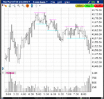
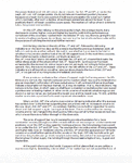
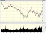
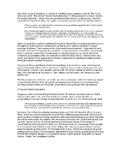
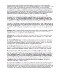
The apex of that hinge was around 51/52, and price had been in a range between 41 and 55 since 2200 the previous evening. Traders then got ruffled at around 0300 (Germans? Russians?) and price broke out of the range to the upside, then retreated and sank below the range, then returned to a neutral position.
At about 0400, demand took the upper hand and drove price all the way to 73, at which point sellers ran out of buyers. Price retreated and new and/or refreshed demand drove it back to 73. But demand was insufficient (note the lighter volume). Note that the 5m chart is unimportant; it's used as a quick and easy zoom out. What is more important is the 1m chart, which should at least be alongside. This shows more clearly the effort to make a new high and the failure to do so. (Wyckoff would of course be using the tape, but we have the luxury of real time streaming charts; the prints and the price movements are the same.)

Americans should keep in mind that none of this is being traded. Americans are still asleep. This is the process of determining context. Even if one doesn't turn on his computer until 0815 with the intent of trading the employment report, determining the context shouldn't take more than 5 minutes (if one can't do it in five minutes, get up at 0800).
If the price action trader is at his computer between 0800 and 0825, he will note that price has stepped down from 73 to 55 in stages (as distinct from the continual upmove from 0330 to 0500).

But even if he doesn't, he'll see -- or should -- that the halfway level of this downmove is or was at about 64, and that price, after a hour of trying, could not get past this. This observation will become important.

At about 0400, demand took the upper hand and drove price all the way to 73, at which point sellers ran out of buyers. Price retreated and new and/or refreshed demand drove it back to 73. But demand was insufficient (note the lighter volume). Note that the 5m chart is unimportant; it's used as a quick and easy zoom out. What is more important is the 1m chart, which should at least be alongside. This shows more clearly the effort to make a new high and the failure to do so. (Wyckoff would of course be using the tape, but we have the luxury of real time streaming charts; the prints and the price movements are the same.)
Americans should keep in mind that none of this is being traded. Americans are still asleep. This is the process of determining context. Even if one doesn't turn on his computer until 0815 with the intent of trading the employment report, determining the context shouldn't take more than 5 minutes (if one can't do it in five minutes, get up at 0800).
If the price action trader is at his computer between 0800 and 0825, he will note that price has stepped down from 73 to 55 in stages (as distinct from the continual upmove from 0330 to 0500).
But even if he doesn't, he'll see -- or should -- that the halfway level of this downmove is or was at about 64, and that price, after a hour of trying, could not get past this. This observation will become important.
Attachments
dbphoenix
Guest Author
- Messages
- 6,954
- Likes
- 1,266
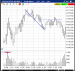
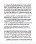
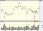
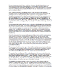
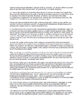
And now we have the employment report and the reaction to it. One might have traded the bounce off 26 if he saw something. I didn't. But price strains to reach 63.5, which is two ticks away from the halfway level of that pre-report range.

What is the risk involved in taking this short?
Is the risk acceptable?
If one doesn't know the risk or hasn't decided whether or not it's acceptable, then there is no trade. He can wait for the open, but getting into this will be vastly more difficult and carry substantially more risk. Wyckoff anticipated Justin Mamis (The Nature of Risk) when he pointed out that the longer one waits, the more risk he must assume, or, in Mamis's terms, the less information risk one wants, the more price risk he must accept. This is why Wyckoff prefers to buy the tests after climaxes (see the H&S and CWH posts I made earlier) rather than the moves above the technical rallies (or below the technical reactions) and trade the springboards within ranges rather than wait for the breakouts.
Attachments
dbphoenix
Guest Author
- Messages
- 6,954
- Likes
- 1,266
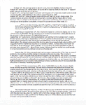
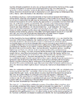
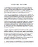
So here we are. The market's been closed since Friday afternoon and it will re-open this evening. It appears that price provided a climactic low in January with relatively heavy volume. Price stopped short of that low on Friday, and though volume was decent, it was less than the volume in January. Have we just experienced a technical rally? Was Friday a test? If volume does not increase and price holds or reverses, then yes, and we have a buying opportunity. Otherwise . . .
So, based on what you've read so far, what does the Wyckoff trader look for? What does he do with it if and when he sees it? This is after all the purpose of studying old charts, whether they are a century old and or a day old, what to look for in order to help one make real-time decisions. And there's no shame in putting together a checklist, a sort of "preflight" checklist. Eventually what one looks for becomes automatic, second-nature, and one can amaze one's friends with what an insightful trader he is (depending on how easily one's friends are amazed).
So, based on what you've read so far, what does the Wyckoff trader look for? What does he do with it if and when he sees it? This is after all the purpose of studying old charts, whether they are a century old and or a day old, what to look for in order to help one make real-time decisions. And there's no shame in putting together a checklist, a sort of "preflight" checklist. Eventually what one looks for becomes automatic, second-nature, and one can amaze one's friends with what an insightful trader he is (depending on how easily one's friends are amazed).
Attachments
dbphoenix
Guest Author
- Messages
- 6,954
- Likes
- 1,266
Richard Wyckoff was a pioneer of technical analysis. While Dow contributed the theory that price moves in a series of trends and reactions, and Schabacker classified those movements into chart patterns, developed gap theory, and stressed the role of trader behavior in the development of patterns and support/resistance, Wyckoff contributed the study of the relationship between volume and price movement to detect imbalances between supply and demand, which in turn provided clues to direction and potential turning points. By also studying the dynamics of consolidations or horizontal movements, he was able to offer a complete market cycle of accumulation, mark-up, distribution, and mark-down, which was in large part the result of shifts in ownership between retail traders and professional money.
Wyckoff sought to develop a comprehensive trading system which (a) focused on those markets and stocks that were “on the springboard” for significant moves, (b) initiated entries at those points which offered the highest probability of success, and (c) exited the positions at the most advantageous time, all with the least possible degree of risk*. His favorite metaphor for the markets and market action was water: waves, currents, eddies, rapids, ebb and flow. He did not view the market as a battlefield nor traders as combatants. He counseled the trader to analyze the waves, determine the current, “go with the flow”, much like a sailor. He thus encouraged the trader to find his entry using smaller “waves”, then, as the current picked him up, ride the current through the larger waves to the natural culmination of the move, even to the extent of pressing one’s advantage, or “pyramiding”, as opposed to cutting profits short, or “scalping”.
“Trading Wyckoff”, then, is more than just relating price and volume. It is a complete trading strategy, ranging from finding the most attractive opportunities through strategy development and trade management to the best moment to close the trade, all with the least possible degree of risk*.
Accumulation: An area where stocks are purchased – or “accumulated” -- with the intention to mark up prices at some later time. Every traded stock is in one of four phases: Accumulation, Mark-up, Distribution, Mark-down. Absorption is a form of "re-accumulation" which occurs toward the end of the Mark-up phase as price approaches old resistance. Buyers "absorb" the offerings of bulls who bought at that old resistance and now want out, as well as the offerings of bears who bought on the way down to that old resistance and now see an opportunity to get out even.
Buying Climax: the opposite of a Selling Climax.
Demand: Buying power, buying pressure.
Demand Line: that line which passes through two successive swing lows (the low points of two successive reactions).
Distribution: An area where stocks are sold with the intention to mark down prices at some later time.
Mark-down: The phase of the cycle where prices decline, from the beginning of a bear campaign to its bottom.
Mark-up: The phase of the cycle where prices rise, from the beginning of a bull campaign to its top.
Overbought Position Line: that line which is drawn parallel to a demand line and passes through the first point of resistance (rally top) which intervenes between two successive points of demand in an up trend.
Oversold Position Line: that line which is drawn parallel to a supply line and passes through the first point of support (reaction low) which intervenes between two successive rally tops in a down trend.
Price movement or price action: the continuous tick-by-tick (transaction-by-transaction) movement of price as shown on the tape or on a corresponding chart.
Rally: A phase in the market that experiences rising prices, that is, higher highs and higher lows.
Reaction: A phase in the market that experiences declining prices, that is, lower highs and lower lows.
Resistance: An area where selling pressure overwhelms buying pressure.
Secondary Reaction (Test): The reaction following a Technical Rally.
Selling Climax: A major panic that occurs at the end of a steep decline in prices.
Shakeout: A sudden break below a support level followed by a rapid reversal.
Springboard: A stock (or group or the market as a whole) is on the springboard following a period of preparation for an advance or decline.
Stop Loss: An order to exit a trade if the market does something that proves your initial decision to enter the trade was wrong.
Supply: Selling power, selling pressure.
Supply Line: that line which passes through two successive swing highs (tops of rallies).
Support: An area where buying pressure overwhelms selling pressure.
Tape: a thin strip of paper on which is printed a series of stock symbols, each print representing a transaction in that stock and consisting of the price at which the transaction took place and the volume of shares changing hands. Modern day equivalents are the "time-and-sales window" and the one-tick chart.
Tape Reading: the art of determining the immediate course or trend of prices from the action of the market as it appears on the tape of the stock ticker.
Technical Rally: The rally that occurs after a Selling Climax.
Thrust: A break above a resistance level followed by a rapid reversal.
Trading Range: A period of balance between buying (bullish) and selling (bearish) forces.
Trend: The line of least resistance.
Trendlines: Straight lines drawn through the tops or bottoms of the price path established during an upward climb or downward pitch. They “serve to define the stride of the price movement, thereby frequently directing our attention either to possibilities of an approaching change of trend or to an actual reversal.”
Volume: Number of units changing hands in each transaction.
Wyckoff sought to develop a comprehensive trading system which (a) focused on those markets and stocks that were “on the springboard” for significant moves, (b) initiated entries at those points which offered the highest probability of success, and (c) exited the positions at the most advantageous time, all with the least possible degree of risk*. His favorite metaphor for the markets and market action was water: waves, currents, eddies, rapids, ebb and flow. He did not view the market as a battlefield nor traders as combatants. He counseled the trader to analyze the waves, determine the current, “go with the flow”, much like a sailor. He thus encouraged the trader to find his entry using smaller “waves”, then, as the current picked him up, ride the current through the larger waves to the natural culmination of the move, even to the extent of pressing one’s advantage, or “pyramiding”, as opposed to cutting profits short, or “scalping”.
“Trading Wyckoff”, then, is more than just relating price and volume. It is a complete trading strategy, ranging from finding the most attractive opportunities through strategy development and trade management to the best moment to close the trade, all with the least possible degree of risk*.
*Risk is minimized by (1) focusing on liquid markets, (2) monitoring the imbalances between buying pressure and selling pressure at those levels of “support” or “resistance” where price is most likely to reverse its trend, (3) entering on reversals (or, if necessary, retracements) rather than breakouts, and (4) getting out when the market tells you to.
GLOSSARY
Accumulation: An area where stocks are purchased – or “accumulated” -- with the intention to mark up prices at some later time. Every traded stock is in one of four phases: Accumulation, Mark-up, Distribution, Mark-down. Absorption is a form of "re-accumulation" which occurs toward the end of the Mark-up phase as price approaches old resistance. Buyers "absorb" the offerings of bulls who bought at that old resistance and now want out, as well as the offerings of bears who bought on the way down to that old resistance and now see an opportunity to get out even.
Buying Climax: the opposite of a Selling Climax.
Demand: Buying power, buying pressure.
Demand Line: that line which passes through two successive swing lows (the low points of two successive reactions).
Distribution: An area where stocks are sold with the intention to mark down prices at some later time.
Mark-down: The phase of the cycle where prices decline, from the beginning of a bear campaign to its bottom.
Mark-up: The phase of the cycle where prices rise, from the beginning of a bull campaign to its top.
Overbought Position Line: that line which is drawn parallel to a demand line and passes through the first point of resistance (rally top) which intervenes between two successive points of demand in an up trend.
Oversold Position Line: that line which is drawn parallel to a supply line and passes through the first point of support (reaction low) which intervenes between two successive rally tops in a down trend.
Price movement or price action: the continuous tick-by-tick (transaction-by-transaction) movement of price as shown on the tape or on a corresponding chart.
Rally: A phase in the market that experiences rising prices, that is, higher highs and higher lows.
Reaction: A phase in the market that experiences declining prices, that is, lower highs and lower lows.
Resistance: An area where selling pressure overwhelms buying pressure.
Secondary Reaction (Test): The reaction following a Technical Rally.
Selling Climax: A major panic that occurs at the end of a steep decline in prices.
Shakeout: A sudden break below a support level followed by a rapid reversal.
Springboard: A stock (or group or the market as a whole) is on the springboard following a period of preparation for an advance or decline.
Stop Loss: An order to exit a trade if the market does something that proves your initial decision to enter the trade was wrong.
Supply: Selling power, selling pressure.
Supply Line: that line which passes through two successive swing highs (tops of rallies).
Support: An area where buying pressure overwhelms selling pressure.
Tape: a thin strip of paper on which is printed a series of stock symbols, each print representing a transaction in that stock and consisting of the price at which the transaction took place and the volume of shares changing hands. Modern day equivalents are the "time-and-sales window" and the one-tick chart.
Tape Reading: the art of determining the immediate course or trend of prices from the action of the market as it appears on the tape of the stock ticker.
Technical Rally: The rally that occurs after a Selling Climax.
Thrust: A break above a resistance level followed by a rapid reversal.
Trading Range: A period of balance between buying (bullish) and selling (bearish) forces.
Trend: The line of least resistance.
Trendlines: Straight lines drawn through the tops or bottoms of the price path established during an upward climb or downward pitch. They “serve to define the stride of the price movement, thereby frequently directing our attention either to possibilities of an approaching change of trend or to an actual reversal.”
Volume: Number of units changing hands in each transaction.
dbphoenix
Guest Author
- Messages
- 6,954
- Likes
- 1,266
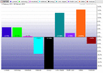
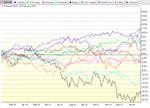
Back in the day, comparing groups was a giant pain in the ass. Nowadays there are websites that do at least the preliminary grunt work and free one to exercise his judgement in more productive ways.
Some time ago, "sectors" were created for the S&P. Nine of them. Rather than compile one's own, one could instead plot and track these sectors to determine continuing relative strength and weakness. This made stock selection vastly easier.
Stockcharts.com plots these sectors according to their performance over time spans that are under the control of the viewer, either in bar form or line form. Both are provided below, both covering one year.
Attachments
dbphoenix
Guest Author
- Messages
- 6,954
- Likes
- 1,266
In the "Comparing Strength and Weakness" docs posted two up, Wyckoff discusses shorting high-flyers that may be exhausting themselves and be ready to roll over as well as bottom-fishing among issues that may be basing and getting ready to emerge from the muck. He also goes into the accumulation/mark-up/distribution/mark-down cycle which we'll get into eventually, but, for now, let's look at how to use the information in these sector comparisons to locate stocks that may be "on the springboard".
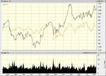
Consumer Staples is a leading sector, and if one looks at the major stocks in that sector (which can be found at just about any of the ETF sites), one will see that the healthiest of these is MO (the comparison between the stock and its sector is done at bigcharts.com):

One can also see, however, that it recently failed to make a higher high. Is this a sign of trouble? For that one would have to apply the lessons taught in the previous section covering W's year-long analysis of the NYT Average.
Consumer Staples is a leading sector, and if one looks at the major stocks in that sector (which can be found at just about any of the ETF sites), one will see that the healthiest of these is MO (the comparison between the stock and its sector is done at bigcharts.com):
One can also see, however, that it recently failed to make a higher high. Is this a sign of trouble? For that one would have to apply the lessons taught in the previous section covering W's year-long analysis of the NYT Average.
Attachments
dbphoenix
Guest Author
- Messages
- 6,954
- Likes
- 1,266
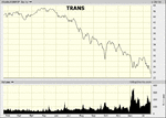
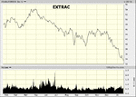
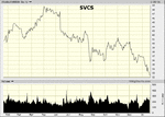
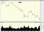
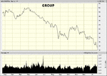
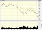
As for bottom-fishing, there's really no contest. Energy sucks and has sucked for quite some time. However, it can continue to suck for the foreseeable future. It has not even broken its stride, much less begun the accumulation process.
For these charts, we'll go to bigcharts.com as they break this stuff down so nicely.
First, the Fossil Fuels group, comprised of four sub-groups: Major Oil&Gas, O&G Products/Services, Oil Extraction, Pipeline Transportation.


For these charts, we'll go to bigcharts.com as they break this stuff down so nicely.
First, the Fossil Fuels group, comprised of four sub-groups: Major Oil&Gas, O&G Products/Services, Oil Extraction, Pipeline Transportation.
Attachments
dbphoenix
Guest Author
- Messages
- 6,954
- Likes
- 1,266
All of these subgroups suck, but, for the sake of example (this isn't meant to be exhaustive), let's look at the "leading" 🙄 stocks in Major O&G:


I hope it's clear that the stock that sucks least is XOM (these charts were done a couple of weeks ago for another thread, but XOM looks even better now than it did then; the others still suck). In fact, XOM looks already to be under accumulation. Whether it is or not, its resistance to further decline suggests that it will be your "indicator" stock, i.e., the stock that will tell you when the skies are beginning to clear, the stock that is most likely to lead the advance.
You do not, in other words, have to follow hundreds of stocks. You just have to be smart.
Attachments
dbphoenix
Guest Author
- Messages
- 6,954
- Likes
- 1,266
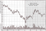
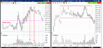
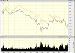
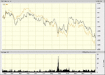
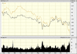
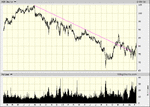
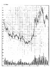
For the sake of tying things together so far, a closer examination of XOM, current as of today:
First, the stride. W has only touched on this. More will be said in "The Significance of Trend Lines". But clearly the stride has been broken. Not as dramatically as it would be with a "V" reversal, but broken nonetheless.

A closer look. The selling climax is more obvious here:

And an examination of volume. Note the heavy volume at the climax low, then the lighter volume on the test. When the downside is tested again, volume remains low. The higher volume results in a move upward. When volume is again heavyish three days later, the result is another move upward. In other words, it's not the volume per se so much as what happens to price as a result of the volume.

XOM could base for another month, or two, or three, or a couple of years. But this is one to watch.
First, the stride. W has only touched on this. More will be said in "The Significance of Trend Lines". But clearly the stride has been broken. Not as dramatically as it would be with a "V" reversal, but broken nonetheless.
A closer look. The selling climax is more obvious here:
And an examination of volume. Note the heavy volume at the climax low, then the lighter volume on the test. When the downside is tested again, volume remains low. The higher volume results in a move upward. When volume is again heavyish three days later, the result is another move upward. In other words, it's not the volume per se so much as what happens to price as a result of the volume.
XOM could base for another month, or two, or three, or a couple of years. But this is one to watch.
Attachments

dbphoenix
Guest Author
- Messages
- 6,954
- Likes
- 1,266
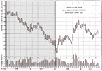
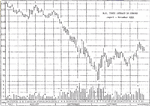
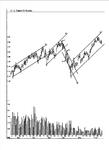
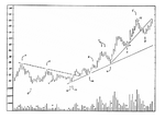
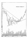
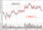
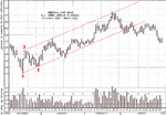
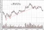
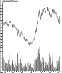
An Individual Chart Study
The following represents the first two months of a year-long analysis of the daily movements of what was then (1930-31) a major market average. The principles of demand and supply that applied then apply today. They haven't changed since the 30s. They haven't changed in principle since the days of the Samarrans, seven thousand years ago, much less Homma, the "father" of the candlestick, in the 18th century. Understand the Law of Supply and Demand and you will have overcome the most important hurdle faced by the trader/investor.
Db
With regard to the above post, #5, Wyckoff also conducted the same sort of analysis later in his course, only this time it was of a stock and it covered 18+ months. There is an extraordinary amount of detail in this section, well worth weeks of concentrated study. Old-fashioned? Maybe. But it's the sort of old-fashioned that will make you a master trader if you study it thoroughly and seriously.
Given the length and the detail, I've uploaded it as a pdf.
Db
Attachments
- Status
- Not open for further replies.
Similar threads
- Replies
- 3
- Views
- 4K
- Replies
- 0
- Views
- 7K