Many traders look to volume as a method for identifying the strength or weakness of a trend. It may also be used to gauge turning points at supply and demand. In looking at volume, most traders will place the volume histogram at the bottom of their chart to see it correlating with the candles and thus the trend.
There is another way to incorporate volume into your charts. You can combine volume with the candles themselves. Volume charts are created in the same way as normal candles. However, instead of being based on time, a new candle is created only when a certain number of shares are traded. Time is irrelevant. Until enough shares are created to complete the current candle, it will not close and a new one will not be formed.
This can be extremely useful in determining strength of trend. When there is an increase in volume to sustain the trend, there will be more candles created and they will appear larger to cover more price. When the volume and buying (uptrend) or selling (downtrend) pressure subsides there will be less candles created. Additionally, a cluster of candles can identify an area where many traders have an interest in the security and a possible strong supply or demand level.
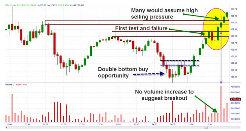
In the following intraday chart of the SPY ETF, a supply level was being tested late in the day after a double bottom buying opportunity. As a trader looking to maximize profits, I must analyze supply levels I have previously assessed as targets. Should I book profits or allow my winners to run? At the first supply there was a violation but then a pullback. In looking at the five minute candle, I would assume failure of the trend at that level and may have exited the trade only to see price advance later.

Fig 1 Spy 5 min chart
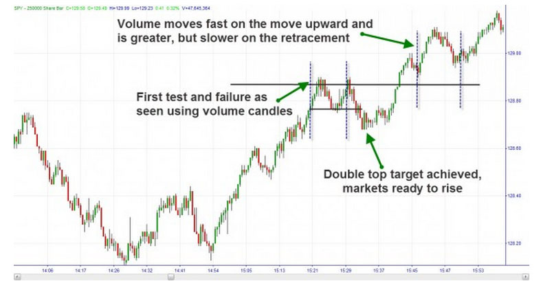
However, let’s examine a chart based on 250,000 share volume. This is a heavily traded security so I have chosen a high value for the volume candles. Each candle shows 250,000 shares traded. Note the same breakout as before. In the first move to the supply level, we spend several candles there. This shows there is equilibrium at the supply level between buyers and sellers. Without great selling pressure dominating, we are not likely to hold that level.

Fig 2 Spy 250000 volume chart
We see volume candles create a double top and move down to the target. After exhausting the remaining sellers at the double top price target, the closing of shorts helps the rise of price above the original supply level.
What is more interesting is the price action on the second breakout of the SPY five minute chart. Notice the high volume on the candle that breaks but fails to close above that supply (noted with a purple arrow). Most traders would associate that with high selling volume and a failure to break supply. However, if you were observing the volume charts, you would have seen that there was greater buying pressure as price moved further and faster with less effort to the upside (an impulse). And prices took more volume and effort to retrace less distance suggesting the buyers were still stronger than the sellers. This hinted at your ability to stay long and capture more profits.
We want to let our winners run and cut losers short. By observing true price action in an easy format such as volume candles, we may be able to accomplish just that.
Brandon Wendell can be contacted on this link Brandon Wendell
There is another way to incorporate volume into your charts. You can combine volume with the candles themselves. Volume charts are created in the same way as normal candles. However, instead of being based on time, a new candle is created only when a certain number of shares are traded. Time is irrelevant. Until enough shares are created to complete the current candle, it will not close and a new one will not be formed.
This can be extremely useful in determining strength of trend. When there is an increase in volume to sustain the trend, there will be more candles created and they will appear larger to cover more price. When the volume and buying (uptrend) or selling (downtrend) pressure subsides there will be less candles created. Additionally, a cluster of candles can identify an area where many traders have an interest in the security and a possible strong supply or demand level.
In the following intraday chart of the SPY ETF, a supply level was being tested late in the day after a double bottom buying opportunity. As a trader looking to maximize profits, I must analyze supply levels I have previously assessed as targets. Should I book profits or allow my winners to run? At the first supply there was a violation but then a pullback. In looking at the five minute candle, I would assume failure of the trend at that level and may have exited the trade only to see price advance later.

Fig 1 Spy 5 min chart
However, let’s examine a chart based on 250,000 share volume. This is a heavily traded security so I have chosen a high value for the volume candles. Each candle shows 250,000 shares traded. Note the same breakout as before. In the first move to the supply level, we spend several candles there. This shows there is equilibrium at the supply level between buyers and sellers. Without great selling pressure dominating, we are not likely to hold that level.

Fig 2 Spy 250000 volume chart
We see volume candles create a double top and move down to the target. After exhausting the remaining sellers at the double top price target, the closing of shorts helps the rise of price above the original supply level.
What is more interesting is the price action on the second breakout of the SPY five minute chart. Notice the high volume on the candle that breaks but fails to close above that supply (noted with a purple arrow). Most traders would associate that with high selling volume and a failure to break supply. However, if you were observing the volume charts, you would have seen that there was greater buying pressure as price moved further and faster with less effort to the upside (an impulse). And prices took more volume and effort to retrace less distance suggesting the buyers were still stronger than the sellers. This hinted at your ability to stay long and capture more profits.
We want to let our winners run and cut losers short. By observing true price action in an easy format such as volume candles, we may be able to accomplish just that.
Brandon Wendell can be contacted on this link Brandon Wendell
Last edited by a moderator:
