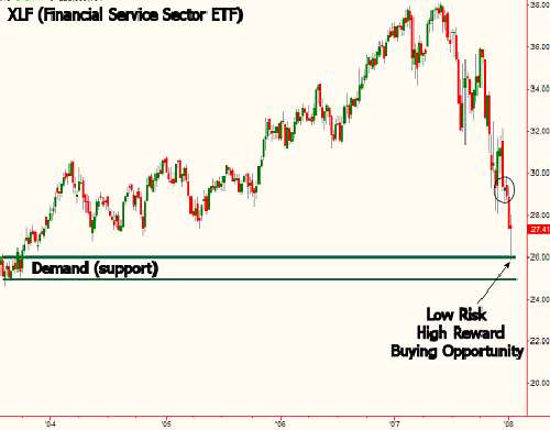
Recently I showed some students a chart of the XLF which is the ETF for the financial service sector. I showed a demand (support) level and suggested this would be a low risk area to buy the XLF for a bounce, not a long term trade. After receiving many questions on this trading opportunity from people who bought the XLF as planned and from those who didn't, I thought it would be a good idea to revisit the chart as the questions in the emails were all the same.
As you can see below, price in the XLF touched our level on 10th January 2008. For those who bought it then, the trade had a gain of $2.00 in the past two days, congrats. You can certainly move your stop to breakeven at this point and consider exiting some or all of the position at or near the circled area seen on the chart as that represents some supply (resistance). Keep in mind that while the gain is nice, the low risk entry taken to get that gain is the key point in this trade that needs to be understood. Obtaining gains in trading is one thing. Obtaining them with the lowest possible risk is another story.

Let's get back to the question?
The Question
How can this demand level that dates back to the year 2003 mean anything today? A couple of emails actually sounded annoyed that I would even have the nerve to do such a thing but I guess that is what makes a market. They went on to ask if the buy orders that made up the demand back in 2003 were the same orders that caused the demand on Wednesday.
Back To Basics
Before we get into specific answers, it is important to understand how markets work and why prices move. Price movement in any free market is a function of an ongoing supply and demand relationship within that market. Opportunity exists when this simple and straight forward relationship is out of balance. Put quite simply, a market is made up of three components: buyers, sellers, and a widget being bought or sold. These widgets may be shares of a stock, S&P futures, foreign currencies, bonds, and many more tangible and intangible "widgets". For example, let's say the widget is a stock like the XLF. This stock has some value. That value or "price" as we call it is determined simply by the supply and demand for the stock, which is the ongoing interaction of all the buyers and sellers taking action with regard to that particular stock.
A market is always in one of three states:

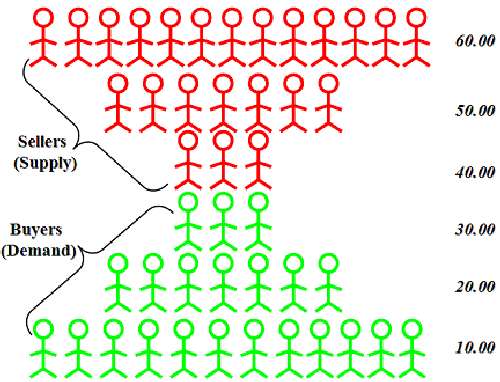
The picture above is how a chart would look if you removed time from the equation. You would see at each price level, how many willing and able buyers and sellers are present. We can certainly derive the same information when viewing time based charts. This is done by identifying supply and demand levels as I did with the XLF and others. Not every cluster of trading is a supply or demand level and not every high or low is a demand level. This is all based on an objective set of rules based on the laws of supply and demand.
The Answers
The fact that this demand level dates back to 2003 does not at all mean it is less relevant than a demand level from a week ago. Typically, supply (resistance) and demand (support) levels from a long time ago are going to produce much better trades than recently produced levels. The reason is that when price is revisiting a level from long ago, price will be far from equilibrium which means the level is ideally placed on the supply and demand curve (large profit margins).
As far as the same willing and able buyers from 2003 still having their orders in the market at that level in the XLF, I think not. As you can see above, these are certainly not the exact same buyers and sellers at levels from the recent and distant past, this is pure supply and demand at work. If you drop the price of most common appliances, you will invite more and more buyers at each price level as you drop price. Conversely, as you raise the price of that item, demand will decline, supply will increase.
As you can see below, price in the XLF touched our level on 10th January 2008. For those who bought it then, the trade had a gain of $2.00 in the past two days, congrats. You can certainly move your stop to breakeven at this point and consider exiting some or all of the position at or near the circled area seen on the chart as that represents some supply (resistance). Keep in mind that while the gain is nice, the low risk entry taken to get that gain is the key point in this trade that needs to be understood. Obtaining gains in trading is one thing. Obtaining them with the lowest possible risk is another story.

Let's get back to the question?
The Question
How can this demand level that dates back to the year 2003 mean anything today? A couple of emails actually sounded annoyed that I would even have the nerve to do such a thing but I guess that is what makes a market. They went on to ask if the buy orders that made up the demand back in 2003 were the same orders that caused the demand on Wednesday.
Back To Basics
Before we get into specific answers, it is important to understand how markets work and why prices move. Price movement in any free market is a function of an ongoing supply and demand relationship within that market. Opportunity exists when this simple and straight forward relationship is out of balance. Put quite simply, a market is made up of three components: buyers, sellers, and a widget being bought or sold. These widgets may be shares of a stock, S&P futures, foreign currencies, bonds, and many more tangible and intangible "widgets". For example, let's say the widget is a stock like the XLF. This stock has some value. That value or "price" as we call it is determined simply by the supply and demand for the stock, which is the ongoing interaction of all the buyers and sellers taking action with regard to that particular stock.
A market is always in one of three states:
- It can be in a state where demand exceeds supply which means there is competition to buy and that leads to higher prices.
- It can be in a state where supply exceeds demand which means there is competition to sell and this leads to declining prices.
- It can be in a state of equilibrium. At equilibrium, there is no competition to buy or sell because the market is at a price where everyone can buy or sell as much as they want. However, as the market moves away from equilibrium, competition increases which forces price back to equilibrium. In other words, competition eliminates itself by forcing market prices back to equilibrium. At equilibrium, there is little to no trading opportunity.

The picture above is how a chart would look if you removed time from the equation. You would see at each price level, how many willing and able buyers and sellers are present. We can certainly derive the same information when viewing time based charts. This is done by identifying supply and demand levels as I did with the XLF and others. Not every cluster of trading is a supply or demand level and not every high or low is a demand level. This is all based on an objective set of rules based on the laws of supply and demand.
The Answers
The fact that this demand level dates back to 2003 does not at all mean it is less relevant than a demand level from a week ago. Typically, supply (resistance) and demand (support) levels from a long time ago are going to produce much better trades than recently produced levels. The reason is that when price is revisiting a level from long ago, price will be far from equilibrium which means the level is ideally placed on the supply and demand curve (large profit margins).
As far as the same willing and able buyers from 2003 still having their orders in the market at that level in the XLF, I think not. As you can see above, these are certainly not the exact same buyers and sellers at levels from the recent and distant past, this is pure supply and demand at work. If you drop the price of most common appliances, you will invite more and more buyers at each price level as you drop price. Conversely, as you raise the price of that item, demand will decline, supply will increase.
Last edited by a moderator:
