Most novices follow the herd when building their first trading screens, grabbing a stack of canned indicators and stuffing as many as possible under the price bars of their favorite securities. This "more is better" approach short circuits signal production because it looks at the market from too many angles at once. It’s ironic because indicators work best when they simplify the analysis, cutting through the noise and providing usable output on - trend, momentum, and timing.
Instead, try taking a different approach and break down the types of information you want to follow during the market day, week, or month. In truth, nearly all technical indicators fit into five categories of research. Each category can be further subdivided into leading or lagging. Leading indicators attempt to predict where the price is headed while lagging indicators offer an historical report of background conditions that resulted in the current price being where it is.
- Trend indicators (lagging) analyze whether a market is moving up, down or sideways over time.
- Mean reversion indicators (lagging) measure how far a price swing will may stretch before a counter impulse triggers a retracement.
- Relative strength indicators (leading) measure oscillations in buying and selling pressure.
- Momentum indicators (leading) evaluate the speed of price change over time.
- Volume indicators (leading or lagging) tally up trades and quantify whether bulls or bears are in control.
So, how can a beginner choose the right setting at the start and avoid months of ineffective signal production? The best approach in most cases is to begin with the most popular numbers while adjusting one indicator at a time and seeing if the output helps or hurts your performance. Using this method, you’ll quickly grasp the specific needs of your level.
Now that you understand the five ways that indicators dissect market action, let’s identify the best ones in each category for novice traders.

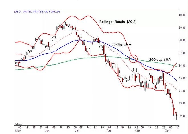
Fig 1 - 50 and 200 day - EMA Trend & Bollinger Bands (20 & 2) Reversion to Mean
Source: eSignal
We’ll start with two indicators that are embedded within the same panel as the daily, weekly or intraday price bars. Moving averages look back at price action over specific time periods, subdividing the total to create a running average that’s updated with each new bar. The 50- and 200-day exponential moving averages (EMAs) are more responsive versions of their better-known cousins, simple moving averages (SMAs). In a nutshell, the 50-day EMA is used to measure the average intermediate price of a security, while the 200-day EMA measures the average long term price.
US Oil Fund (USO)’s 50- and 200-day EMAs rose steadily into the summer of 2014, while the instrument pushed up to a 9-month high. The 50-day EMA turned lower in August, with the 200-day EMA following suit one month later. The shorter-term average then crossed over the longer-term average (indicated by the red circle), signifying a bearish change in trend that preceded a historic breakdown.
USO buying and selling impulses stretch into seemingly hidden levels that force counter waves or retracements to set into motion. Bollinger bands (20,2) try to identify these turning points by measuring how far price can travel from a central tendency pivot, the 20-day SMA in this case, before triggering a reversionary impulse move back to the mean. The bands also contract and expand in reaction to volatility fluctuations, showing observant traders when this hidden force is no longer an obstacle to rapid price movement.

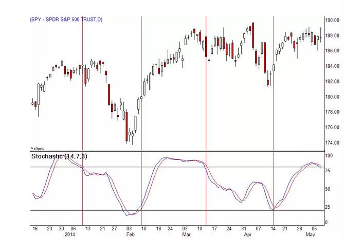
Fig 2 Stochastics (14,7 & 3) Relative Strength
Source: eSignal
Market movement evolves through buy-and-sell cycles that can be identified through stochastics (14,7,3) and other relative strength indicators. These cycles often reach a peak at overbought or oversold levels and then shift in the opposite direction, with the two indicator lines crossing over. Cycle alternations don’t automatically translate into higher or lower security prices as you might expect. Rather, bullish or bearish turns signify periods in which buyers or sellers are in control of the ticker tape. It still takes volume, momentum and other market forces to generate price change.
SPDR S&P Trust (SPY) oscillates through a series of buy-and-sell cycles over a 5-month period. Look for signals where:
- A crossover has occurred at or near an overbought or oversold level
- Indicator lines then thrust toward the center of the panel.
This two-tiered confirmation is necessary because stochastics can oscillate near extreme levels for long periods in strongly trending markets. Also, while 14,7,3 is a perfect setting for novice traders, consider experimenting to find the setting that best fits the instrument you are analyzing. For example, experienced traders often switch to faster 5,3,3 inputs.

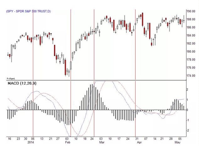
Fig 3 - MACD (12,26 & 9) – Demonstrating Momentum
Source: eSignal
Moving average convergence divergence (MACD) indicator, set at 12,26,9, gives novice traders a powerful tool to examine rapid price change. This classic momentum tool measures how fast a particular market is moving, whilst it attempts to pinpoint natural turning points. Buy or sell signals go off when the histogram reaches a peak and reverses course to pierce through the zero line. The height or depth of the histogram, as well as the speed of change, all interact to generate a variety of useful market data.
SPY shows four notable MACD signals over a 5-month period. The first signal flags waning momentum, while the second captures a directional thrust that unfolds right after the signal goes off. The third signal looks like a false reading but accurately predicts the end of the February - March buying impulse. The fourth triggers a whipsaw that’s evident when the histogram fails to penetrate the zero line.

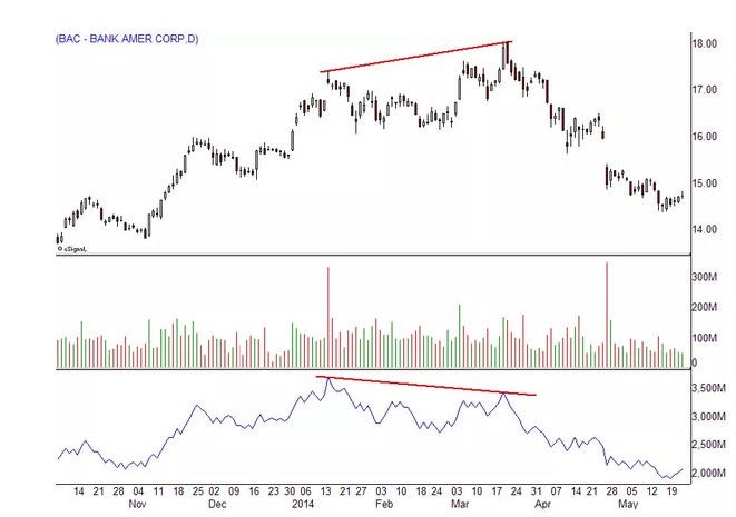
Fig 4 - On-Balance-Volume (OBV)
Source: eSignal
Keep volume histograms under your price bars to examine current levels of interest in a particular security or market. The slope of participation over time reveals new trends, often before price patterns complete breakouts or breakdowns. You can also place a 50-day average of volume across the indicator to see how the current session compares with historic activity.
Now add on-balance volume (OBV), an accumulation-distribution indicator, to complete your snapshot of transaction flow. The indicator adds up buying and selling activity, establishing whether bulls or bears are winning the battle for higher or lower prices. You can draw trendlines on OBV, as well as track the sequence of highs and lows. It works extremely well as a convergence-divergence tool, as Bank of America (BAC) proves between January and April when prices hit a higher high while OBV hit a lower high, signalling a bearish divergence preceding a steep decline.
In Summary
Choosing the right technical indicators is daunting but can be managed if novice traders focus the effects into five categories of market research: trend, mean reversion, relative strength, momentum, and volume. Once they’ve added effective indicators for each category, they can begin the long but satisfying process of tweaking inputs to match their trading styles and risk tolerance.
Adam Barone can be contacted on this link: Adam Barone
Last edited by a moderator:
