Long Term Dow Analysis
Hedge Funds Review - December
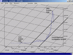
This yearly chart of the Dow Jones goes at least some way to proving that markets have been, and continue to be, defined by a uniform behavioural pattern that shapes their evolution. During my association with this methodology I have seen this pattern assert itself across every asset class, every stock, currency, bond, commodity. Neither is the pattern isolated in one timeframe; the pattern is fractal in nature so that in whatever timeframe you care to look, this same pattern of behaviour is still there, just the same.
To explain further, I believe that the upward sloping lines that define what I call a ‘Bull Channel,’ are the parameters for perfect harmonious, sustainable growth. Deviation to the channel above indicates the perpetuation of what is commonly known as a bubble. Deviation below indicates obvious weakness and that something has gone fundamentally wrong.
Using the example of the Dow Jones, the excessively strong move up has caused the natural equilibrium of markets to become destabilised. Generally, when a market, having broken out of the original Bull Channel, eventually reaches the next upward line of support, this is always enough to spell out, not only the end of the excessive gains, but also the start of a protracted correction to work out those excessive gains. In every instrument that has exhibited this type of behaviour, the outcome is always the same. We can confidently expect or predict a retracement to the lower upward sloping line of the original bull channel in all instances. I have never seen any instrument defy this rule.
My analysis of the Dow Jones therefore leads me to predict that it will have to retrace to the lower of the two market upward sloping lines, or 4150, were it to sink this year. This, although unlikely, is the risk in this market currently. If it does not happen this year, then it may be next, but to me it seems inevitable, the severity of the collapse will depend on how well it is managed. The exact level of support rises dynamically as each year passes and the upward sloping line of support remains unchallenged.
It is clear that the Dow, S&P 500 and Nasdaq are not cheap historically by any measurement and certainly not at levels from which new Bull markets tend to emerge. The Dow in the low 4000’s with a P/E in single digits for example, might prove an attractive entry point, long term. A break of that line of support would be catastrophic, but I am struggling to think of a scenario, other than nuclear war, God forbid, that would mean that we would have to hand back all the productivity and efficiency gains made over the last 70 years, although the increasingly obese trade deficit in the US does give grave cause for concern in the long run.
There is another interesting point to note from this particular chart by which I am referring to the link between the peak of the bubble of 1929 and the peak of the bubble of 2000. The position one places the Harmonic Grid over the chart is of course of paramount importance but it is relatively simple. In the case of this chart the Harmonic Point is the peak of the 1929 bubble. From that peak we can see clearly that the upward sloping line extends perfectly to the 2000 bubble peak. Is this coincidence? I seriously doubt it.
As I was reported to have said in last month’s issue (see page 7) we are in the midst of a technical bear market rally which should be persuasive enough to tempt plenty of retail money from the sidelines before peaking and then heading sharply lower.
The Nasdaq 100 has bottomed, at least in the medium term, using the monthly chart and looks to have the potential to treble from its recent lows. Clients are already holding on to near 40% gains since the October lows and I am carefully watching for the signal to bag those profits using the shorter-term charts and monitoring the VIX for a return of investor nervousness.
The Harmonic Grid method of analysis consistently and importantly, very visually, identifies very low risk, very high reward opportunities across all markets in any timeframe.
For those of you who are interested in my services, full details may be found at my web site
www.marketharmony.co.uk or by contacting me directly on 01780 410562.