M
You are using an out of date browser. It may not display this or other websites correctly.
You should upgrade or use an alternative browser.
You should upgrade or use an alternative browser.
Best Thread learning to read price action with p/f charts
- Thread starter Dentalfloss
- Start date
- Watchers 60
Dentalfloss
Legendary member
- Messages
- 63,404
- Likes
- 3,726

Dentalfloss
Legendary member
- Messages
- 63,404
- Likes
- 3,726
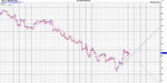
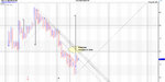
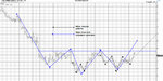
a daily line chart which also has the close plotted
the latest uptrend only started on july 26..so down to 30 or even 15 min to plot that
the res area is below 300
somewhere in 280-290 region
the latest uptrend only started on july 26..so down to 30 or even 15 min to plot that
the res area is below 300
somewhere in 280-290 region
Dentalfloss
Legendary member
- Messages
- 63,404
- Likes
- 3,726
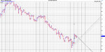
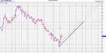
5 day/close
the res area is more apparent..imho
looks to be 280 ish..
a decent thrust column /it looks like from that lowest point and a very small p/b from that res area
i cannot get intraday data for uk stocks

the res area is more apparent..imho
looks to be 280 ish..
a decent thrust column /it looks like from that lowest point and a very small p/b from that res area
i cannot get intraday data for uk stocks
M
malaguti
Hey Dentist,
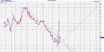
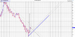
hourly, 2x3 close slightly better perhaps. Clear resistance from the bearish support line. Yes, no doubt the horizontal resistance is at 280ish, and looking back (you cant see on the image) there looks to be previous support in that area.
hourly, 2x3 close slightly better perhaps. Clear resistance from the bearish support line. Yes, no doubt the horizontal resistance is at 280ish, and looking back (you cant see on the image) there looks to be previous support in that area.
Attachments
Dentalfloss
Legendary member
- Messages
- 63,404
- Likes
- 3,726
great stuff..
so,now we have an idea where the big res area is
and we can plot that latest uptrend accurately with either 60 min or 30 min data
now,you need to do a little homework
1.plot the supports for that uptrend...where you would like to enter
remeber the s/r map we talked about...dont bother with pivots
the support is subjectiev trend lines and 45 degree lines etc
and we want to identify in advance potential breakout points..mind you if we see a good p/f pattern
even better
so then we have a good idea where supp and res lies
M
malaguti
Hi Dentist, here's very much the same charts with some comments on them
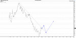
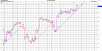
The detail in the hourly gives me two options, one says we are clear of the resistance line, whereas one box setting higher says we have a bit to go, and thats also reflected in the traditional line on close with trend line added...so in summary we are first looking at a break of the trend line, plus a close on the hourly higher that 280 as an entry. Again a traditional double top buy on 5x3 daily.
Now we have targets to look at..we have initial targets of 280 (nice that) which would confirm a good entry should we be more bullish, secondly targets of 300 which coincides with longer term resistance line off 5x3 on daily and then targets of 370
Traditional line charts would favour a break of trend, and then a retest of that trend line, again favouring a 300 mark resistance then back down. My hourly close gives me clear new trend support which is the same on both box settings.
I'm tempted to enter on the 280 break, watch the price action, and then enter again on another break of 300 if we then get that down move which is quite likely after a change of trend
Attachments
Hi Dentist, I went over your entire thread over the last weekend, and discovered, that the Wyckoff method with appropriate box settings works very well for intraday trades rather than the usual 3 box settings that are recommended as a standard in most readings. Must thank you for presenting your trading ideas in such a clear manner. The Wyckoff method becomes very useful, when you project the larger trend trendlines on the charts and look at smaller time frames and for identifying the supports and resistances.
Here are some useful observations from my own use of PnF in the Indian stock markets:
1. While you have also mentioned that Jeremy Du Plessis recommends the use of Closing data a one point vs High Low bar data, you did not mention why this is needed. The answer is simple. Close data gives signals with levels which exclude the high low information, and therefore, the stop losses can get blown out if one is not careful. One answer to this is to use closing data for signal generation and high low to put the stop losses. I tried both separately and then as above and have finally reverted to just High Low data with the choice of appropriate box size and data bar size to keep things simple (1 min,2 min etc...). A high low chart with same input bars as close data appears more noisy, but the moment you adjust the minutes width for the bar, the charts become manageable and easy to read.
2. New highs and lows should always be looked at with nearest resistances/supports and recent highs and lows, as the reversals, if there is a change in trend can be identified quickly.
3. Trend lines that connect and touch only 2 points on the charts are as good as random lines drawn on the charts. If the lines graze or kiss at least three points on the charts, they are very useful in identifying trend reversals, by using a double top double confirmation.
4. For each instrument that you trade, there is an average retracement distance that can be observed from historical data. For an index which has a current value around 5000, which is the case of the Indian Nifty Futures, for example, 25 is a good reversal retracement level. If you are in a long trending trade, you will discover, that retracements of less than 25 points (you can try proportionate levels for other indices), are not significant and reversal signals from the main trend can be ignored. Likewise, traders can explore when the daily range of the instrument is in a ranging zone, that trades can be avoided by selecting a minimum distance threshold from a high or low for a long and short respectively. This avoids trades which otherwise get blown out because traders traded close to supports and resistances.
Hope this helps readers here.
My sample trades are shown below :
Last edited:
M
malaguti
See Dentist, I'm not the only member of your fan club..on a serious note though, I agree on the 1 box, however I probably dont trade it in the traditional sense, preferring 2 for the counts, which aren't automatic on 1 box reversals. But this is my favourite chart, a 5 minute 1x1 close (again, if I can find a good close setting, high low just muddies things for me)
This chart, where i have only loaded the data for the past few trades, has actually produced 9 consecutive winning trades, simply looking at the prevailing 45 bullish/bearish support line..9 consecutive winning trades and over 250 S&P points.
trading has never been easier for me..since listening to the Dentist here, and following P&F
Attachments
See Dentist, I'm not the only member of your fan club..on a serious note though, I agree on the 1 box, however I probably dont trade it in the traditional sense, preferring 2 for the counts, which aren't automatic on 1 box reversals. But this is my favourite chart, a 5 minute 1x1 close (again, if I can find a good close setting, high low just muddies things for me)
This chart, where i have only loaded the data for the past few trades, has actually produced 9 consecutive winning trades, simply looking at the prevailing 45 bullish/bearish support line..9 consecutive winning trades and over 250 S&P points.
trading has never been easier for me..since listening to the Dentist here, and following P&F
The trick is to do what Dentist is doing. You can control the data used by the Point and Figure charting software. I use Amibroker as my main charting platform and have written a script which just outputs text files of the last one weeks data every 30 seconds for my intraday trading purposes. Through Amibroker, which receives tick by tick data through an online feed, I modify the output as 1 min/2 min/5 minutes or any minute bars. This data is then read by Bulls Eye Broker - it detects a new file update by a change in the time stamp in the file header. So voila, I have BEB4, which doesnt have online data capability, providing near realtime PnF charts which can be "tuned" to the right data sizes. The impact of changing the minutes width is immediate smoothening of the PnF charts. Couple that with box sizes, and you have a winner.
M
malaguti
The trick is to do what Dentist is doing. You can control the data used by the Point and Figure charting software. I use Amibroker as my main charting platform and have written a script which just outputs text files of the last one weeks data every 30 seconds for my intraday trading purposes. Through Amibroker, which receives tick by tick data through an online feed, I modify the output as 1 min/2 min/5 minutes or any minute bars. This data is then read by Bulls Eye Broker - it detects a new file update by a change in the time stamp in the file header. So voila, I have BEB4, which doesnt have online data capability, providing near realtime PnF charts which can be "tuned" to the right data sizes. The impact of changing the minutes width is immediate smoothening of the PnF charts. Couple that with box sizes, and you have a winner.
Or of course you could do what I do..use updata, with intraday tick by tick, no downoading uploading all the counts are automatic and trendlies are automatic.
Visual inspection is the key, no "tuning" necessary..learnt that from the Dentist. I switch on my PC and as you say voila. Best P&F charting software there is.
Hey look. I think were on the same page anyway
Dentalfloss
Legendary member
- Messages
- 63,404
- Likes
- 3,726
Hi Malaguti
mine"s a pint of Stella Artois
mine"s a pint of Stella Artois
M
malaguti
Hi Malaguti
mine"s a pint of Stella Artois
😆
Done, we can get down to the slug and next time we really don't talk about box sizes!!
Or of course you could do what I do..use updata, with intraday tick by tick, no downoading uploading all the counts are automatic and trendlies are automatic.
Visual inspection is the key, no "tuning" necessary..learnt that from the Dentist. I switch on my PC and as you say voila. Best P&F charting software there is.
Hey look. I think were on the same page anyway
Sure we are..(on the same page). Those are standard features of BEB4 too.. I highlighted for the sake of understanding.
On trendlines, would urge you to look at non 45 degree trendlines that touch at least three points on the charts. These are extremely effective for helping discover trend reversals.
And I really appreciate Dentists idea of drawing these lines on zoomed out views of the charts, before diving in back to the chart detail of interest. Price is generally seen to be bouncing of larger time frame trend lines and you can take advantage of that in smaller time frames. (time frame being more a place holder for the chart detail that you use - box size/bar width).
There is a problem in using pure tick data - as that tends to introduce noise, irrespective of box size and reversal boxes that you use. I also initially thought that this was not possible to control. While BEB4 can read data directly from my charting platform Amibroker, the tick level data does create the issue that I just mentioned.
So instead of using a direct data link to Amibroker, I started exporting data from Amibroker, first, manually, and then automated the process. By chosing 1min/2min/5 minute data bar intervals and varying the box size/reversals, there is a big change in the views of the PnF charts. Stick to high low parameters for viewing the charts. For intraday Wyckoff with 2 minutes bar sizes works good for me with scrip specific box sizes. (2 for an index of 5000 value, for example).
This process simplifies the "visual inspection" needed to effectively use PnF.
Comments, Dentist?


M
malaguti
Sure we are..(on the same page). Those are standard features of BEB4 too.. I highlighted for the sake of understanding.
I know, I've used BEB, but updata does everything for me..its automated. computers eh?
On trendlines, would urge you to look at non 45 degree trendlines that touch at least three points on the charts. These are extremely effective for helping discover trend reversals.
Its covered in pages 176 to 199 in duplessis book..your examples are great, but I understand duplessis also
And I really appreciate Dentists idea of drawing these lines on zoomed out views of the charts, before diving in back to the chart detail of interest. Price is generally seen to be bouncing of larger time frame trend lines and you can take advantage of that in smaller time frames. (time frame being more a place holder for the chart detail that you use - box size/bar width).
I use different charts for different timeframes in all honesty, and I'm not a fan of subjective trend lines by their very nature they are subjective. some of your charts below actually highlight my argument..anything shallower than 45 is in my opinion not a good indicator of the trend..ala Gann and the two main trend lines are the 1x1 (which is 45degrees) and the 2x1. But this is a debateable issue. what works for you, may not work for others. Take another look at your 123 trend line touches..they dont actually touch..just one does at 1 and another which you havent marked at the end. If you were to draw those correctly the price at 3 may actually go through the trend line..does that mean its ended, are you going long..which high..which low are you going to use...they are subjective as not even in your own analysis can you decide, hence I prefer to stick to 45s wherever I can
There is a problem in using pure tick data - as that tends to introduce noise, irrespective of box size and reversal boxes that you use. I also initially thought that this was not possible to control. While BEB4 can read data directly from my charting platform Amibroker, the tick level data does create the issue that I just mentioned.
Look at my charts again Abnash, you will see I condense tick into 5minute, hourly etc and the point is covered on page 104 of duplessis
So instead of using a direct data link to Amibroker, I started exporting data from Amibroker, first, manually, and then automated the process. By chosing 1min/2min/5 minute data bar intervals and varying the box size/reversals, there is a big change in the views of the PnF charts. Stick to high low parameters for viewing the charts (here I disagree, I will use high low but I will ALWAYS refer back to the close chart as that is my gaspel) pages 92-93. For intraday Wyckoff with 2 minutes bar sizes works good for me with scrip specific box sizes. (2 for an index of 5000 value, for example).
I use updata, so does duplessis..i think ive said enough now on this
This process simplifies the "visual inspection" needed to effectively use PnF.
Disagree, so does duplessis..I would urge you to read his book. I'll quote
"Only YOU can decide the data series and box and reversal sizes as it is dependent on what YOU wish to extract from the chart
Again, I learnt this one on one with the great man who started this thread
Comments, Dentist?
Now, I know this appears somewhat rude, but its not meant to be...
What this thread needs is more input and debate from others so I welcome your comments, as im sure Dentist does, but more charts rather than preaching..more real life examples, of how YOU analyse a chart is more welcome to me than somebody who just tells others what they can read for themselves.
Your following charts are great, thanks for those...this will no doubt keep this thread alive and encourage the debates that rage on even amongst P&F analysts.
If you can post a chart of something that is happening now, which may alert others to their potential might be a great idea..this is what Dentist is doing every day and is what I am trying to do in my own way whenever I can
Thanks though Abnash for your comments
Last edited by a moderator:
M
malaguti
Dentalfloss
Legendary member
- Messages
- 63,404
- Likes
- 3,726
hi malaguti & abnash
finally,this thread comes alive...great stuff
comments/thoughts
1.abnash
the charts you posted are too noisy..imho
they are not too clear cut
my own opinion is that you move around box sizes and reversals to analyse the trend
what i usually do is just look at the line chart first.define the trends from that i want to analyse
so for intraday fx i will look at the last 2-3 trends on the line chart.when they started and what levels
i will then go down to 60 min/30 and 15 min to pick up any minor trends..note these down as above
the line chart is close...no candles
we can then look at these trends in p/f format
with p/f...trendlines are constant price change per reversal/whereas on candles...trendlines are constant price change per unit of time..there is a big difference
hence trendlines are placed on the chart first
by moving around box sizes and reversals,we can pinpoint support and res for that particular time input
we can then divide the chart into bullish and bearish sections using the trendlines
on the charts i post i usually only display one or two trends...dont need any more
candlestick traders are too busy calling out levels and divergences..we have the advantage,that we can define trend arithmetically
so trendlines are 45 degree.or drawn on the right hand side of semi catapults/one box..subjective...min 2 touches
2.malaguti
dont be too specific with box sizes..they can change from week to week..
so 1.00 by 1 reversal/close could be 1.2 by 1 reversal hilo next week or next month
subjective trendlines..you must put in...45 degree lines can be clumsy in a fast market
does that all make sense ??
Last edited:
Dentalfloss
Legendary member
- Messages
- 63,404
- Likes
- 3,726
abnash
forgot to mention
3 point touch trendline....
better to use a bullish support line in an uptrend and a bearish resistance line in a downtrend,either 45 degree or subjective
then putting on internal trendlines nearer the price action
you can then see s/r more clearly
p/f charting is a method of analysing data...no more
M
malaguti
2.malaguti
dont be too specific with box sizes..they can change from week to week..
so 1.00 by 1 reversal/close could be 1.2 by 1 reversal hilo next week or next month
I'm learning buddy
subjective trendlines..you must put in...45 degree lines can be clumsy in a fast market..point taken, but still too subjective imo
Similar threads
- Replies
- 34
- Views
- 11K