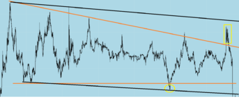
@1nvest Thanks for your proposal. Ok for the support line, but your resistance seems more doubtful in that four highs don't actually reach it. That's what makes me hesitate as for this price chart representing a simple channel.
Price isn't supposed to reach it, its there as a guide. If there is a high, you draw a line connecting the highs, until your line is taken out.
To explain my logic a bit more, I try to capture the chart pattern during its formation (and not afterwards as you did)
How dare you..my lines are drawn in real time, unlike yours!! what you don't see are the lines drawn before, because they are largely irrelevant as time moves on. the only significant one, is mine that i've drawn. take a look at how the lines "fan out" as more price action takes place. which is not a line of best fit, such as yours, which bears no resemblance whatsoever to the highs taking place beforehand.
for a simple reason: once you wait for the channel to be completely known and broken by the price, you can't take advantage of it anymore, it's just too late. That's why I try to draw the lines after only 2 or 3 touches so that I can anticipate the next price moves and take position when a bounce or a break occur. Do you really think it's so subjective that it can't be anticipated?
yes it is very subjective. as far as im concerned really there are only two lines you should be thinking of. the high, and the low. because everything in between is merely noise. your "line of best fit" was hit 3 times to up and downside. not a very good indication was it? that was the whole point of this thread
there was only one direction price action was going, it was down which was emphasised by the lower low right at the beginning, and a further push to the downside later on. The horizontal high right at the beginning was not broken, that tells you something, and throughout price is merely pushing more and more to the downside, but then retracing back into the channel. Call it what you will.
your trend lines that you draw is only an indication of the direction of price. looking for breaks of that trend line is not a good idea. price should break below or above, form another (higher) low to the upside or (lower) high to the downside. price should confirm your direction, not the trend line
as for McQuants opinion. I dont necessarily follow. You are looking for an edge, just like everyone else, you are choosing chart patterns. good luck to you.. its not one i use to be honest.
if you are into chart patterns, there is a site
Provides free access to stock market chart patterns, Elliott waves, busted chart patterns, event patterns, and so on, written by internationally known author and trader Thomas Bulkowski.
thepatternsite.com
run by a guy names bullkowski. worth a look