Best Thread FXCM Discussion

Range bar -non time based charts

Hi Jason,
Sorry to butt in - but I'm with OLdNoob on this issue 100%. Restricting non time based charts such as Renko, Point & Figure and 3 Line Break to a data feed based on units of time makes no sense at all. Sure, it's fine for panning out and taking a macro view - or if you're a swing or position trader. But, for intraday traders, the ability to specify Renko, PnF or 3 Line Break charts with (X) ticks of data is an absolute must. If that can be achieved, I'll look at FXCM in a whole new light. As things stand, I'm sorry to say that IG have a large edge regarding this particular issue. On everyone!
;)
Tim.

Maybe add some Range bars -also NON time based-such as this company has

https://ovo.cz/products/offline-charts-for-mt4/omnia-charts-collection/
But maybe more basic?
 
Hi again, Jason, another feature I'd like to see is to enable a ' hide individual indicator windows ' option.

So if I have 3 indicators opened below in separate windows, I want to be able to select individually which ones to hide, that way , I can toggle them off and on as needed, and this will open up chart display area to allow greater focus on price action. I know there's an arrow to ' hide all indicators ' already, but can your developer team set it to enable hiding of individual indicator windows ?

Thanks for consideration.
 
Hi Jason, has or can FXCM offer clients access to Forex real time squawk services ? :) Including order flow levels would be nice.

Has it been discussed at management levels before ?

Maybe add some Range bars -also NON time based-such as this company has

https://ovo.cz/products/offline-charts-for-mt4/omnia-charts-collection/
But maybe more basic?

Hi again, Jason, another feature I'd like to see is to enable a ' hide individual indicator windows ' option.

So if I have 3 indicators opened below in separate windows, I want to be able to select individually which ones to hide, that way , I can toggle them off and on as needed, and this will open up chart display area to allow greater focus on price action. I know there's an arrow to ' hide all indicators ' already, but can your developer team set it to enable hiding of individual indicator windows ?

Thanks for consideration.

Thanks you both! It's feedback from traders like you that helps us to keep improving our platforms. I've shared your suggestions with our developers and will let you know if these features become available.

In the meantime, you might be interested to know there has been a recent update to Trading Station Desktop.

This update is not yet automatic when you log into your account, but if you want to use the latest features now, you can get the new version today. Simply go to "Help > Software Updates" from the menu bar at the top of your Trading Station and follow the steps to complete the installation.

One of my favorite new features is the Simulation Mode. This allows you to replay market data at real or accelerated speed (for example, 10 times real speed).

WPjgceE.png

The best part is that Simulation Mode is available 24/7 even during weekend maintenance. This is great for traders who like to do their charting, practicing and strategizing over the weekend when trading is closed. Now you can test how well you would have traded key market moves from the past.

I will make more posts over the next week to highlight some of the other new features added to the latest version of Trading Station Desktop.

Let me know what you think!
 
Last edited:
How about allowing more than 20 instruments to be added to the list ? It's a real pain especially on mobile phone to be swapping instruments on the list, especially when some of them can't be removed to make more room because they have orders against them?!?
 
How about allowing more than 20 instruments to be added to the list ? It's a real pain especially on mobile phone to be swapping instruments on the list, especially when some of them can't be removed to make more room because they have orders against them?!?

While the 20-symbol limit is the default setting, you can email our Operations department at admin AT fxcm DOT com and request that this limit be removed from your live account. Please reference your FXCM account number in your email.

Then you can display more than 20 symbols on Trading Station (desktop, web and mobile) at once. You will still be limited to viewing no more than 40 symbols at once on MT4 (desktop and mobile).
 
I will make more posts over the next week to highlight some of the other new features added to the latest version of Trading Station Desktop.

With the recent Trading Station Desktop update, you can now draw arrows on your Marketscope charts.
(To update your platform to the latest version, go to "Help > Software Updates" from the menu bar.)

To create an arrow:

  1. Right-click on your chart.
  2. Select Add Tool from the pop-up menu.
  3. Select Arrow Up, Down, Left or Right.
  4. Customize your arrow color and other setings in the Properties window and click OK.

p3p6TXl.png

  • You can change the shape of an arrow by first left-clicking on it to select it, and then left-clicking and dragging on one of the 4 points that appears in the outline.
  • You can modify or delete an arrow by right-clicking on it and selecting Change or Remove from the pop-up menu.

Please let me know if you have any questions or comments on the new features added to Trading Station Desktop.

Our service includes products that are traded on margin and carry a risk of losses in excess of your deposited funds. The products may not be suitable for all investors. Please ensure that you fully understand the risks involved.
 
I will be out of the office until Monday, September 5th and will respond to your posts and private messages when I return.

For immediate assistance, you can contact our 24-hour live customer support.

To my fellow traders in the US celebrating Labor Day, I hope you enjoy the holiday weekend! :cool:
 
2 charts with 50 day MA but different trendlines

Hi, here are 2 charts, 1 min and 5 mins, with a 50 day MA.

Why does the 50 day MA look different on both charts?

I'm guessing the software is only showing 50 day MA based on the 1 min and 5 min time frames, which is confusing as I assumed a 50 day MA would be based on an avg of closes over 50 days?

screen shot on pc

Hi, are you sure these are 50-day moving averages?

While TradingView is a third-party charting service, I think what they are showing you with these charts are two different 50-period moving averages. It looks as if the 1-minute chart is showing a 50-minute moving average, while the 5-minute chart is showing a moving average where each point on the line is an average of the previous 50 candles each of which is a 5-minute bar.
 
Last edited:
Hi, here are 2 charts, 1 min and 5 mins, with a 50 day MA.

Why does the 50 day MA look different on both charts?

I'm guessing the software is only showing 50 day MA based on the 1 min and 5 min time frames, which is confusing as I assumed a 50 day MA would be based on an avg of closes over 50 days?

screen shot on pc


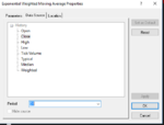
If you want to see a do DAY moving average on a shorter timeframe chart you need to change the data source when applying the indicator from default period (the timeframe of the chart candles) to daily.

Click on the data source tab and at the bottom change the data source from default ( it will show the ma of the last 50 candles) to d1
 

Attachments

  • indicator data source.PNG
    indicator data source.PNG
    9.2 KB · Views: 292
I've attached a 5 min and daily chart if you look in the top left corner of both charts you will see that the ma value is the same.
 

Attachments

  • chart ma.PNG
    chart ma.PNG
    119.6 KB · Views: 688
If you want to see a do DAY moving average on a shorter timeframe chart you need to change the data source when applying the indicator from default period (the timeframe of the chart candles) to daily.

Click on the data source tab and at the bottom change the data source from default ( it will show the ma of the last 50 candles) to d1

I've attached a 5 min and daily chart if you look in the top left corner of both charts you will see that the ma value is the same.

Thanks for sharing this information, OLdNoob :smart:
 
Can US based traders use the Myfxbook auto trade service on their FXCM accounts?

Hi Blackshield,

Unfortunately, this auto trade service is only available to non-US residents. :(

As a US trader, you can run automated strategies/EAs using our Trading Station, NinjaTrader and MT4 platforms.
 
Jason,

I'm having trouble running larger moving average indicators on the mobile app (100 period and above) who would I need to speak to for a fix?
 
Please check the data/chart for NZDUSD monthly. The high in September was .7486 and the monthly candle should be an inverted hammer. The correct data is present on daily, weekly, hourly, etc charts but the monthly is wrong. Instead, the monthly chart shows a small doji with a high of .7330.

Earlier this month the data and candle were correct and then it changed. Why? It is now showing incorrect market data and I wonder now if any of the FXCM charts are accurate.

Thanks.
 
Jason,

I'm having trouble running larger moving average indicators on the mobile app (100 period and above) who would I need to speak to for a fix?

Hi OLdNoob,

My first thought is that you should check whether your chart is zoomed out enough to display the moving average line, because if the moving average line is too far above or below the current chart price, then the line will not appear on your chart display.

My second thought is that you should try scrolling to the left to allow enough historical price data to load in order for the 100+ period moving average line to perform calculations. Below is a screenshot of the daily USD/JPY chart showing a 200-day moving average line on my Trading Station Mobile app.

If those checks don't resolve the issue for you, then please contact our live customer support team which is available to help you 24 hours a day.
 

Attachments

  • Screenshot_2016-10-10-16-12-06.png
    Screenshot_2016-10-10-16-12-06.png
    99.7 KB · Views: 195
Please check the data/chart for NZDUSD monthly. The high in September was .7486 and the monthly candle should be an inverted hammer. The correct data is present on daily, weekly, hourly, etc charts but the monthly is wrong. Instead, the monthly chart shows a small doji with a high of .7330.

Earlier this month the data and candle were correct and then it changed. Why? It is now showing incorrect market data and I wonder now if any of the FXCM charts are accurate.

Thanks.

Hi WD,

Which charting program are you using? Below is a screenshot of a monthly NZD/USD chart on my Trading Station Desktop platform, and it shows a high of 0.74860 for the ask price in September.
 

Attachments

  • nzd usd september high.png
    nzd usd september high.png
    86.7 KB · Views: 200
Hi WD,

Which charting program are you using? Below is a screenshot of a monthly NZD/USD chart on my Trading Station Desktop platform, and it shows a high of 0.74860 for the ask price in September.

Oddly enough, it is correct today. I use Trading Station Desktop as well. Last week it was incorrect all week and I turned my system off each day. I expected it to correct upon re-starting. But today(Monday) I fired up the platform and checked it - it's correct now. My assumption is that it may have been caught/corrected during weekend maintenance.

All's well. Thanks.
 
Top