I was asked to look at this company for a friend considering taking a position and thought the work I did may benefit others how as one way to tackle this issue. I am not suggesting my view or approach is the only or best way to consider trading but it may offer up ideas to others.
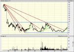
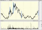
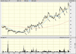
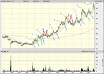
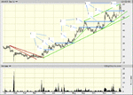
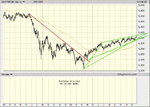
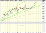
The company is Northgate Information Solutions: NIS and has been in a nice trend.
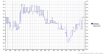
Start with the long term trend, to do this I needed to go back 10 years when this company came to market so this is a weekly chart. I have drawn in the major downtrend lines showing the 'fan principle' as the rate of the trend begins to slow. I have also included major support and resistence. We can see that at present the price is just into the upper half what appears to be a 9 year range.
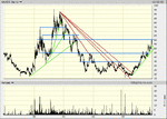
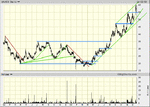
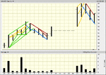
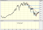
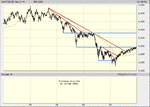
charts to follow
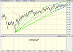
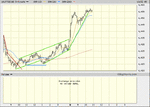
The company is Northgate Information Solutions: NIS and has been in a nice trend.
Start with the long term trend, to do this I needed to go back 10 years when this company came to market so this is a weekly chart. I have drawn in the major downtrend lines showing the 'fan principle' as the rate of the trend begins to slow. I have also included major support and resistence. We can see that at present the price is just into the upper half what appears to be a 9 year range.
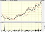
charts to follow