Jopo-80
Newbie
- Messages
- 3
- Likes
- 0
Hello!
I´m myself totally new to trading and hence I wanted to start a tutorial thread for all newbies wanting to learn the trade. Hopefully we will get lots of pros here answering questions etc. I don´t know much yet about trading but incidentally I´m a teacher student so I know something about educational materials, theres my contribution to this thread, I hope I can ask the right questions and some pro will then answer them. 👍
This tutorial is meant for those who do not yet fully know how to read charts and fully analyze them. Anyone is free to ask questions about charts in this thread and hopefully the pros will answer them.
To the charts...
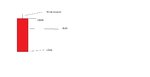
Most likely anyone can read a basic line chart. The line goes up or down, thats easy, but the "candlestick" charts can be more tricky and they will be the first one to be dealt with. Attached is a picture of a candlestick chart. The pictured chart is in 5 minute sections, that is every bar represents a 5 minute time period. As far as I know the blue bars represent a rise in asset price and the red bars represent a fall, correct me if I´m wrong or if something is missing. Note that every bar begins at the end level of the last bar.
Here´s where I put forth the first question:
Q1: What do the thin black lines protruding up and down from every bar mean?
Everyone please number your questions and answers accordingly. Q1 is answered by A1 and so forth, just to keep it clear. Also, please add pictures to your questions and answers if at all you have them, pictures make it so much more clearer. "Remember, a picture is worth a 1000 words."
Hopefully we will get a good and informative thread on chart reading.
-Cheers from Finland! 👍
I´m myself totally new to trading and hence I wanted to start a tutorial thread for all newbies wanting to learn the trade. Hopefully we will get lots of pros here answering questions etc. I don´t know much yet about trading but incidentally I´m a teacher student so I know something about educational materials, theres my contribution to this thread, I hope I can ask the right questions and some pro will then answer them. 👍
This tutorial is meant for those who do not yet fully know how to read charts and fully analyze them. Anyone is free to ask questions about charts in this thread and hopefully the pros will answer them.
To the charts...
Most likely anyone can read a basic line chart. The line goes up or down, thats easy, but the "candlestick" charts can be more tricky and they will be the first one to be dealt with. Attached is a picture of a candlestick chart.
Here´s where I put forth the first question:
Q1: What do the thin black lines protruding up and down from every bar mean?
Everyone please number your questions and answers accordingly. Q1 is answered by A1 and so forth, just to keep it clear. Also, please add pictures to your questions and answers if at all you have them, pictures make it so much more clearer. "Remember, a picture is worth a 1000 words."
Hopefully we will get a good and informative thread on chart reading.
-Cheers from Finland! 👍
Last edited: