Noise removal is one of the most important aspects of active trading. By employing noise-removal techniques, traders can avoid false signals and get a clearer picture of an overall trend. Here we take a look at different techniques for removing market noise and show you how they can be implemented to help you profit.
What Is Market Noise?
Market noise is simply all of the price data that distorts the picture of the underlying trend. This includes mostly small corrections and intraday volatility. To fully understand this concept, let's take a look at two charts - one with noise and one with noise removed:
Before noise is removed:
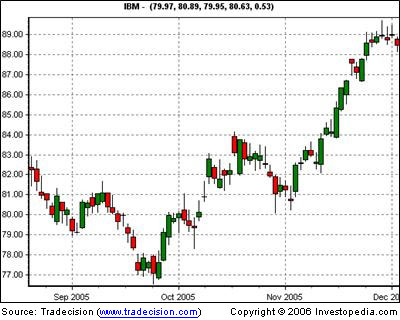
Fig1
After noise is removed:
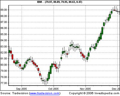
Fig2
Notice that in Figure 2, there are no longer any areas in which the trend is not easily seen, whereas in Figure 1, it is often difficult to identify whether the trend is changing on some days. The technique used in this chart is averaging - that is, where the current candle factors in the average of prior candles in order to create a smoother trend. This is the aim of noise reduction: to clarify trend direction and strength.
Let's take a look at how we can determine these two factors and combine them to create reliable charts that are easier to read.
Isolating Trend Direction
Isolating trend direction is best done through the use of specialized charts designed to eliminate minor corrections and deviations and only show larger trends. Some of the charts (such as Figure 2 above) simply average prices to create a smoother chart, while others completely recreate the chart by taking only trend-affecting moves into consideration.
Renko Charts
One example of a chart type that only uses trend-affecting moves is the Renko chart, named after the Japanese term "renga", meaning "brick". Renko charts isolate trends by taking price into account but ignoring time.
They are created by using a simple three-step process:
Let's take a look at an example:
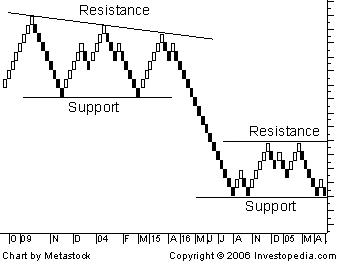
Fig 3
As you can see, it is much easier to identify trends on these charts than on traditional candlestick charts. Further noise reduction can be obtained by increasing the size of the bricks; however, this will also increase the intra-trend volatility - make sure that you have enough capital to withstand this volatility. Overall, Renko charts provide an excellent way to isolate trends, but they are limited by the fact that they don't provide a way to determine trend strength other than simply looking at the trend length, which can be misleading. We'll take a look at how to determine trend strength later in the article.
Heikin-Ashi Charts
A second type of chart that can be used for noise reduction is the Heikin-Ashi chart. These charts use a strategy similar to the charts seen in Figs. 1 and 2: they factor in the current bar with an average of past bars in order to create a smoother trend. This process creates much smoother price patterns that are much easier to read.
These are the charts most commonly used when reducing market noise; they can easily be used with other indicators because they don't factor out time. Another added benefit is that they also smooth out the indicator because the price bars are used as indicator inputs. This can help make indicators far easier to read.
Kagi Charts
Kagi charts are designed to show supply and demand through the use of thin and thick lines. New lines are created whenever a new high or low is established. By isolating highs and lows, it becomes much easier to see the larger trends.
Let's look at an example:
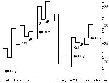
Fig 4
Trending times are then defined as times when demand exceeds supply (uptrend) or supply exceeds demand (downtrend). Finding trends becomes as easy as looking for thick or thin lines.
These charts are also excellent for noise reduction, but they are limited because they can't determine trend strength other than by measuring the move lengths, which can be misleading.
Determining Trend Strength
Trend strength is best gauged through the use of indicators. For the purposes of this article, we will take the most popular indicator - directional movement index (DMI) - and its derivative, the average directional movement index (ADX).
The DMI indicator is the most widely used trend strength indicator. This indicator is divided into two parts: +DI and -DI. These two indicators are then plotted to determine overall trend strength.
The ADX indicator is simply the averaging of the two DMI (directional movement index) indicators (+/-) to create a single line that can be used to instantly determine whether a price is trending or dormant.
Let's see an example of how this can be useful:
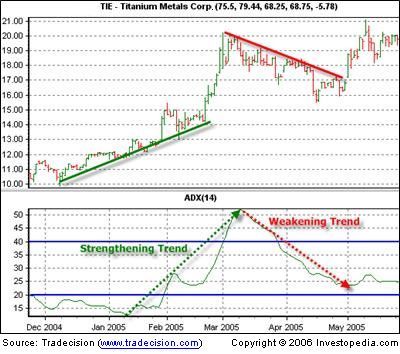
Fig 5
As you can see, the slope increases at a greater rate when the trend is stronger and at a lesser rate when the trend is weaker. Typically, the ADX is set at a 14-bar range, with 20 and 40 being the two key points. If the ADX is rising above 20, it signifies the beginning of a new trend. If it rises above 40, that means the trend is likely about to end. As you can see from Figure 5, it can give you a fairly accurate read.
Creating a Usable Strategy
Although the ADX appears to work well on its own, market volatility can cause second-guessing and false signals. However, when combined with chart types that more easily highlight trends, it becomes a lot easier to identify profitable opportunities.
Using a combined analysis is as simple as determining whether the chart pattern's sentiment is the same as the indicator's sentiment. Therefore, if you are using Heikin-Ashi and ADX, simply check to see what the trend direction is on the chart and then take a look at the trend strength shown on the ADX. If both are telling you that there is a strong trend, then it may be a good idea to enter.
Here's an example:
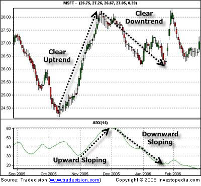
Fig 6
Here we can see the trends are smoothed out by the use of averaging techniques (like Heikin-Ashi) and are being confirmed through the use of indicators (like ADX). This gives us a clear and reliable picture of the current market situation, without any unnecessary clutter (market noise).
In Summary
As you can see, chart analysis is much easier when using noise-removal techniques. They can help you avoid costly false signals and other mistakes, while allowing you to quickly and accurately locate and capitalize on trends.
Justin Kuepper can be contacted at Internationalinvest
What Is Market Noise?
Market noise is simply all of the price data that distorts the picture of the underlying trend. This includes mostly small corrections and intraday volatility. To fully understand this concept, let's take a look at two charts - one with noise and one with noise removed:
Before noise is removed:

Fig1
After noise is removed:

Fig2
Notice that in Figure 2, there are no longer any areas in which the trend is not easily seen, whereas in Figure 1, it is often difficult to identify whether the trend is changing on some days. The technique used in this chart is averaging - that is, where the current candle factors in the average of prior candles in order to create a smoother trend. This is the aim of noise reduction: to clarify trend direction and strength.
Let's take a look at how we can determine these two factors and combine them to create reliable charts that are easier to read.
Isolating Trend Direction
Isolating trend direction is best done through the use of specialized charts designed to eliminate minor corrections and deviations and only show larger trends. Some of the charts (such as Figure 2 above) simply average prices to create a smoother chart, while others completely recreate the chart by taking only trend-affecting moves into consideration.
Renko Charts
One example of a chart type that only uses trend-affecting moves is the Renko chart, named after the Japanese term "renga", meaning "brick". Renko charts isolate trends by taking price into account but ignoring time.
They are created by using a simple three-step process:
Choose a brick size. This is simply the minimum price change required for a new brick to appear.
Compare the current day's close with the high and low of the previous brick.
If the closing price is higher or lower than the top of the previous brick by at least the size of one brick, one or more bricks are drawn in the next column in the respective direction.
Let's take a look at an example:

Fig 3
As you can see, it is much easier to identify trends on these charts than on traditional candlestick charts. Further noise reduction can be obtained by increasing the size of the bricks; however, this will also increase the intra-trend volatility - make sure that you have enough capital to withstand this volatility. Overall, Renko charts provide an excellent way to isolate trends, but they are limited by the fact that they don't provide a way to determine trend strength other than simply looking at the trend length, which can be misleading. We'll take a look at how to determine trend strength later in the article.
Heikin-Ashi Charts
A second type of chart that can be used for noise reduction is the Heikin-Ashi chart. These charts use a strategy similar to the charts seen in Figs. 1 and 2: they factor in the current bar with an average of past bars in order to create a smoother trend. This process creates much smoother price patterns that are much easier to read.
These are the charts most commonly used when reducing market noise; they can easily be used with other indicators because they don't factor out time. Another added benefit is that they also smooth out the indicator because the price bars are used as indicator inputs. This can help make indicators far easier to read.
Kagi Charts
Kagi charts are designed to show supply and demand through the use of thin and thick lines. New lines are created whenever a new high or low is established. By isolating highs and lows, it becomes much easier to see the larger trends.
Let's look at an example:

Fig 4
Trending times are then defined as times when demand exceeds supply (uptrend) or supply exceeds demand (downtrend). Finding trends becomes as easy as looking for thick or thin lines.
These charts are also excellent for noise reduction, but they are limited because they can't determine trend strength other than by measuring the move lengths, which can be misleading.
Determining Trend Strength
Trend strength is best gauged through the use of indicators. For the purposes of this article, we will take the most popular indicator - directional movement index (DMI) - and its derivative, the average directional movement index (ADX).
The DMI indicator is the most widely used trend strength indicator. This indicator is divided into two parts: +DI and -DI. These two indicators are then plotted to determine overall trend strength.
The ADX indicator is simply the averaging of the two DMI (directional movement index) indicators (+/-) to create a single line that can be used to instantly determine whether a price is trending or dormant.
Let's see an example of how this can be useful:

Fig 5
As you can see, the slope increases at a greater rate when the trend is stronger and at a lesser rate when the trend is weaker. Typically, the ADX is set at a 14-bar range, with 20 and 40 being the two key points. If the ADX is rising above 20, it signifies the beginning of a new trend. If it rises above 40, that means the trend is likely about to end. As you can see from Figure 5, it can give you a fairly accurate read.
Creating a Usable Strategy
Although the ADX appears to work well on its own, market volatility can cause second-guessing and false signals. However, when combined with chart types that more easily highlight trends, it becomes a lot easier to identify profitable opportunities.
Using a combined analysis is as simple as determining whether the chart pattern's sentiment is the same as the indicator's sentiment. Therefore, if you are using Heikin-Ashi and ADX, simply check to see what the trend direction is on the chart and then take a look at the trend strength shown on the ADX. If both are telling you that there is a strong trend, then it may be a good idea to enter.
Here's an example:

Fig 6
Here we can see the trends are smoothed out by the use of averaging techniques (like Heikin-Ashi) and are being confirmed through the use of indicators (like ADX). This gives us a clear and reliable picture of the current market situation, without any unnecessary clutter (market noise).
In Summary
As you can see, chart analysis is much easier when using noise-removal techniques. They can help you avoid costly false signals and other mistakes, while allowing you to quickly and accurately locate and capitalize on trends.
Justin Kuepper can be contacted at Internationalinvest
Last edited by a moderator:
