On another thread, a 1 hour P&F chart was posted which caused some confusion given that P&F charts don't represent time along the x axis in the way that most other charts do. So, where does the time aspect come in?
This is an interesting point and, as the thread in question was not about P&F, it seemed appropriate to re-activate this old thread to expand further on the topic here. With the exception of tick charts, all P&F charts have a time-frame. It matters not a jot what that time frame is, be it 1 minute, 1 hour or 1 day, the basic principles of the P&F method apply to each and every one of them. I'll do my best to explain . . .
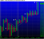
Imagine a chart - say a 1 hour chart - in which the current column comprises blue 'X's denoting that price is rising. If, during the hour the price rises by the value of one full box, then a new blue X will be added to the top of the column when the chart updates at the end of the hour. The really important point to note is that the chart will record this even if, during the course of the hour, price has waterfalled to zero and then risen back up again! The reversal will NOT be recorded on the chart. Now let's zoom in to a 15 minute chart examining the first quarter period of the same instrument. Currently, like the 1 hour chart, this also has a column of rising blue 'X's. For the sake of argument, let's say price falls by the value of at least 3 full boxes. (This is a 3 box reversal chart.) However, although price starts to recover within the 15 minute timeframe, it doesn't quite manage to move up above the highest blue X by the value of one full box. When the chart updates at the end of the 15 minute period, it will print a new column of falling red 'O's, indicating a three box reversal has taken place.
The timeframe of a chart will produce very different results, even if all other variables remain the same. Given that you can not only adjust the timeframe of the chart but also the the box size and the reversal amount, the possible variations on P&F charts is virtually limitless. If you don't know exactly what you want your chart to show and how to utilise the information it yields, this vast choice might not be a good thing. On the other hand, if you know what you want, why you want it and how to use it once you've got it, well . . . 🙂
Tim.
(BTW, I'm not trying to present myself as an expert on the P&F charting method; I'm anything but! However, I am interested in it and am keen to stimulate discussion between other users and prospective devotees.)