Point and Figure (P&F) charting has been around for well over a century, occupying a bit of a niche. It tends to be an area that some get quite heavily into, while a fair percentage of the non-users look at it now and again and regard it as something they'd quite like to get the hang of but never seem to get round to it. As what it does for traders today is far more important than whether Dow used it in 1903 (in my view at least) that's it for the history lesson.
P&F charts go left to right, with columns of X's and O's showing periods when the price was climbing or dropping. That's not all that dissimilar to most other chart styles - where P&F deviates somewhat is in the fact that a column can last anything from a day to weeks, months, even years whilst your candlestick chart will draw a new candle every day. The P&F chart only swaps to a new column if the price is deemed to have changed direction by a significant amount - what constitutes "significant" can be decided by the user, their software, or a combination of the two.
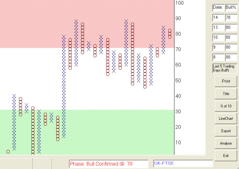
caption: FTSE100, Bullish Percentage, mid-Dec 2004
P&F charts don't have to be stock charts - the Bullish Percent chart is used to determine the current market's overall mood, the one above shows the mid-Dec 04 status of the UK FTSE
I'm going to describe charts (mainly) using "End of Day" terminology, but P&F works in any timescale - I run charts based on daily and weekly data, I also have charts based on RT data down to a minute per bar... they are constructed pretty well the same way, and give the same information to the user. I'll use the term "bar" to describe the basic unit of data - ie it might be a 1 minute, 1 hour, daily, weekly, monthly... who cares.... whatever the timescale you've decided to base charts on, one bar of that data has O,H,L,C and V data.
caption: SP500, 1 minute, bar-based
P&F charts are equally tradeable in realtime, the above chart shows a current (at time of writing) SP500 chart. Breakouts, trends and reversals are still readily apparent on the charts - this one spans 7 trading days...
There are a lot of online resources you can look at regarding how to construct a P&F chart, and a number of good books on the subject. You're going to get my personal opinion along the way here, so my apologies in advance to anyone I offend by being less than awestruck when referring to the big names in the field... I don't think trading is improved by slavishly following others, and if I disagree with a "name" then I'm inclined to say so.
Books you might consider reading include:-
One of the bigger names in P&F is Tom Dorsey, and whether you subscribe to his ideas on using the signals or not his book on the basics of P&F is good as a reference - cunningly titled "Point and Figure Charting" it's not exactly bargain basement stuff, my copy was $60 or so several years back. "The Complete Guide to Point and Figure Charting" by Heinrich Weber & Kermit Zieg, published a year or so back by Harriman House, is much cheaper at £29.99 - usually you can get it for rather less than this, £20 or so. T2W's bookshop leads into Global Bookshops, they flog this (they publish it) and you'll get a cheaper copy by using the onsite shop. Whilst not being quite as encyclopaedic in approach it explains chart construction etc perfectly well, and goes on to discuss actually using the charts in (to my mind) a more realistic manner.
Okay - chart construction... normally charts are constructed from either the bar's closing price, or from both the high and the low. I, like many, believe the H-L charts are more appropriate, encompassing the bar's full range traded, rather than a single price at the close - the daily range, to me, is a better guide to supply and demand as it affects the share price... so that's all I'm gonna say on that, agree with it or disagree.
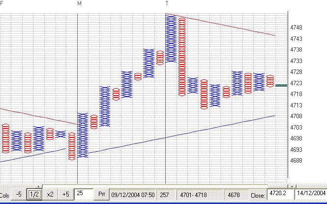
caption: FTSE 1 minute, (1 pt x 3 box reversal)
In the UK the uptrend is notably absent, the 1 minute (above) and 10 minute (below) charts of the FTSE show an intial drop and a fairly lacklustre day overall, with a market moving sideways in quite a narrow range.

P&F charts take the price data and turn it, as I'm sure you are already aware, into a graph like display. You may well, if you've been via sites like stockcharts.com, have seen that there are different ways to chart the prices - "log" charts are popular, there's also a fairly US centric "traditional" scaling that I'd argue is only really useable on US shares, you might find a fixed price scaling, scalings based on Bollinger boxes... all sorts! Actually, as you are starting out, you don't need to worry too much which you use - once you are deeply immersed in the charts then you'll have looked into the options and picked your favourite method.... if you bother to backtest lumps of data you'll discover that one method is pretty much the same as any other anyway - shock horror, backtest results show time and again that whether you use log charts, traditional scaling, or charts based on the mating habits of Brazilian Tree frogs (for all I know or care) the results over a decent number of stocks and time tends to even out ... there just doesn't seem to be a method that is noticeably better than the others.
This leads to our first two choices when setting a chart up - what boxsize and reversal count should be used? Boxsize first - let's keep it simple, if you are running a charting package of some sort, or using stockcharts etc., then a reasonable starting point is to select 2% log scaling. (Sometimes it'll say 2% percentage boxes, or similar - what we're after here is simply to ensure that every box is 2% higher than the box below it, and 2% lower than the one above). The "reversal count" tells us how many boxes "in the other direction" the price has to swing before we call it a significant change, and start to chart a new column. Sounds complex, but it isn't at all...
Imagine that on the chart each square is a price that has to be "filled" by the share as it goes past - using a simple "each box = 1p" scaling as an example (no clever percentage stuff, this is only an example) and a reversal count of 3 - which is pretty commonly used - let's start building a simple chart...
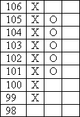
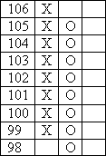
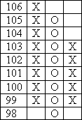
Prices for days 1 to 6 are:
The range of prices goes from 0.98 on day 5, up to 1.06 on day 3, which is a 9p range of boxes... so here's what I draw:-
I'm going to start drawing with an X column, the price is currently rising - charting software will decide whether to draw an X or an O column to start with, it's a trivial matter for this example - I'm not going to explain it as it'll add a para or two to the word count and very little to the understanding. So, column 1 goes up from 98 to 1.02...
The rules for constructing columns are simple - if the current column extends by at least one more box, then that's what you do. If the column doesn't extend, then you look for a reversal into a new column... you don't do a reversal check unless the current column fails to extend. We never do both - ie you don't extend and reverse on the same bar of data.
Watch the sequence below, hopefully it'll make sense!
Chart construction - Worked example
Some people quibble about events like day 5, arguing that surely the chart ought to react more to the huge spike up than to a mediocre move in the existing direction. Ultimately the argument is that this isn't necessarily decisive, extending the daily range might be an indecisive sign, but if the share really has swapped direction it will be confirmed by the next bar (as it did in this example) and the chart will "catch up". P&F is often said to remove some of the chart "noise", and as in anything in Technical Analysis you tend to increase lag when you improve the quality of signal.
Suffice it to say that whilst this may, occasionally, lead to later signals than other methods there are other times when P&F will signal a change ahead of other methods - one reason to consider using P&F is to avoid seeing the same things, and at the same times, as the majority of traders.
Now, I rather glossed over boxsize and reversal count, but using log (or sometimes called "percentage" or similar) charts a 2% boxsize is a decent size to practise with, and whilst there are fans of all sorts of methods of calculating boxsize and reversal counts a 3 box reversal is usually as good as any. Optimisation of both these values may lead to improved signal reliability (ie the buy and sell signals are "right" a bit more often) and dedicated proponents who get deeply into P&F will develop their own views on what to use and when to use it, but that's way down the line and another thing that in most cases doesn't make a lot of difference anyway.
The new P&F user will get a long, long way into P&F using 2% boxes and a 3 box reversal, gradually altering one or other to experiment with individual shares. Some software programs allow you to optimise, most allow the user to set these values either globally for all shares or individually, these are areas to play with when you've got the basics hacked.
The simplest signals given by P&F charts are the double top breakout, and double bottom breakout - if the last column is an X column then the double top occurs when the top of the latest column rises to the same height as the previous X column... the breakout, which is the buy signal, is when the latest column goes higher than the previous X column... as shown in the chart snippet below:
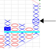
caption: A simple buy signal
The arrowed X with the rectangle drawn around it, in the right most column, is one box higher than the top of the previous X column... this makes a double top breakout signal. A double bottom breakdown is similar, but the other way up of course...
caption: A simple sell signal
This signal (the arrowed O in the next last column) has been superseded - the [O] is the double bottom breakdown, as it is a box lower than the previous O column bottom. You can see that in this case the sell signal was good for a further 3 box fall, but then turned up into a new (current) X column. Other markings on the charts relate to previous buy/sell signals, target price calculations, and support/resistance trendlines that don't concern us here, they're just part of the charting program used for the screenshots.
P&F charts are generally quite good at highlighting support and resistance, and consolidation areas - in the example of the sell signal chart it doesn't take much effort to spot that the blue X box in the next to last X column was not only a poor buy candidate but also rather marks an obvious area of resistance... that long, flat top and the dangling attempts to drive the price downwards suggest the chart is far from a sure fire long, and we'd probably consider a drive above that flat top as a significant change in mood.
There are a couple of dozen common buy and sell formations, setups if you like, where patterns of columns are taken to imply bullish or bearish moves are occurring. From backtesting I've found little real reason to get overly creative here - the reliability (win percentage) of the patterns isn't markedly greater if you pick from the more esoteric ones, choosing the less common patterns is more use as a way to ensure you don't have to pick and choose which signals to trade.... cutting number of trades down to a manageable number can be an issue if you want to trade from the whole market or a large group like the S&P500 or similar, where you might get thousands of signals a year.
I mentioned target prices earlier, sometimes referred to as price objectives, there are two common ways to calculate a price target from a P&F chart. I'm not going into detail, but you use the latest buy and sell signals to determine the section of chart to use for the calculation, and then it's a case of counting columns across a consolidation, or rows following the signal, and doing a simple multiplication to produce a number that is then added to the low (or deducted from the high, for a sell signal) ... hey presto a target price. Programs will often calculate them for you, they are usually labelled as Horizontal and Vertical price targets depending on which of the two main methods were used to calculate them.
I'm in two minds about targets - I tend to use them to help identify trades that have a decent bit of room to run into, but I don't tend to pay much attention to the actual target price. Sounds odd? What I mean is that I might calculate that MSFT is a long trade with a price target 12% above the last close, offering me ample room to place a nice spread to profit from. If MSFT was showing a buy signal and the target was only 2% away then I'd look closer at the chart to see whether it does indeed offer a fair potential - the "simple sell signal" above has a buy signal showing remember, but you'd have been pretty optimistic to take it at the time! I'm using the target not to say MSFT is going to go to $XX.XX I'm using it to highlight shares that I expect to move quite a way, allowing me to get a nice position where I'm not expecting to get stopped out 2 days later while my stop is still below my entry price. I'm not fantastic (yet) at timing entry and exit, I'm therefore trying to shade the odds a little to allow for even a bit of bumbling to still show a profit, and shares that are predicted to top out a box or 2 boxes after the buy signal are a risk I prefer not to take.
There's a lot on P&F on the web, there are a number of programsout there that will chart P&F for you. I'm not going to mention any
of them, as I flog one myself and I'm hardly going to advertise the opposition whilst ignoring my own lovingly crafted beast, but they're not that hard to find and reviews of some are available in the T2W reviews section. You'll also find reviews of P&F books there, so personally I'd suggest you head over to the reviews section if you want a book or a program.
Many of the general purpose programs like Metastock include P&F charting, if you already have such a program then this will almost certainly be okay to start with - if you decide that you really like P&F and want to use it in earnest I'd suggest you go buy a specialist program for it... that's not just advertising blurb, I went my own way several years ago when I couldn't get the existing programs to do P&F the way I wanted it, I'd be lying if I said I thought the average charting program did that good a job of handling P&F for the keen P&F user. (They're fine for a dabble, so don't spend any money until you are convinced you need to!)
This is something you only need to spend time on at first - not hard cash! Websites like Stockcharts will allow you to play with P&F charts if your own program suite doesn't include something suitable, and you'll find lots of introductory texts there, or linked from there,
that will lead you to Tom Dorsey's site etc where more complete guidance on constructing charts and targets etc can be read. I'd suggest you start there, buy a book along the way as a ready reference - the Weber/Zieg one won't break the bank, and much of the Dorsey book is actually covered in the freely downloadable tutorials on Dorsey's site anyway. This is not a super secret charting method where only those who spend lavish sums eventually acquire all the good bits - P&F charting is pretty simple stuff, the average book is 30 pages of technical info on how to calculate and draw things, followed by 200 pages of opinions, repetition, examples and padding. (I feel this is a fair description of most trading and investing books, not just P&F).
P&F charts go left to right, with columns of X's and O's showing periods when the price was climbing or dropping. That's not all that dissimilar to most other chart styles - where P&F deviates somewhat is in the fact that a column can last anything from a day to weeks, months, even years whilst your candlestick chart will draw a new candle every day. The P&F chart only swaps to a new column if the price is deemed to have changed direction by a significant amount - what constitutes "significant" can be decided by the user, their software, or a combination of the two.
caption: FTSE100, Bullish Percentage, mid-Dec 2004
P&F charts don't have to be stock charts - the Bullish Percent chart is used to determine the current market's overall mood, the one above shows the mid-Dec 04 status of the UK FTSE
I'm going to describe charts (mainly) using "End of Day" terminology, but P&F works in any timescale - I run charts based on daily and weekly data, I also have charts based on RT data down to a minute per bar... they are constructed pretty well the same way, and give the same information to the user. I'll use the term "bar" to describe the basic unit of data - ie it might be a 1 minute, 1 hour, daily, weekly, monthly... who cares.... whatever the timescale you've decided to base charts on, one bar of that data has O,H,L,C and V data.
caption: SP500, 1 minute, bar-based
P&F charts are equally tradeable in realtime, the above chart shows a current (at time of writing) SP500 chart. Breakouts, trends and reversals are still readily apparent on the charts - this one spans 7 trading days...
There are a lot of online resources you can look at regarding how to construct a P&F chart, and a number of good books on the subject. You're going to get my personal opinion along the way here, so my apologies in advance to anyone I offend by being less than awestruck when referring to the big names in the field... I don't think trading is improved by slavishly following others, and if I disagree with a "name" then I'm inclined to say so.
Books you might consider reading include:-
One of the bigger names in P&F is Tom Dorsey, and whether you subscribe to his ideas on using the signals or not his book on the basics of P&F is good as a reference - cunningly titled "Point and Figure Charting" it's not exactly bargain basement stuff, my copy was $60 or so several years back. "The Complete Guide to Point and Figure Charting" by Heinrich Weber & Kermit Zieg, published a year or so back by Harriman House, is much cheaper at £29.99 - usually you can get it for rather less than this, £20 or so. T2W's bookshop leads into Global Bookshops, they flog this (they publish it) and you'll get a cheaper copy by using the onsite shop. Whilst not being quite as encyclopaedic in approach it explains chart construction etc perfectly well, and goes on to discuss actually using the charts in (to my mind) a more realistic manner.
Okay - chart construction... normally charts are constructed from either the bar's closing price, or from both the high and the low. I, like many, believe the H-L charts are more appropriate, encompassing the bar's full range traded, rather than a single price at the close - the daily range, to me, is a better guide to supply and demand as it affects the share price... so that's all I'm gonna say on that, agree with it or disagree.
caption: FTSE 1 minute, (1 pt x 3 box reversal)
In the UK the uptrend is notably absent, the 1 minute (above) and 10 minute (below) charts of the FTSE show an intial drop and a fairly lacklustre day overall, with a market moving sideways in quite a narrow range.
P&F charts take the price data and turn it, as I'm sure you are already aware, into a graph like display. You may well, if you've been via sites like stockcharts.com, have seen that there are different ways to chart the prices - "log" charts are popular, there's also a fairly US centric "traditional" scaling that I'd argue is only really useable on US shares, you might find a fixed price scaling, scalings based on Bollinger boxes... all sorts! Actually, as you are starting out, you don't need to worry too much which you use - once you are deeply immersed in the charts then you'll have looked into the options and picked your favourite method.... if you bother to backtest lumps of data you'll discover that one method is pretty much the same as any other anyway - shock horror, backtest results show time and again that whether you use log charts, traditional scaling, or charts based on the mating habits of Brazilian Tree frogs (for all I know or care) the results over a decent number of stocks and time tends to even out ... there just doesn't seem to be a method that is noticeably better than the others.
This leads to our first two choices when setting a chart up - what boxsize and reversal count should be used? Boxsize first - let's keep it simple, if you are running a charting package of some sort, or using stockcharts etc., then a reasonable starting point is to select 2% log scaling. (Sometimes it'll say 2% percentage boxes, or similar - what we're after here is simply to ensure that every box is 2% higher than the box below it, and 2% lower than the one above). The "reversal count" tells us how many boxes "in the other direction" the price has to swing before we call it a significant change, and start to chart a new column. Sounds complex, but it isn't at all...
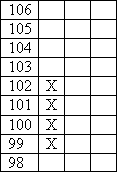
Imagine that on the chart each square is a price that has to be "filled" by the share as it goes past - using a simple "each box = 1p" scaling as an example (no clever percentage stuff, this is only an example) and a reversal count of 3 - which is pretty commonly used - let's start building a simple chart...
Prices for days 1 to 6 are:
| Day | Low | High |
| 1 | 0.99 | 1.02 |
| 2 | 1.01 | 1.05 |
| 3 | 1.03 | 1.06 |
| 4 | 1.01 | 1.05 |
| 5 | 0.98 | 1.07 |
| 6 | 0.99 | 1.03 |
The range of prices goes from 0.98 on day 5, up to 1.06 on day 3, which is a 9p range of boxes... so here's what I draw:-
I'm going to start drawing with an X column, the price is currently rising - charting software will decide whether to draw an X or an O column to start with, it's a trivial matter for this example - I'm not going to explain it as it'll add a para or two to the word count and very little to the understanding. So, column 1 goes up from 98 to 1.02...
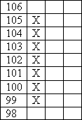
The rules for constructing columns are simple - if the current column extends by at least one more box, then that's what you do. If the column doesn't extend, then you look for a reversal into a new column... you don't do a reversal check unless the current column fails to extend. We never do both - ie you don't extend and reverse on the same bar of data.
Watch the sequence below, hopefully it'll make sense!
| 
| 
|
| Day 1 (Low 98, High 102) The price rises from 98 to 102... the first column starts | Day 2 (Low 101, High 105) 105 is at least 1 box higher so we draw it in, we ignore the low as we extended X's. | Day 3 (Low 103, High 106) We have 1 box to add, so extend again |
| 
| 
|
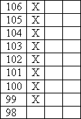
| Day 4 (Low:101, High 105) 105 isn't higher up than the current top X, so no extension - reversal count is three, so is the low 3 boxes down? Yes, 3 boxes down would be 103, and 101 is below it, so swap to O's | Day 5 (Low 98, High 100) Check for extension, 98 is one box lower, so we draw the new O in and ignore the daily high price even though it's way up high! | Day 6 (Low 99, High 103) 99 isn't a box and is lower than the current low, so no extension and we check for a reversal - 103 is 3 boxes or more in the other direction so we start a new column |
Chart construction - Worked example
Some people quibble about events like day 5, arguing that surely the chart ought to react more to the huge spike up than to a mediocre move in the existing direction. Ultimately the argument is that this isn't necessarily decisive, extending the daily range might be an indecisive sign, but if the share really has swapped direction it will be confirmed by the next bar (as it did in this example) and the chart will "catch up". P&F is often said to remove some of the chart "noise", and as in anything in Technical Analysis you tend to increase lag when you improve the quality of signal.
Suffice it to say that whilst this may, occasionally, lead to later signals than other methods there are other times when P&F will signal a change ahead of other methods - one reason to consider using P&F is to avoid seeing the same things, and at the same times, as the majority of traders.
Now, I rather glossed over boxsize and reversal count, but using log (or sometimes called "percentage" or similar) charts a 2% boxsize is a decent size to practise with, and whilst there are fans of all sorts of methods of calculating boxsize and reversal counts a 3 box reversal is usually as good as any. Optimisation of both these values may lead to improved signal reliability (ie the buy and sell signals are "right" a bit more often) and dedicated proponents who get deeply into P&F will develop their own views on what to use and when to use it, but that's way down the line and another thing that in most cases doesn't make a lot of difference anyway.
The new P&F user will get a long, long way into P&F using 2% boxes and a 3 box reversal, gradually altering one or other to experiment with individual shares. Some software programs allow you to optimise, most allow the user to set these values either globally for all shares or individually, these are areas to play with when you've got the basics hacked.
The simplest signals given by P&F charts are the double top breakout, and double bottom breakout - if the last column is an X column then the double top occurs when the top of the latest column rises to the same height as the previous X column... the breakout, which is the buy signal, is when the latest column goes higher than the previous X column... as shown in the chart snippet below:
caption: A simple buy signal
The arrowed X with the rectangle drawn around it, in the right most column, is one box higher than the top of the previous X column... this makes a double top breakout signal. A double bottom breakdown is similar, but the other way up of course...
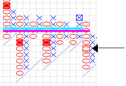
caption: A simple sell signal
This signal (the arrowed O in the next last column) has been superseded - the [O] is the double bottom breakdown, as it is a box lower than the previous O column bottom. You can see that in this case the sell signal was good for a further 3 box fall, but then turned up into a new (current) X column. Other markings on the charts relate to previous buy/sell signals, target price calculations, and support/resistance trendlines that don't concern us here, they're just part of the charting program used for the screenshots.
P&F charts are generally quite good at highlighting support and resistance, and consolidation areas - in the example of the sell signal chart it doesn't take much effort to spot that the blue X box in the next to last X column was not only a poor buy candidate but also rather marks an obvious area of resistance... that long, flat top and the dangling attempts to drive the price downwards suggest the chart is far from a sure fire long, and we'd probably consider a drive above that flat top as a significant change in mood.
There are a couple of dozen common buy and sell formations, setups if you like, where patterns of columns are taken to imply bullish or bearish moves are occurring. From backtesting I've found little real reason to get overly creative here - the reliability (win percentage) of the patterns isn't markedly greater if you pick from the more esoteric ones, choosing the less common patterns is more use as a way to ensure you don't have to pick and choose which signals to trade.... cutting number of trades down to a manageable number can be an issue if you want to trade from the whole market or a large group like the S&P500 or similar, where you might get thousands of signals a year.
I mentioned target prices earlier, sometimes referred to as price objectives, there are two common ways to calculate a price target from a P&F chart. I'm not going into detail, but you use the latest buy and sell signals to determine the section of chart to use for the calculation, and then it's a case of counting columns across a consolidation, or rows following the signal, and doing a simple multiplication to produce a number that is then added to the low (or deducted from the high, for a sell signal) ... hey presto a target price. Programs will often calculate them for you, they are usually labelled as Horizontal and Vertical price targets depending on which of the two main methods were used to calculate them.
I'm in two minds about targets - I tend to use them to help identify trades that have a decent bit of room to run into, but I don't tend to pay much attention to the actual target price. Sounds odd? What I mean is that I might calculate that MSFT is a long trade with a price target 12% above the last close, offering me ample room to place a nice spread to profit from. If MSFT was showing a buy signal and the target was only 2% away then I'd look closer at the chart to see whether it does indeed offer a fair potential - the "simple sell signal" above has a buy signal showing remember, but you'd have been pretty optimistic to take it at the time! I'm using the target not to say MSFT is going to go to $XX.XX I'm using it to highlight shares that I expect to move quite a way, allowing me to get a nice position where I'm not expecting to get stopped out 2 days later while my stop is still below my entry price. I'm not fantastic (yet) at timing entry and exit, I'm therefore trying to shade the odds a little to allow for even a bit of bumbling to still show a profit, and shares that are predicted to top out a box or 2 boxes after the buy signal are a risk I prefer not to take.
There's a lot on P&F on the web, there are a number of programsout there that will chart P&F for you. I'm not going to mention any
of them, as I flog one myself and I'm hardly going to advertise the opposition whilst ignoring my own lovingly crafted beast, but they're not that hard to find and reviews of some are available in the T2W reviews section. You'll also find reviews of P&F books there, so personally I'd suggest you head over to the reviews section if you want a book or a program.
Many of the general purpose programs like Metastock include P&F charting, if you already have such a program then this will almost certainly be okay to start with - if you decide that you really like P&F and want to use it in earnest I'd suggest you go buy a specialist program for it... that's not just advertising blurb, I went my own way several years ago when I couldn't get the existing programs to do P&F the way I wanted it, I'd be lying if I said I thought the average charting program did that good a job of handling P&F for the keen P&F user. (They're fine for a dabble, so don't spend any money until you are convinced you need to!)
This is something you only need to spend time on at first - not hard cash! Websites like Stockcharts will allow you to play with P&F charts if your own program suite doesn't include something suitable, and you'll find lots of introductory texts there, or linked from there,
that will lead you to Tom Dorsey's site etc where more complete guidance on constructing charts and targets etc can be read. I'd suggest you start there, buy a book along the way as a ready reference - the Weber/Zieg one won't break the bank, and much of the Dorsey book is actually covered in the freely downloadable tutorials on Dorsey's site anyway. This is not a super secret charting method where only those who spend lavish sums eventually acquire all the good bits - P&F charting is pretty simple stuff, the average book is 30 pages of technical info on how to calculate and draw things, followed by 200 pages of opinions, repetition, examples and padding. (I feel this is a fair description of most trading and investing books, not just P&F).
Last edited by a moderator: