In part 1, I discussed two examples of how and why volume can show the changing face of supply and demand. When the order of supply and demand is change we will get a change in market direction, sometimes a significant change in trend or otherwise some degree of retracement of the prior move. We will now continue on from that discussion and show larger periods of transition which can lead to quite substantial turning points in the major trends. These can be easy to identify, but do require some patience. If you did not read the prior article it would now be worth reviewing that before going on.
Let’s firstly take a look at AWB Limited.
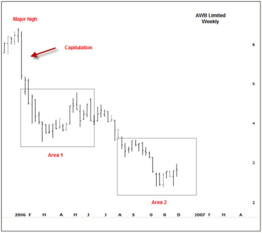
Since early 2006, the price of AWB had been in a downward spiral. The story that eventually came out suggested AWB was doing some bad business against the UN sanction in Iraq. The initial shock sent the shares plunging by 18% in a single week.
This is a sure sign of a change in sentiment and it’s not exactly rocket science to know there must have been some kind of bad news that changes the outlook.
But what is important here is that this significant sell off is actually the first sign that strength may start to appear in the near future. As I discussed in part 1, demand strength actually starts in price weakness and here is a sign of capitulation. A wide ranging bar on increased volume is a sign of panic and when we see panic we can usually expect that a bargain could be in the offering, but this is where the patience is required. What we usually start to see after capitulation is a transition from sellers to buyers. This transition has two important characteristics; firstly it takes some time and secondly prices do tend to drift lower. Let’s zoom into the AWB chart at Area 1 and also add our volume indicators.
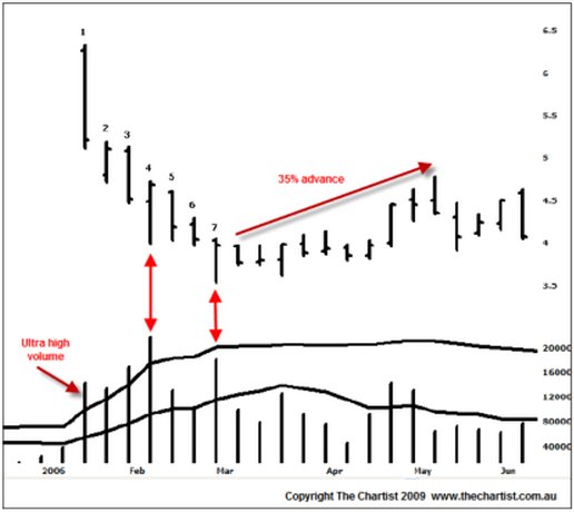
Bar 1 is the capitulation; a very wide ranging bar and ultra high volume. Remember that ultra high volume is signaled when the volume histogram penetrates the volume Bollinger band. Bar 2 gaps lower but closes on the weeks high and does so on high volume. This is a sign that the Smart Money is interested in buying. There is no other way that prices can close higher on increased volume if buyers were not involved. Bar 3 however shows sellers returning; a push lower, a low close and another increase in volume. Bar 4 is the turning point and is a sure sign that buying interest is occurring. This is the time to start thinking that this market will turn higher soon. This bar shows a move to new lows but a complete rejection, i.e. a high close and very high volume. We’re seeing the Smart Money taking positions, even though the stock is drifting lower. Now take a close look at bars 5 and 6. What happens? Essentially they are inside days with a slight downward bias but look at the volume? There is none. Volume has dried right up. This means that sellers are done; they’re exhausted. Those that wanted to sell have either been fulfilled or do not wish to chase prices any lower. Bar 7 sees another probe lower, another high close and yet again a rapid increase in volume. Combined with bars 2 and 4, both of which show background strength, this is continued evidence that the stock is being accumulated. It’s only a matter of time before enough of the supply has been accumulated that prices will start to rise again.
For the next 2 months AWB rallied 34% off that exact low. The first signs of upward price momentum would be the signal to initiate longs. We have the Smart Money footprints in the volume so we just need to time the entry for our own comfort. Take a look at the bars from that low. All down bars had low volume; all up bars had high volume. There was a specific transition from sellers to buyers which led to a reasonable, albeit unsustainable, price rise.
The following chart shows that advance in more detail. Bar 8 was a very promising bar indeed; a wide range higher, a high close and a good increase in volume. With the high close we can deduce that buyers had the control. Bar 9 is an important bar for current longs. It shows an attempted push higher, a reasonably tight range but more importantly a weak close and solid increase in volume. This is the first time that sellers had come back to the market. Now these sellers can originate from two sources; either profit takers that bought at lower levels, after all, it was a rapid rise in quick time which will always create profit taking; or it is very old longs who were waiting for the evitable bounce to get out of their positions. We’re not to know which, but what we do know is that selling has emerged and that caution is required.
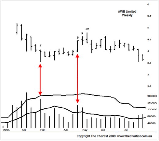
Bar 10 shows a rise into new recent highs but a close on the absolute lows. This is of paramount importance – what does it mean? Bar 9 identifies sellers because we had a weak close on high volume. Immediately following, Bar 10 shows a low close on low volume, which suggests buyers have disappeared. If buyers have gone, who is going to support the market if those sellers from Bar 9 decide to chase prices lower? Nobody. If there is no buyer demand or buyer support then prices have the risk of falling until buyer demand comes back again. And that is exactly what has occurred.
Let’s move forward to Area 2 where prices fall through the early lows set in Area 1. Please refer to the following chart.
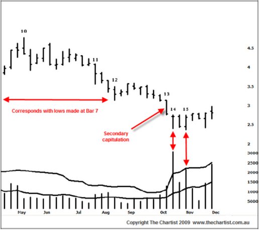
Bar 11 makes a low at $3.57, has a close off the lows and shows a mild increase in volume. The $3.57 level is important because the lows made on Bar 7 were at $3.55 which is where the prior buying entered the market. It could be easily argued that we will see those buyers back again at this level. So the minor increase in volume and a close off the week’s lows is an important sign when they correspond with an old low to the left. Prices continue to drift lower as weaker hands stop out below the lows made earlier in the year. However, although Bar 12 closes off the lows it’s quite a low volume bar not quite conducive to a significant change in supply and demand. Prices move sideways on low volume until we see Bar 13 take out the major lows and close on those new lows. The difference here is that volume is poked up through the volume Bollinger band suggesting ultra high volume. Again, this is probably a sign of capitulation as it’s a clear break to new lows suggesting sellers in control. But look at bar 14. Is that not the very same thing we started to see on Bar 2 of the first chart? A wide ranging bar down, a high close and massive volume. In fact this could almost be construed as a blow-off low, although the range is not quite wide enough for a text book example of such. Nonetheless it does show that buyers are in again. The following bar is a down close but volume has dried up – sellers exhausted? Bar 15 takes out the lows of bar 14 by 2c before rallying hard and closing high. Again, volume was very high suggesting that buyers are stepping up to the plate.
Interestingly enough this current price/volume activity is occurring immediately before the findings of the Cole Inquiry. Does the Smart Money know the outcome already? Remember in article 1 I suggested that good news tends to precede a fall and bad news a rally? Would the release of the report be considered potentially damaging news? Yes it could. We know the old adage that things look the worst at the low and best at the top but it is possible that volume is suggesting that the worst is over and that quite possibly we’re going to start to see prices trade higher.
The very last bar on this chart was the release of the report to Parliament. We have a probe above the small ledge but a lower close than the open and a rapid increase in volume. This is not an immediately good sign because it does suggest strong selling. Therefore we’d need to assess the volume/price relationship of the coming few weeks to better measure the willingness of the buyers seen at bars 14 and 15.
All in all, the relationship and volume/price is a very strong measure of subtle changes in supply and demand and can lead to both minor and major changes of trend. Therefore it’s beneficial for both traders and investors alike to really understand these nuances so they can better position themselves for new trades or offer warning signs for current trades.
Nick Radge can be contacted at The Chartist
Let’s firstly take a look at AWB Limited.
Since early 2006, the price of AWB had been in a downward spiral. The story that eventually came out suggested AWB was doing some bad business against the UN sanction in Iraq. The initial shock sent the shares plunging by 18% in a single week.
This is a sure sign of a change in sentiment and it’s not exactly rocket science to know there must have been some kind of bad news that changes the outlook.
But what is important here is that this significant sell off is actually the first sign that strength may start to appear in the near future. As I discussed in part 1, demand strength actually starts in price weakness and here is a sign of capitulation. A wide ranging bar on increased volume is a sign of panic and when we see panic we can usually expect that a bargain could be in the offering, but this is where the patience is required. What we usually start to see after capitulation is a transition from sellers to buyers. This transition has two important characteristics; firstly it takes some time and secondly prices do tend to drift lower. Let’s zoom into the AWB chart at Area 1 and also add our volume indicators.
Bar 1 is the capitulation; a very wide ranging bar and ultra high volume. Remember that ultra high volume is signaled when the volume histogram penetrates the volume Bollinger band. Bar 2 gaps lower but closes on the weeks high and does so on high volume. This is a sign that the Smart Money is interested in buying. There is no other way that prices can close higher on increased volume if buyers were not involved. Bar 3 however shows sellers returning; a push lower, a low close and another increase in volume. Bar 4 is the turning point and is a sure sign that buying interest is occurring. This is the time to start thinking that this market will turn higher soon. This bar shows a move to new lows but a complete rejection, i.e. a high close and very high volume. We’re seeing the Smart Money taking positions, even though the stock is drifting lower. Now take a close look at bars 5 and 6. What happens? Essentially they are inside days with a slight downward bias but look at the volume? There is none. Volume has dried right up. This means that sellers are done; they’re exhausted. Those that wanted to sell have either been fulfilled or do not wish to chase prices any lower. Bar 7 sees another probe lower, another high close and yet again a rapid increase in volume. Combined with bars 2 and 4, both of which show background strength, this is continued evidence that the stock is being accumulated. It’s only a matter of time before enough of the supply has been accumulated that prices will start to rise again.
For the next 2 months AWB rallied 34% off that exact low. The first signs of upward price momentum would be the signal to initiate longs. We have the Smart Money footprints in the volume so we just need to time the entry for our own comfort. Take a look at the bars from that low. All down bars had low volume; all up bars had high volume. There was a specific transition from sellers to buyers which led to a reasonable, albeit unsustainable, price rise.
The following chart shows that advance in more detail. Bar 8 was a very promising bar indeed; a wide range higher, a high close and a good increase in volume. With the high close we can deduce that buyers had the control. Bar 9 is an important bar for current longs. It shows an attempted push higher, a reasonably tight range but more importantly a weak close and solid increase in volume. This is the first time that sellers had come back to the market. Now these sellers can originate from two sources; either profit takers that bought at lower levels, after all, it was a rapid rise in quick time which will always create profit taking; or it is very old longs who were waiting for the evitable bounce to get out of their positions. We’re not to know which, but what we do know is that selling has emerged and that caution is required.
Bar 10 shows a rise into new recent highs but a close on the absolute lows. This is of paramount importance – what does it mean? Bar 9 identifies sellers because we had a weak close on high volume. Immediately following, Bar 10 shows a low close on low volume, which suggests buyers have disappeared. If buyers have gone, who is going to support the market if those sellers from Bar 9 decide to chase prices lower? Nobody. If there is no buyer demand or buyer support then prices have the risk of falling until buyer demand comes back again. And that is exactly what has occurred.
Let’s move forward to Area 2 where prices fall through the early lows set in Area 1. Please refer to the following chart.
Bar 11 makes a low at $3.57, has a close off the lows and shows a mild increase in volume. The $3.57 level is important because the lows made on Bar 7 were at $3.55 which is where the prior buying entered the market. It could be easily argued that we will see those buyers back again at this level. So the minor increase in volume and a close off the week’s lows is an important sign when they correspond with an old low to the left. Prices continue to drift lower as weaker hands stop out below the lows made earlier in the year. However, although Bar 12 closes off the lows it’s quite a low volume bar not quite conducive to a significant change in supply and demand. Prices move sideways on low volume until we see Bar 13 take out the major lows and close on those new lows. The difference here is that volume is poked up through the volume Bollinger band suggesting ultra high volume. Again, this is probably a sign of capitulation as it’s a clear break to new lows suggesting sellers in control. But look at bar 14. Is that not the very same thing we started to see on Bar 2 of the first chart? A wide ranging bar down, a high close and massive volume. In fact this could almost be construed as a blow-off low, although the range is not quite wide enough for a text book example of such. Nonetheless it does show that buyers are in again. The following bar is a down close but volume has dried up – sellers exhausted? Bar 15 takes out the lows of bar 14 by 2c before rallying hard and closing high. Again, volume was very high suggesting that buyers are stepping up to the plate.
Interestingly enough this current price/volume activity is occurring immediately before the findings of the Cole Inquiry. Does the Smart Money know the outcome already? Remember in article 1 I suggested that good news tends to precede a fall and bad news a rally? Would the release of the report be considered potentially damaging news? Yes it could. We know the old adage that things look the worst at the low and best at the top but it is possible that volume is suggesting that the worst is over and that quite possibly we’re going to start to see prices trade higher.
The very last bar on this chart was the release of the report to Parliament. We have a probe above the small ledge but a lower close than the open and a rapid increase in volume. This is not an immediately good sign because it does suggest strong selling. Therefore we’d need to assess the volume/price relationship of the coming few weeks to better measure the willingness of the buyers seen at bars 14 and 15.
All in all, the relationship and volume/price is a very strong measure of subtle changes in supply and demand and can lead to both minor and major changes of trend. Therefore it’s beneficial for both traders and investors alike to really understand these nuances so they can better position themselves for new trades or offer warning signs for current trades.
Nick Radge can be contacted at The Chartist
Last edited by a moderator:


