If "volume precedes price" as is often suggested then it should be possible to apply analytical techniques to certain volume attributes that will have some predictive capabilities with regard to future price development. Using various techniques that come under the general heading of money flow analysis it becomes feasible to decide whether a particular security is being accumulated or distributed. A security that is undergoing accumulation can be expected to gain in price and a security that is displaying the characteristics of distribution will probably offer opportunities on the short side. Equally, it can be very informative to see whether there are divergences between the security's price behaviour and its volume behaviour.
The Money Flow Index(MFI)
The Money Flow Index is a volume-weighted version of the Relative Strength Index. The indicator compares the total transaction values traded on days with upward price movement to the transaction values traded on days with downward price movement.
The steps involved in calculating the Money Flow Index are:
MFI is most valuable when a security is in a relatively quiet phase of volume and price development. This can best be illustrated with the following example, which proved to be highly profitable, and which arose for Martha Stewart Living (MSO) in late August 2005. The setup for the trade is displayed in Figure 1. Notice especially the price congestion during most of August 2005 in which price activity was confined to a very narrow range between $26 and $27. During this period of price stagnation there is clear evidence of accumulation taking place in the MFI chart segment below the price chart. Also noticeable is the manner in which the steepness of the MFI slope stands in contrast to the much gentler slope of the RSI slope. On August 25th the stock broke out on heavy volume and over the next four sessions moved from $26 to $34.
It is the dissonance or divergence that is revealing and which provides short term trading cues. The pattern can provide us with the foundations for a reliable template or pattern recognition algorithm using the MFI. When price has been trading within a very narrow range for several periods but there is unmistakable evidence of positive money flow indicating accumulation, be prepared for a potentially major price breakout. This is essentially a short term pattern in that one is not monitoring for any longer term evidence of accumulation but rather looking for a trading opportunity that should arise typically within a ten to twenty day period. In the case of MSO the trader who had observed the unusually positive MFI prior to the breakout on the 25th could have achieved a 25% return within four trading sessions.
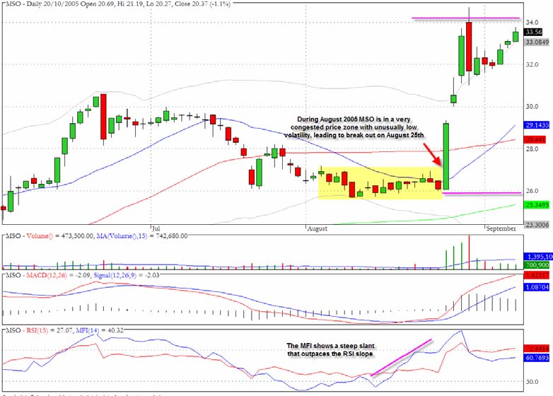
Another example of a very similar setup can be seen in the chart for AMGN (Figure 2) at the end of June 2005.
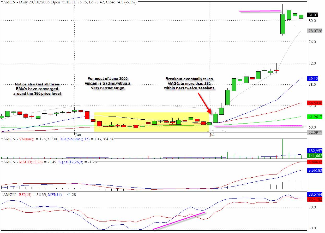
There is again evidence of accumulation during the month of June 2005 as highlighted in the steepening slope of the MFI especially visible during the second half of June. Also very noticeable in Figure 2 is the fact that the stock moved sideways within a very narrow range for the remainder of the month of June. All three exponential moving averages, the 20, 50 and 200 day EMA's, had converged at or close to the $60 price level. When reviewing longer term charts for AMGN it can be seen that this price level has proven to be fairly pivotal for the stock historically and certain institutions will have specific filters and screens set up to take a closer look at a stock that is trading at an area of important chart support. Also significant perhaps is that the period under review in the chart coincides with the end of the second calendar quarter, which is a period during which portfolio managers are overhauling their holdings and often engaging in some new acquisitions and portfolio cosmetics. The fact that there was little day to day volatility during this period suggests that the stock was probably not featuring as a priority for many day trading desks and it is precisely this relative calmness of this period of trading that is the hallmark of the pattern we have found to be so useful.
On July 5th, following a long holiday weekend the stock broke out from the period of price congestion with a 2.7% upward move to $62.51. This was then followed by a series of further upward moves including the major upwards gap on July 20th which enabled the stock to close above $80 representing a 33% advance from the price breakout at the beginning of July. There is a revealing dissimilarity between this chart and the one for MSO that we previously examined which in some ways would have made the AMGN opportunity more attractive. As can be seen from Figure 2, the price breakout for AMGN was less abrupt and traders that understood the dynamics that had lead to the July 5th upward move still had plenty of opportunity to climb aboard for the substantial short term profits that were to be realized within three weeks.
In each of the examples there is one key factor that becomes evident upon closer inspection of the charts which is the fact that in each case the price action is subdued just prior to the breakout and yet there is a very noticeable increase in the MFI values. An additional, not mandatory, requirement for the pattern is that the price has entered a zone where it is close to one or more of its key moving averages or an area of previous chart support. This suggests that the optimal circumstances for using the MFI indicator is in what we would call quiet markets. When a stock is thrusting or experiencing strong trend days there are too many dynamics at work for a meaningful segregation of the up volume and the down volume. So how can the value of a money flow based analysis be salvaged for more volatile trading conditions? The approach that is proposed here is based on the notion that we adopt a selective screening process to the actual data that we examine in terms of our segregation of positive and negative volume sessions. This can be achieved using a technique of comparative quantiles analysis.
Money Flow Based on Comparative Quantiles Analysis (CQA)
The term quantile is a generic term from statistics and the best way to explain it is to look at a specific example of a quantile - the median value of a price series. To take a simple example if we have 101 closing prices in a data series and we rank them from lowest to highest, the exact mid point of the ranking (i.e. the 51st closing price) will have be the median value. The median value implicitly requires a ranking of the data unlike the mean value which simply sums the values and divides by the number of values. Unlike a moving average a quantile approach requires a continual ranking of price data and then selecting the value that lie on the boundary of the percentile or quantile that one wishes to focus on. One of the main advantages of the median is that it is less sensitive to the inclusion of outliers.
The first intuition at this stage to help explain the CQA approach is to introduce the notion that quantile values can be extracted from two different but related sets of data points such as closing price and volume from a particular stock's history. When we use a moving time window approach where we look back at (say) the previous 20 data points for that specific series, we can then determine whether the current data point is above the quantile threshold, below it, or possibly equal to the specified quantile value. As soon as that marker has been established many different realms of analysis become possible such as a comparison between what may be happening in the upper quantile with respect to price but the lower quantile with respect to volume or the range for the session. It is for this reason that we call the methodology comparative quantiles analysis (CQA). Before we can properly introduce the methodology we need to take care of some preliminary issues and define some key terminology including the true range, closing position with the true range, signed volume and accumulation windows.
True Range
The True Range is expressed quite simply as the greater value of the following:
It is worth tracking this value in all trading sessions and then one can derive an average true range value for a specified look-back period or window.
Closing Position Bias
The closing difference is the difference between the closing price for the current session and the closing price for the previous session. It will be a signed value depending on whether the stock gained or declined relative to its previous price. The closing position bias is simply the signed closing difference divided by the true range and reflects where the current closing price is in relation to the range of trading as delimited by the most recent two sessions. If the value is +1 then the stock closed up from the previous session and at the high for the day, if the value is -1 then the stock closed down for the day and at the low for the day. Intermediate values provide a useful barometer of the "strength" of the close. To take another instance a value of 0.5 would indicate that the closing price was above the previous close and is to be found at a level equivalent to the point three quarters of the true range whereas a value of -0.5 would suggest that the close was at a point below the previous close and at one quarter of the true range.
Signed Transaction Volume
The sign value attributed to the volume (i.e. whether it is positive or negative) depends on whether the closing bias is above or below certain thresholds. Our normal procedure is to set the threshold for attaching a negative sign to the volume at values for the closing bias which are less than -.0.5 since the stock not only closed down but also in its lower quartile (i.e. the 25 percentile value) with respect to its intraday range. The upper threshold for qualifying as a positive volume session can then be set where the closing bias is above 0.5
which shows not only that the stock closed up but was also in the upper quartile of its true range. There will then be an intermediate zone that approximately corresponds to the middle quartiles for closing bias that can either be considered to have a neutral volume sign or a zero value which effectively means that they do not register in any accumulation.
The next issue relates to what should be the actual value to accumulate within the positive and negative camps. As we have seen the value which is used in the Money Flow Index, is determined by multiplying the session's volume by the typical price for the session. In our own calculations we have found that the following value has proven to be most useful in indicating turning points: Closing Price x Signed Volume (which can be zero) * True Range for the session (in dollar terms). By including the true range value the signed volume that is used in the CQA methodology takes on a weighting that is commensurate with the degree of intraday price movement.
Accumulation Window
This term is used frequently in the CQA methodology and specifically in regard to the money flow analysis it represents the period during which the signed transaction volume is to be accumulated. In the case of the co-occurrences between events in different quantiles it is similar to the above but enables us to count the number of occasions on which events
registered in the designated quantile for one variable overlap with those for a second variable's quantile.
Case Study - Newmont Mining (NEM)
To demonstrate the features of the quantile based approach to volume analysis and highlight the manner in which it allows us to anticipate price turning points, both positive and negative, we will examine the gold mining stock Newmont Mining (NEM).
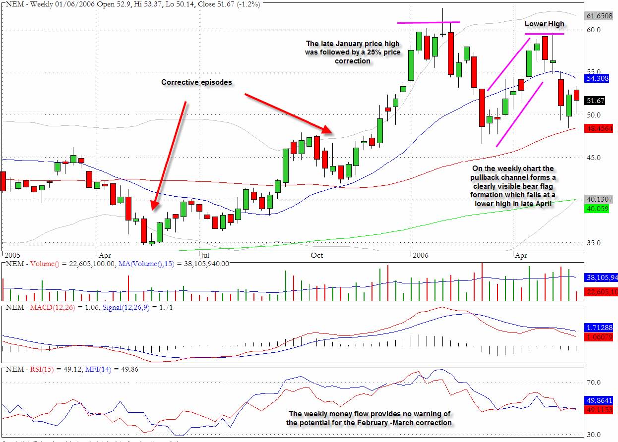
Figure 3 covers the weekly closes for Newmont Mining from January 2005 to June 2006 and shows the more obvious turning points in price development for the stock. From its low in May 2005 at around $35, NEM moved up to the $60 level in late January 2006. There was a corrective period in October 2005 but the price action following that, at the end of 2005 and throughout January of 2006, was very positive. The price topped out at the end of January when a more severe corrective episode began.
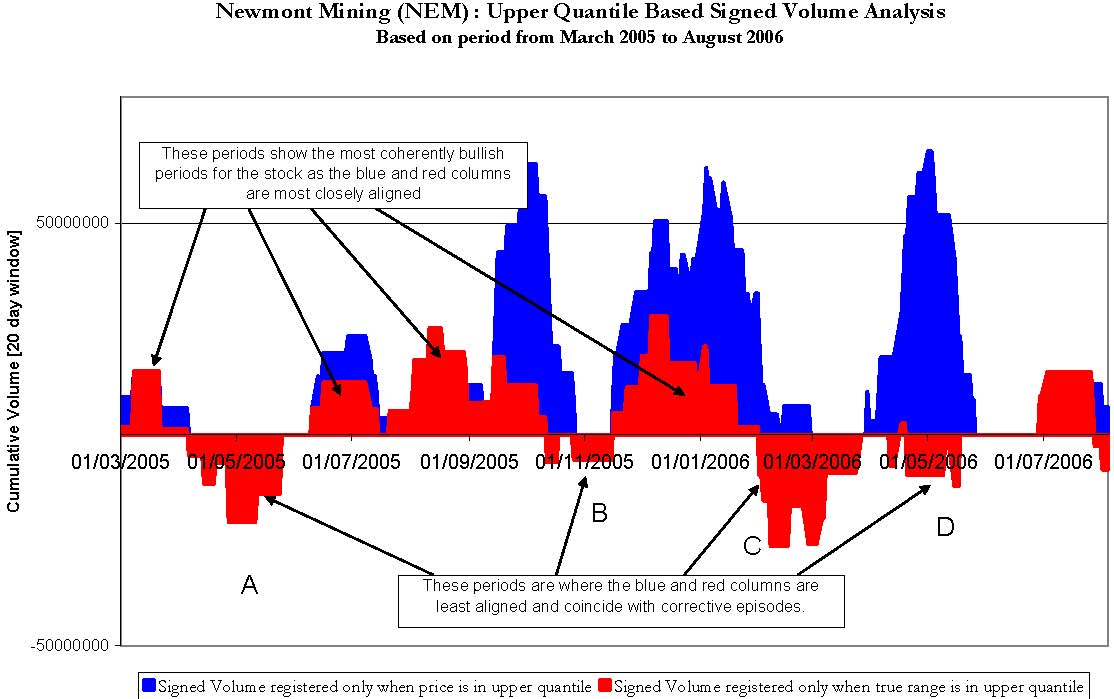
Figure 4 is the first of our quantile based diagrams and it maps the same period as the price chart covered in Figure 3. The four corrective episodes have been indicated in Figure 4 by A, B, C and D. What can be seen in Figure 4 is that where the red and blue columns are most closely aligned corresponds with the more bullish price phases for NEM, and as the red and blue columns are diverging from each other, often associated with the red columns descending below the zero line, NEM is correcting. There is a very close match between all of these points that have been arrowed in Figure 4 with the observed weakness in NEM. The May 2005 weakness at point A is clear as is the temporary setback in November 2005 marked at point B. Most critically the more serious correction that appears at the end of January (point C) is anticipated by the red columns moving below the zero line at the end of January 2006 prior to the price high which actually occurred at $61.83 on February 1st. If one had adopted the crossover below zero as a trading trigger point for a short trade one could have entered a short trade on February 1st when the closing price was $61.60 which would then have yielded a ten percent profit within the next ten trading sessions. The final corrective phase is marked at point D on Figure 4 and corresponds to the late April/early May slump and it also coincides with a substantial non-alignment of the red and blue columns.
Newmont Mining (NEM) : Upper Quantile Based Signed Volume AnalysisBased on period from March 2005 to August 2006- 50000000500000000 1/03/2005 01/05/2005 01/07/2005 01/09/2005 01/11/2005 01/01/2006 01/03/2006 01/05/2006 01/07/2006 Cumulative Volume [20 day window]Signed Volume registered only when price is in upper quantile Signed Volume registered only when true range is in upper quantileThese periods are where the blue and red columns areleast aligned and coincide with corrective episodes. These periods show the most coherently bullish periods for the stock as the blue and red columns are most closely aligned ABCD.
Let us examine what lies behind the calculations in Figure 4. The blue columns represent the volume that has been accumulated during a twenty day accumulation window only in the case where the closing price is in the upper quantile (set at the 90% level). The actual volume that is registered has a positive signed value where the volume occurred in conjunction with a strong close (i.e. above the 0.5 closing bias threshold) or a negative value when the volume occurred in connection with a weak close (i.e. below -0.5 in terms of closing bias). If the closing bias value lies between -0.5 and 0.5 then a zero volume value is recorded. Both positive and negative amounts will therefore appear in the accumulation and the sign of the net volume figure will show on balance the degree to which upper quantile price activity is conforming to strong closes. Looking at Figure 4 it is also apparent that there are several periods when there is an absence of any blue columns as the prevailing price is failing to register in the upper quantile. The red columns are constructed according to whether the true range values observed for each session are above the upper quantile value for true range (also set at the 90% level). Once again the values accumulated will tend to show whether range expansion is occurring in conjunction with strong closes or weak closes since this is the basis on which the sign value is attributed to the volume.
When the red and blue columns in Figure 4 are aligned and above the zero volume level this conveys three separate but related items of useful information
A lot of valuable information is revealed by these conjunctions and provides an assurance that the bullish price action is being well supported by other below the surface dynamics that are constructive.
Alternatively when the red and blue columns are least aligned and the red columns are moving below the zero volume line the underlying dynamics are revealing the following
Now that the overview has been established it will be helpful to drill down to a micro analysis of a key turning point for NEM which is the late January 2006 sell-off which can be clearly seen on the price chart (Figure 3) and which is also marked as point C in Figure 4.
To highlight this excellent trading opportunity on the short side we have zoomed in on the relevant time period in Figure 5 to show how the red columns were descending in a clear downward trend during January 2006 and slipped below the zero line during the last few days of January. This is in marked contrast to the behaviour during December 2005 where there is positive alignment of the two lines.
Newmont Mining (NEM) : Quantile Based Volume AnalysisFocus on divergences leading up to sell-off in February 2006-5000000050000000 01/12/2005 21/12/2005 10/01/2006 30/01/2006 19/02/2006 Cumulative Signed VolumeUpper Quantile Price based Signed Volume Upper Quantile True Range Based Signed VolumeThe red line moves below zero on February 1st 2006 after a prolonged period of alignment with the blue line in December and January
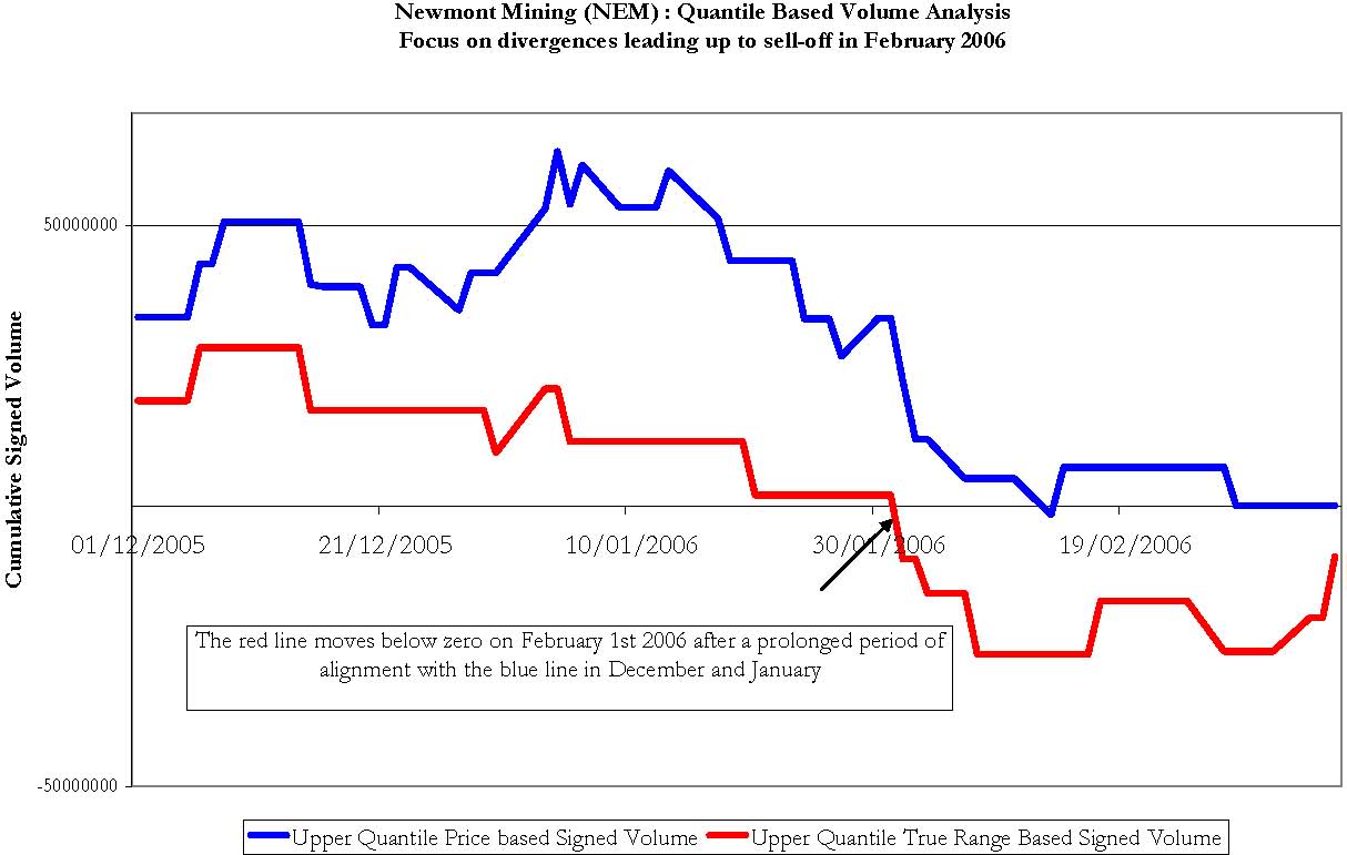
The positive alignment during December 2005 demonstrates that when range was expanding it was associated with strong closes and this was closely tracking the accumulation of positive volume based on the bullish price action. As we move through January we find that the opposite begins to emerge which is that on days when the true range values are in the upper quantile there is, on balance, more negative volume being registered which reflects the fact that the closing bias on these sessions was in the lower reaches of the session's true range. The signed volume associated with price performance in the upper quantile is still revealing that there is a bullish tone to the price development but the underlying volume and money flow dynamics are diverging. The red column drops below the zero point on the vertical axis on February 1st 2006 which coincides perfectly with the price top before the February correction which brought NEM down to $48 for more than a 20% correction.
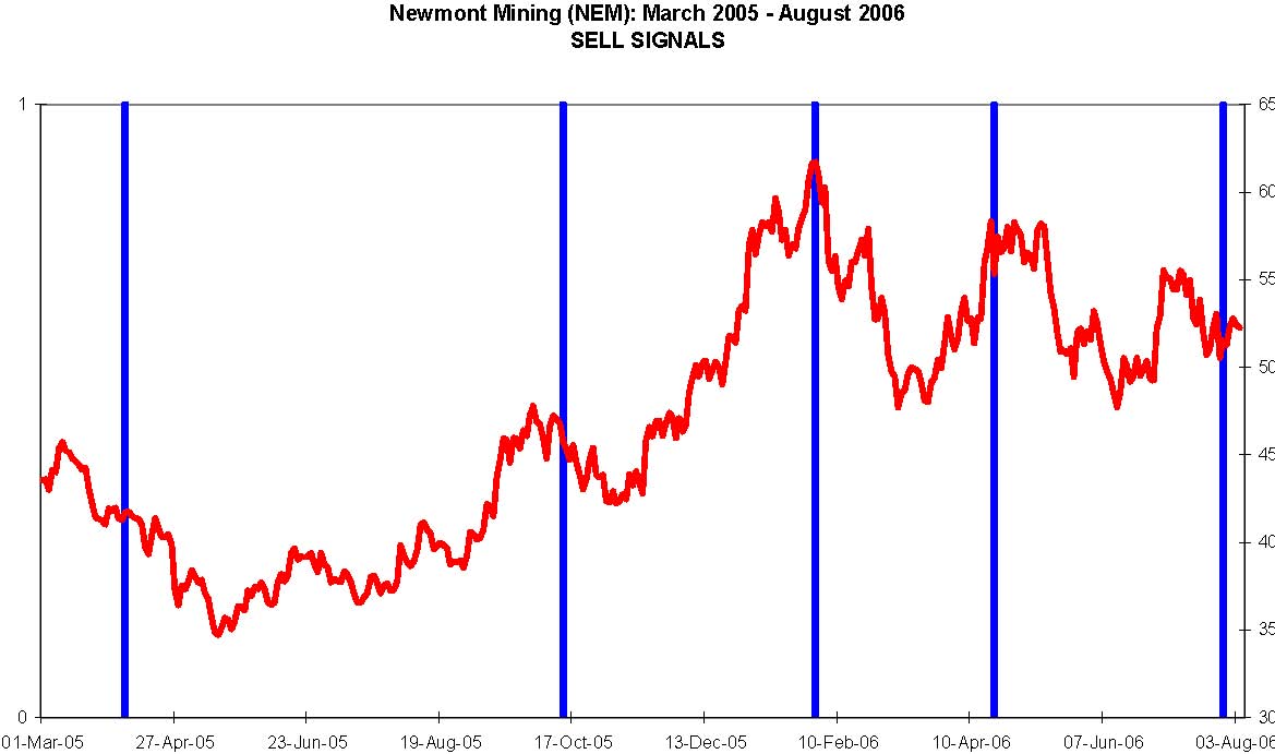
From the different scenarios that have been outlined it becomes possible to develop a framework for timing turning points and this can be more or less precisely tuned. As a very simple rule we could short NEM whenever the red columns drop below zero and the blue columns have been above zero for at least the ten previous sessions. Using this simple rule would have produced the series of sell signals which are marked in Figure 6. In each case the signal was followed by rather significant price declines and the timing of the turning points is remarkably accurate.
Newmont Mining (NEM): March 2005 - August 2006 SELL SIGNALS 01 01-Mar-05 27-Apr-05 23-Jun-05 19-Aug-05 17-Oct-05 13-Dec-05 10-Feb-06 10-Apr-06 07-Jun-06 03-Aug-06 30 35 40 45 50 55 60 65
Turning to the positive divergences it can be seen that when we track volume only when the price is in the lower quantile (set at 10%) and continue to track the signed volume when the true range is still in the upper quantile it becomes feasible to find those turning points where NEM is about to rally. First of all we shall look at the actual plot of signed volume for the above scenario.
Newmont Mining (NEM) : Lower Quantile Based Signed Volume AnalysisBased on period from March 2005 to August 2006 - 8000000020000000 01/03/2005 01/05/2005 01/07/2005 01/09/2005 01/11/2005 01/01/2006 01/03/2006 01/05/2006 01/07/2006 Cumulative Volume [20 day window] Signed Volume registered only when price is in lower quantile Signed Volume registered only when true range is in upper quantile Where the red columns are moving above zero after an extended period of being at or below zero and where the blue columns are below zero represent bullish turning points. These periods show the most coherently bearish periods for the stock as the blue and red columns are most closely aligned.
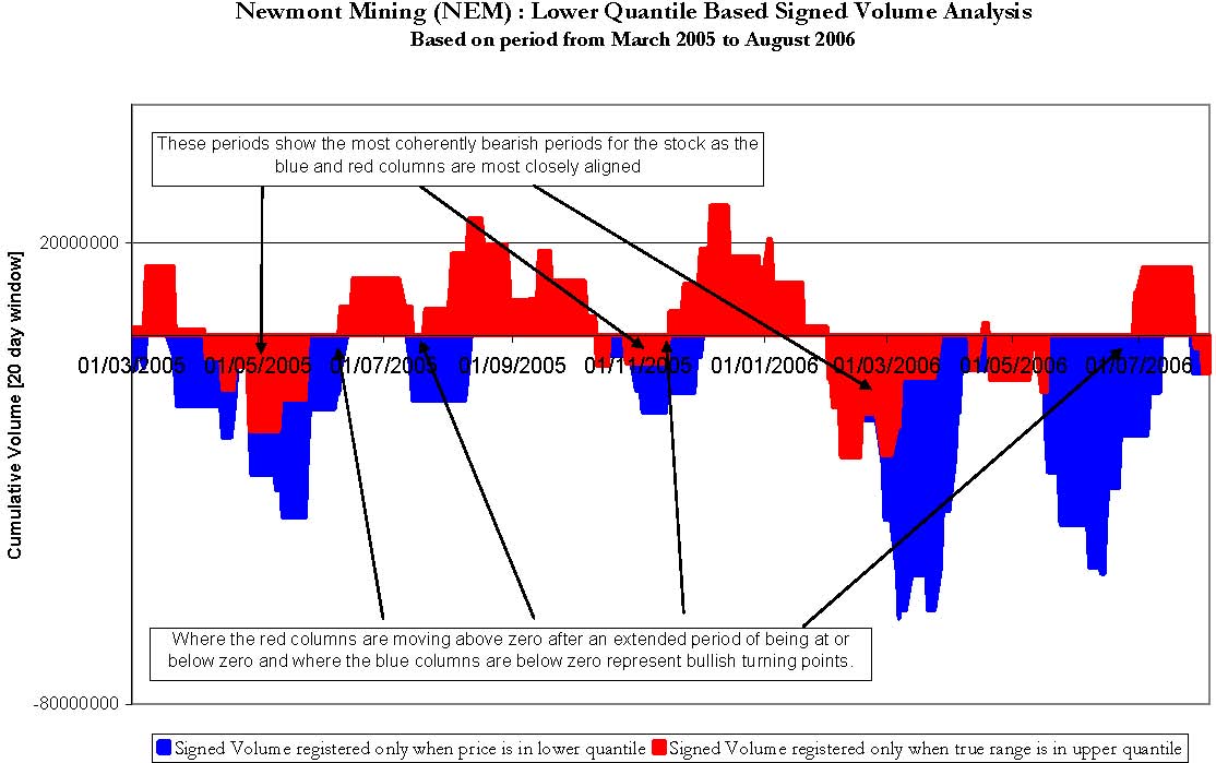
When the red and blue columns in Figure 7 are most closely aligned and below the zero volume level, this corresponds to the most coherently bearish phases of the price development for NEM. The following implicit information is conveyed in Figure 7.
Alternatively when the red and blue columns are least aligned and the red columns are moving above the zero volume line but the blue columns are lingering below the zero line the underlying dynamics are revealing the following.
If we apply the rule which is to buy when the red line moves above zero after it has been at or below zero for more than ten sessions Figure 8 shows exactly those occasions when a buy signal would have been generated.
Newmont Mining (NEM) : March 2005 - August 2006 BUY SIGNALS 01 01-Mar-05 27-Apr-05 23-Jun-05 19-Aug-05 17-Oct-05 13-Dec-05 10-Feb-06 10-Apr-06 07-Jun-06 03-Aug-06 $30$35 $40$45 $50 $55 $60 $65
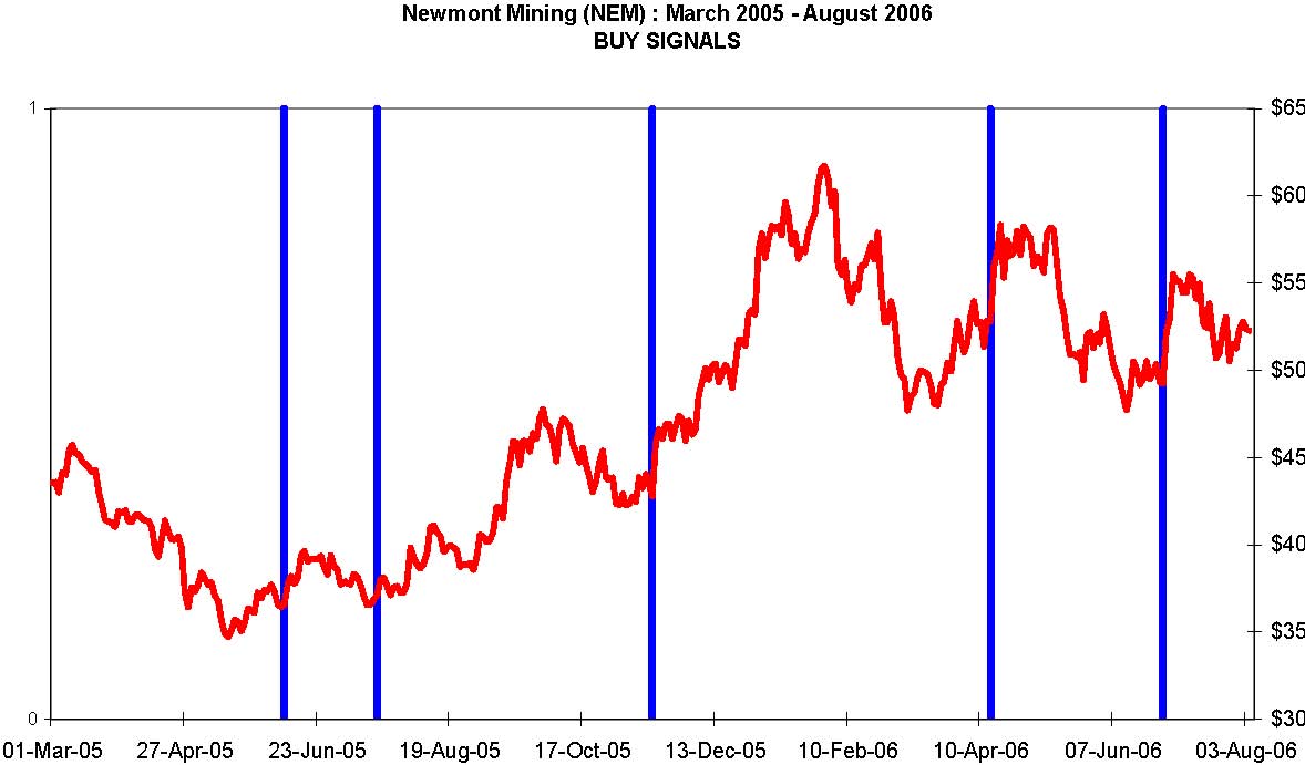
The closing price for NEM has been plotted on the right hand axis of Figure 8 and confirms that in each case the buy signal was followed by positive price action. In fact each of the key positive price moves for the period under review have been captured using the CQA money flow methodology.
The Money Flow Index(MFI)
The Money Flow Index is a volume-weighted version of the Relative Strength Index. The indicator compares the total transaction values traded on days with upward price movement to the transaction values traded on days with downward price movement.
The steps involved in calculating the Money Flow Index are:
- Decide on the time window or lookback period of interest
- Calculate the Typical Price for each of the periods i.e. (High + Low + Close) / 3
- Determine the total transaction amount or Money Flow for each period i.e. Typical Price * Volume
- Determine the Positive Money Flow amount: i.e. accumulate a Positive Money Flow amount for each of the periods, within the time window, when the Typical Price moves up from the previous value
- Determine the Negative Money Flow amount: i.e. accumulate a Negative Money Flow amount for each of the periods, within the time window, when the Typical Price moves down from the previous value
- Determine the Money Flow Ratio: i.e. Positive Money Flow / Negative Money Flow
- Determine the Money Flow Index: i.e. 100 - 100 / (1 + Money Flow Ratio)
MFI is most valuable when a security is in a relatively quiet phase of volume and price development. This can best be illustrated with the following example, which proved to be highly profitable, and which arose for Martha Stewart Living (MSO) in late August 2005. The setup for the trade is displayed in Figure 1. Notice especially the price congestion during most of August 2005 in which price activity was confined to a very narrow range between $26 and $27. During this period of price stagnation there is clear evidence of accumulation taking place in the MFI chart segment below the price chart. Also noticeable is the manner in which the steepness of the MFI slope stands in contrast to the much gentler slope of the RSI slope. On August 25th the stock broke out on heavy volume and over the next four sessions moved from $26 to $34.
It is the dissonance or divergence that is revealing and which provides short term trading cues. The pattern can provide us with the foundations for a reliable template or pattern recognition algorithm using the MFI. When price has been trading within a very narrow range for several periods but there is unmistakable evidence of positive money flow indicating accumulation, be prepared for a potentially major price breakout. This is essentially a short term pattern in that one is not monitoring for any longer term evidence of accumulation but rather looking for a trading opportunity that should arise typically within a ten to twenty day period. In the case of MSO the trader who had observed the unusually positive MFI prior to the breakout on the 25th could have achieved a 25% return within four trading sessions.

Another example of a very similar setup can be seen in the chart for AMGN (Figure 2) at the end of June 2005.

There is again evidence of accumulation during the month of June 2005 as highlighted in the steepening slope of the MFI especially visible during the second half of June. Also very noticeable in Figure 2 is the fact that the stock moved sideways within a very narrow range for the remainder of the month of June. All three exponential moving averages, the 20, 50 and 200 day EMA's, had converged at or close to the $60 price level. When reviewing longer term charts for AMGN it can be seen that this price level has proven to be fairly pivotal for the stock historically and certain institutions will have specific filters and screens set up to take a closer look at a stock that is trading at an area of important chart support. Also significant perhaps is that the period under review in the chart coincides with the end of the second calendar quarter, which is a period during which portfolio managers are overhauling their holdings and often engaging in some new acquisitions and portfolio cosmetics. The fact that there was little day to day volatility during this period suggests that the stock was probably not featuring as a priority for many day trading desks and it is precisely this relative calmness of this period of trading that is the hallmark of the pattern we have found to be so useful.
On July 5th, following a long holiday weekend the stock broke out from the period of price congestion with a 2.7% upward move to $62.51. This was then followed by a series of further upward moves including the major upwards gap on July 20th which enabled the stock to close above $80 representing a 33% advance from the price breakout at the beginning of July. There is a revealing dissimilarity between this chart and the one for MSO that we previously examined which in some ways would have made the AMGN opportunity more attractive. As can be seen from Figure 2, the price breakout for AMGN was less abrupt and traders that understood the dynamics that had lead to the July 5th upward move still had plenty of opportunity to climb aboard for the substantial short term profits that were to be realized within three weeks.
In each of the examples there is one key factor that becomes evident upon closer inspection of the charts which is the fact that in each case the price action is subdued just prior to the breakout and yet there is a very noticeable increase in the MFI values. An additional, not mandatory, requirement for the pattern is that the price has entered a zone where it is close to one or more of its key moving averages or an area of previous chart support. This suggests that the optimal circumstances for using the MFI indicator is in what we would call quiet markets. When a stock is thrusting or experiencing strong trend days there are too many dynamics at work for a meaningful segregation of the up volume and the down volume. So how can the value of a money flow based analysis be salvaged for more volatile trading conditions? The approach that is proposed here is based on the notion that we adopt a selective screening process to the actual data that we examine in terms of our segregation of positive and negative volume sessions. This can be achieved using a technique of comparative quantiles analysis.
Money Flow Based on Comparative Quantiles Analysis (CQA)
The term quantile is a generic term from statistics and the best way to explain it is to look at a specific example of a quantile - the median value of a price series. To take a simple example if we have 101 closing prices in a data series and we rank them from lowest to highest, the exact mid point of the ranking (i.e. the 51st closing price) will have be the median value. The median value implicitly requires a ranking of the data unlike the mean value which simply sums the values and divides by the number of values. Unlike a moving average a quantile approach requires a continual ranking of price data and then selecting the value that lie on the boundary of the percentile or quantile that one wishes to focus on. One of the main advantages of the median is that it is less sensitive to the inclusion of outliers.
The first intuition at this stage to help explain the CQA approach is to introduce the notion that quantile values can be extracted from two different but related sets of data points such as closing price and volume from a particular stock's history. When we use a moving time window approach where we look back at (say) the previous 20 data points for that specific series, we can then determine whether the current data point is above the quantile threshold, below it, or possibly equal to the specified quantile value. As soon as that marker has been established many different realms of analysis become possible such as a comparison between what may be happening in the upper quantile with respect to price but the lower quantile with respect to volume or the range for the session. It is for this reason that we call the methodology comparative quantiles analysis (CQA). Before we can properly introduce the methodology we need to take care of some preliminary issues and define some key terminology including the true range, closing position with the true range, signed volume and accumulation windows.
True Range
The True Range is expressed quite simply as the greater value of the following:
- The current high less the current low.
- The absolute value of the current high less the previous close.
- The absolute value of the current low less the previous close.
It is worth tracking this value in all trading sessions and then one can derive an average true range value for a specified look-back period or window.
Closing Position Bias
The closing difference is the difference between the closing price for the current session and the closing price for the previous session. It will be a signed value depending on whether the stock gained or declined relative to its previous price. The closing position bias is simply the signed closing difference divided by the true range and reflects where the current closing price is in relation to the range of trading as delimited by the most recent two sessions. If the value is +1 then the stock closed up from the previous session and at the high for the day, if the value is -1 then the stock closed down for the day and at the low for the day. Intermediate values provide a useful barometer of the "strength" of the close. To take another instance a value of 0.5 would indicate that the closing price was above the previous close and is to be found at a level equivalent to the point three quarters of the true range whereas a value of -0.5 would suggest that the close was at a point below the previous close and at one quarter of the true range.
Signed Transaction Volume
The sign value attributed to the volume (i.e. whether it is positive or negative) depends on whether the closing bias is above or below certain thresholds. Our normal procedure is to set the threshold for attaching a negative sign to the volume at values for the closing bias which are less than -.0.5 since the stock not only closed down but also in its lower quartile (i.e. the 25 percentile value) with respect to its intraday range. The upper threshold for qualifying as a positive volume session can then be set where the closing bias is above 0.5
which shows not only that the stock closed up but was also in the upper quartile of its true range. There will then be an intermediate zone that approximately corresponds to the middle quartiles for closing bias that can either be considered to have a neutral volume sign or a zero value which effectively means that they do not register in any accumulation.
The next issue relates to what should be the actual value to accumulate within the positive and negative camps. As we have seen the value which is used in the Money Flow Index, is determined by multiplying the session's volume by the typical price for the session. In our own calculations we have found that the following value has proven to be most useful in indicating turning points: Closing Price x Signed Volume (which can be zero) * True Range for the session (in dollar terms). By including the true range value the signed volume that is used in the CQA methodology takes on a weighting that is commensurate with the degree of intraday price movement.
Accumulation Window
This term is used frequently in the CQA methodology and specifically in regard to the money flow analysis it represents the period during which the signed transaction volume is to be accumulated. In the case of the co-occurrences between events in different quantiles it is similar to the above but enables us to count the number of occasions on which events
registered in the designated quantile for one variable overlap with those for a second variable's quantile.
Case Study - Newmont Mining (NEM)
To demonstrate the features of the quantile based approach to volume analysis and highlight the manner in which it allows us to anticipate price turning points, both positive and negative, we will examine the gold mining stock Newmont Mining (NEM).

Figure 3 covers the weekly closes for Newmont Mining from January 2005 to June 2006 and shows the more obvious turning points in price development for the stock. From its low in May 2005 at around $35, NEM moved up to the $60 level in late January 2006. There was a corrective period in October 2005 but the price action following that, at the end of 2005 and throughout January of 2006, was very positive. The price topped out at the end of January when a more severe corrective episode began.

Figure 4 is the first of our quantile based diagrams and it maps the same period as the price chart covered in Figure 3. The four corrective episodes have been indicated in Figure 4 by A, B, C and D. What can be seen in Figure 4 is that where the red and blue columns are most closely aligned corresponds with the more bullish price phases for NEM, and as the red and blue columns are diverging from each other, often associated with the red columns descending below the zero line, NEM is correcting. There is a very close match between all of these points that have been arrowed in Figure 4 with the observed weakness in NEM. The May 2005 weakness at point A is clear as is the temporary setback in November 2005 marked at point B. Most critically the more serious correction that appears at the end of January (point C) is anticipated by the red columns moving below the zero line at the end of January 2006 prior to the price high which actually occurred at $61.83 on February 1st. If one had adopted the crossover below zero as a trading trigger point for a short trade one could have entered a short trade on February 1st when the closing price was $61.60 which would then have yielded a ten percent profit within the next ten trading sessions. The final corrective phase is marked at point D on Figure 4 and corresponds to the late April/early May slump and it also coincides with a substantial non-alignment of the red and blue columns.
Newmont Mining (NEM) : Upper Quantile Based Signed Volume AnalysisBased on period from March 2005 to August 2006- 50000000500000000 1/03/2005 01/05/2005 01/07/2005 01/09/2005 01/11/2005 01/01/2006 01/03/2006 01/05/2006 01/07/2006 Cumulative Volume [20 day window]Signed Volume registered only when price is in upper quantile Signed Volume registered only when true range is in upper quantileThese periods are where the blue and red columns areleast aligned and coincide with corrective episodes. These periods show the most coherently bullish periods for the stock as the blue and red columns are most closely aligned ABCD.
Let us examine what lies behind the calculations in Figure 4. The blue columns represent the volume that has been accumulated during a twenty day accumulation window only in the case where the closing price is in the upper quantile (set at the 90% level). The actual volume that is registered has a positive signed value where the volume occurred in conjunction with a strong close (i.e. above the 0.5 closing bias threshold) or a negative value when the volume occurred in connection with a weak close (i.e. below -0.5 in terms of closing bias). If the closing bias value lies between -0.5 and 0.5 then a zero volume value is recorded. Both positive and negative amounts will therefore appear in the accumulation and the sign of the net volume figure will show on balance the degree to which upper quantile price activity is conforming to strong closes. Looking at Figure 4 it is also apparent that there are several periods when there is an absence of any blue columns as the prevailing price is failing to register in the upper quantile. The red columns are constructed according to whether the true range values observed for each session are above the upper quantile value for true range (also set at the 90% level). Once again the values accumulated will tend to show whether range expansion is occurring in conjunction with strong closes or weak closes since this is the basis on which the sign value is attributed to the volume.
When the red and blue columns in Figure 4 are aligned and above the zero volume level this conveys three separate but related items of useful information
- The closing price is behaving relatively well (i.e. in the upper quartile of its recent performance).
- The closing position bias is relatively strong (i.e. the closes are in the top quarter of the daily range).
- The expansion of range is, on balance, associated with strong closes.
A lot of valuable information is revealed by these conjunctions and provides an assurance that the bullish price action is being well supported by other below the surface dynamics that are constructive.
Alternatively when the red and blue columns are least aligned and the red columns are moving below the zero volume line the underlying dynamics are revealing the following
- The closes are relatively weak which is causing more negative volume to be accumulated than positive volume.
- The range expansion is, on balance, being associated with weak closes where the position of the close is near the bottom of the daily range.
- If there are no blue columns this shows that price has been performing poorly for at least the number of sessions in the accumulation window.
Now that the overview has been established it will be helpful to drill down to a micro analysis of a key turning point for NEM which is the late January 2006 sell-off which can be clearly seen on the price chart (Figure 3) and which is also marked as point C in Figure 4.
To highlight this excellent trading opportunity on the short side we have zoomed in on the relevant time period in Figure 5 to show how the red columns were descending in a clear downward trend during January 2006 and slipped below the zero line during the last few days of January. This is in marked contrast to the behaviour during December 2005 where there is positive alignment of the two lines.
Newmont Mining (NEM) : Quantile Based Volume AnalysisFocus on divergences leading up to sell-off in February 2006-5000000050000000 01/12/2005 21/12/2005 10/01/2006 30/01/2006 19/02/2006 Cumulative Signed VolumeUpper Quantile Price based Signed Volume Upper Quantile True Range Based Signed VolumeThe red line moves below zero on February 1st 2006 after a prolonged period of alignment with the blue line in December and January

The positive alignment during December 2005 demonstrates that when range was expanding it was associated with strong closes and this was closely tracking the accumulation of positive volume based on the bullish price action. As we move through January we find that the opposite begins to emerge which is that on days when the true range values are in the upper quantile there is, on balance, more negative volume being registered which reflects the fact that the closing bias on these sessions was in the lower reaches of the session's true range. The signed volume associated with price performance in the upper quantile is still revealing that there is a bullish tone to the price development but the underlying volume and money flow dynamics are diverging. The red column drops below the zero point on the vertical axis on February 1st 2006 which coincides perfectly with the price top before the February correction which brought NEM down to $48 for more than a 20% correction.
From the different scenarios that have been outlined it becomes possible to develop a framework for timing turning points and this can be more or less precisely tuned. As a very simple rule we could short NEM whenever the red columns drop below zero and the blue columns have been above zero for at least the ten previous sessions. Using this simple rule would have produced the series of sell signals which are marked in Figure 6. In each case the signal was followed by rather significant price declines and the timing of the turning points is remarkably accurate.
Newmont Mining (NEM): March 2005 - August 2006 SELL SIGNALS 01 01-Mar-05 27-Apr-05 23-Jun-05 19-Aug-05 17-Oct-05 13-Dec-05 10-Feb-06 10-Apr-06 07-Jun-06 03-Aug-06 30 35 40 45 50 55 60 65

Turning to the positive divergences it can be seen that when we track volume only when the price is in the lower quantile (set at 10%) and continue to track the signed volume when the true range is still in the upper quantile it becomes feasible to find those turning points where NEM is about to rally. First of all we shall look at the actual plot of signed volume for the above scenario.
Newmont Mining (NEM) : Lower Quantile Based Signed Volume AnalysisBased on period from March 2005 to August 2006 - 8000000020000000 01/03/2005 01/05/2005 01/07/2005 01/09/2005 01/11/2005 01/01/2006 01/03/2006 01/05/2006 01/07/2006 Cumulative Volume [20 day window] Signed Volume registered only when price is in lower quantile Signed Volume registered only when true range is in upper quantile Where the red columns are moving above zero after an extended period of being at or below zero and where the blue columns are below zero represent bullish turning points. These periods show the most coherently bearish periods for the stock as the blue and red columns are most closely aligned.

When the red and blue columns in Figure 7 are most closely aligned and below the zero volume level, this corresponds to the most coherently bearish phases of the price development for NEM. The following implicit information is conveyed in Figure 7.
- When the blue columns are below zero this is indicating that the closing price is relatively weak (i.e. in the lower quantile of its recent performance). Since the signed volume is below zero it is also indicating that these lower quantile closes are also associated with poor closing bias in the sense that the close is near to the bottom of the daily range.
- If the red columns are below zero this is also pointing to the fact that expansion of range is, on balance, associated with a weak closing bias.
Alternatively when the red and blue columns are least aligned and the red columns are moving above the zero volume line but the blue columns are lingering below the zero line the underlying dynamics are revealing the following.
- The price closes are relatively weak which is causing more negative volume to be accumulated than positive volume.
- The range expansion is, on balance, being associated with stronger closes where the position of the close is nearer to the top of the daily range.
If we apply the rule which is to buy when the red line moves above zero after it has been at or below zero for more than ten sessions Figure 8 shows exactly those occasions when a buy signal would have been generated.
Newmont Mining (NEM) : March 2005 - August 2006 BUY SIGNALS 01 01-Mar-05 27-Apr-05 23-Jun-05 19-Aug-05 17-Oct-05 13-Dec-05 10-Feb-06 10-Apr-06 07-Jun-06 03-Aug-06 $30$35 $40$45 $50 $55 $60 $65

The closing price for NEM has been plotted on the right hand axis of Figure 8 and confirms that in each case the buy signal was followed by positive price action. In fact each of the key positive price moves for the period under review have been captured using the CQA money flow methodology.
Last edited by a moderator:
