There are many reasons why I enjoy teaching students how to trade the financial markets of the world, ranging from the satisfaction I obviously get from helping others, to knowing that I am helping people to protect the capital they worked so hard for in the first place, and also when I discover something new for myself! That's right; I also learn new things not only from my students, but also from researching and explaining ideas and topics in the teaching environment. This very week I have been teaching and have been focusing on the most effective way to screen for equities to swing and position trade. I was showing the guys in the classroom how to use a great website called Finviz to screen for their stocks to trade, when I noticed in the corner of the homepage that there was a section on Forex. Clicking on the link brings you to a page like this:
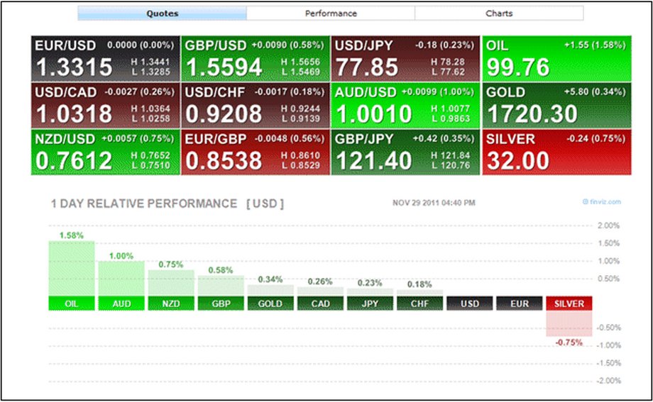
Figure 1
While this "Heat Map" above of currencies only focuses on the major US Dollar pairings, it struck me immediately as a way to gauge strength or weakness across the board for major currency pairs like EURUSD, GBPUSD, and the like. If you have not seen a heat map like this before, they have been typically used for equities trading, which can sometimes be a minefield for the novice trader when they are attempting to find a suitable stock to trade. Remember that while there are literally hundreds of stocks one has to choose from, we also have individual sectors and industries to choose from, too. The smart trader will use a tool such as a heat map to identify the strongest and weakest sectors and industries and find the best stocks to trade within these, so as to increase his or her odds for success. When we were checking out the Finviz heat map during class and I saw the Forex section on the site at the top of the page, I thought to myself that there was really no reason why the professional and disciplined Forex trader couldn't use a heat map in pretty much the same way for their trading as well.
The above example shows us a selection of the biggest gainers and losers on the trading day in the blocks, and below, we can see a relative strength chart of various currencies, plus gold and silver, against the US Dollar. This is for one day performance only, but what about if we looked at a bigger skew of data? Below, I have taken a shot of a half-year's relative strength analysis for the majors:
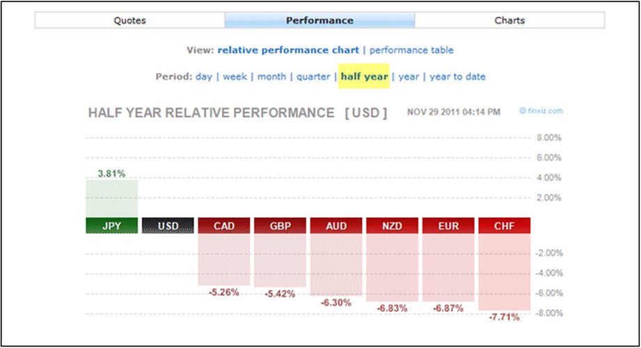
Figure 2
Looking to the above data for hints towards ideal speculative opportunities, we can objectively deduce what may or may not be an ideal play to take in the currency markets when scanning for trades. Considering the above analysis, we have a selection of the major currencies and how they have been performing against the Dollar. We can see that over the last 6 months, at one end, the Japanese Yen has shown the most consistent levels of strength, followed by, to a much lesser extent, the Canadian Dollar. In turn, and at the other end of the scale, are the likes of the New Zealand Dollar, Euro and the Swiss Franc. With this in mind, we can then use this in conjunction with our supply and demand levels to find trades which may or may not produce the better profit margins. Below, we can see a chart of the US Dollar Index hitting a demand zone a little while back in late October:
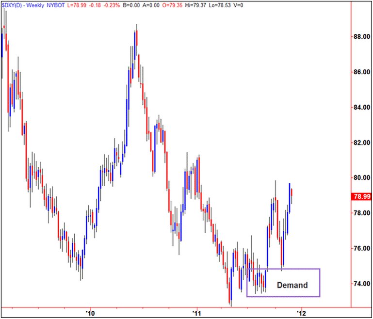
Figure 3
Around this time, a good play would have been to be a buyer of the Dollar against other currencies, but the question, is which ones? Taking into account that the Yen has been impressively strong, we should not consider this pair as the chart below shows that the USDJPY did rally, but failed to make new highs:
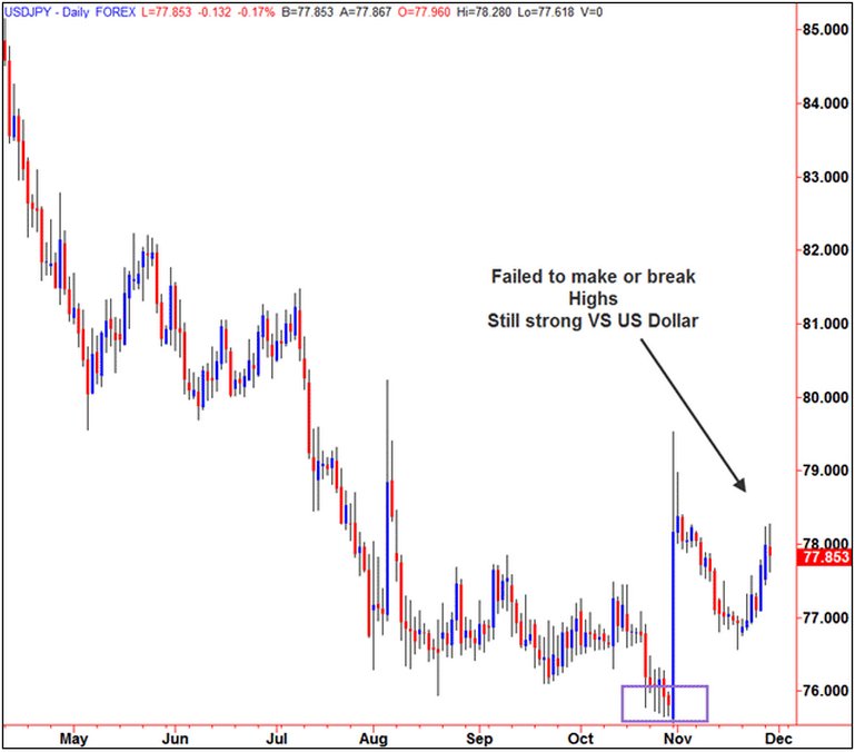
Figure 4
At the same time, the strength of the Canadian Dollar also produced a move when it hit demand around the same time, but like the USDJPY, also failed to follow-through to make new highs, but did, however, produce a good trade:
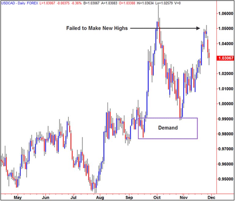
Figure 5
Finally, let's take a look at the relatively weaker NZDUSD and how that compared against the US Dollar, remembering that across the last 6 months, it has been on the lower end of the relative strength scale:
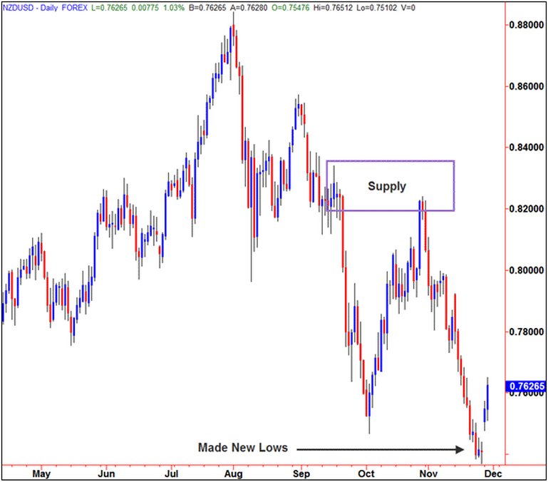
Figure 6
As we can see, the NZDUSD also rallied into supply, but unlike the other stronger currencies, it did go on to make new lows against the Greenback, which was hinted at by our relative strength data from the heat map. Considering this result, I would feel that the odds would be in my favour for a better risk to reward profile on a pair like this if it was to continue its relative weakness in the months and weeks to come.
It should be noted that while there really is no one single leading indicator of what's to come in trading, using simple deductive analysis can always help the disciplined trader if they use the information in the right way. It was obvious that taking a short against the Yen was probably not the best play due to the half year strength of the Yen, but that we also had better odds by instead shorting the Kiwi Dollar due to its apparent weakness over the last 6 month period. As a rule-based trader, I will always look for specific entries and targets in any of my trades, but I know that on the occasion when I get the chance to stack a few more odds for success in my favor, I should take them if I can. I hope this was useful.
Sam Evans can be contacted by email at Sam Evans
Figure 1
While this "Heat Map" above of currencies only focuses on the major US Dollar pairings, it struck me immediately as a way to gauge strength or weakness across the board for major currency pairs like EURUSD, GBPUSD, and the like. If you have not seen a heat map like this before, they have been typically used for equities trading, which can sometimes be a minefield for the novice trader when they are attempting to find a suitable stock to trade. Remember that while there are literally hundreds of stocks one has to choose from, we also have individual sectors and industries to choose from, too. The smart trader will use a tool such as a heat map to identify the strongest and weakest sectors and industries and find the best stocks to trade within these, so as to increase his or her odds for success. When we were checking out the Finviz heat map during class and I saw the Forex section on the site at the top of the page, I thought to myself that there was really no reason why the professional and disciplined Forex trader couldn't use a heat map in pretty much the same way for their trading as well.
The above example shows us a selection of the biggest gainers and losers on the trading day in the blocks, and below, we can see a relative strength chart of various currencies, plus gold and silver, against the US Dollar. This is for one day performance only, but what about if we looked at a bigger skew of data? Below, I have taken a shot of a half-year's relative strength analysis for the majors:
Figure 2
Looking to the above data for hints towards ideal speculative opportunities, we can objectively deduce what may or may not be an ideal play to take in the currency markets when scanning for trades. Considering the above analysis, we have a selection of the major currencies and how they have been performing against the Dollar. We can see that over the last 6 months, at one end, the Japanese Yen has shown the most consistent levels of strength, followed by, to a much lesser extent, the Canadian Dollar. In turn, and at the other end of the scale, are the likes of the New Zealand Dollar, Euro and the Swiss Franc. With this in mind, we can then use this in conjunction with our supply and demand levels to find trades which may or may not produce the better profit margins. Below, we can see a chart of the US Dollar Index hitting a demand zone a little while back in late October:
Figure 3
Around this time, a good play would have been to be a buyer of the Dollar against other currencies, but the question, is which ones? Taking into account that the Yen has been impressively strong, we should not consider this pair as the chart below shows that the USDJPY did rally, but failed to make new highs:
Figure 4
At the same time, the strength of the Canadian Dollar also produced a move when it hit demand around the same time, but like the USDJPY, also failed to follow-through to make new highs, but did, however, produce a good trade:
Figure 5
Finally, let's take a look at the relatively weaker NZDUSD and how that compared against the US Dollar, remembering that across the last 6 months, it has been on the lower end of the relative strength scale:
Figure 6
As we can see, the NZDUSD also rallied into supply, but unlike the other stronger currencies, it did go on to make new lows against the Greenback, which was hinted at by our relative strength data from the heat map. Considering this result, I would feel that the odds would be in my favour for a better risk to reward profile on a pair like this if it was to continue its relative weakness in the months and weeks to come.
It should be noted that while there really is no one single leading indicator of what's to come in trading, using simple deductive analysis can always help the disciplined trader if they use the information in the right way. It was obvious that taking a short against the Yen was probably not the best play due to the half year strength of the Yen, but that we also had better odds by instead shorting the Kiwi Dollar due to its apparent weakness over the last 6 month period. As a rule-based trader, I will always look for specific entries and targets in any of my trades, but I know that on the occasion when I get the chance to stack a few more odds for success in my favor, I should take them if I can. I hope this was useful.
Sam Evans can be contacted by email at Sam Evans
Last edited by a moderator: