Stan Weinstein's Stage Analysis

UK Sectors

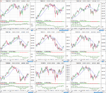
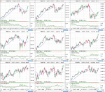
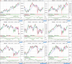
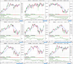
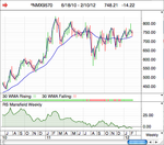
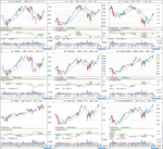
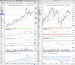
As we were talking about UK sectors I thought I'd post the latest Weinstein style charts for stage analysis.
 

Attachments

  • UK_Sectors_List_10_2_12.png
    UK_Sectors_List_10_2_12.png
    92.6 KB · Views: 363
  • UK_Sectors_1_10_2_12.png
    UK_Sectors_1_10_2_12.png
    106.1 KB · Views: 367
  • UK_Sectors_2_10_2_12.png
    UK_Sectors_2_10_2_12.png
    106.1 KB · Views: 353
  • UK_Sectors_3_10_2_12.png
    UK_Sectors_3_10_2_12.png
    109 KB · Views: 343
  • UK_Sectors_4_10_2_12.png
    UK_Sectors_4_10_2_12.png
    104.5 KB · Views: 334
  • UK_Sectors_5_10_2_12.png
    UK_Sectors_5_10_2_12.png
    15.2 KB · Views: 316
Last edited:
cheers isatrader, that was a big help. I've decided to get pro real time, so just playing around with it now to see how it works. i don't suppose you have to hand the ticker symbols for the US sectors? not sure if you have posted before or not.
 
cheers isatrader, that was a big help. I've decided to get pro real time, so just playing around with it now to see how it works. i don't suppose you have to hand the ticker symbols for the US sectors? not sure if you have posted before or not.

Stockcharts has the US sectors listed and I'm not sure if it's the same in ProRealTime as most of the programs use different tickers when it comes to sectors. Do a search in Stockcharts for just the dollar symbol "$" or use this link StockCharts.com - Free Charts - Symbol Search and then scroll down to $DJUSAE Dow Jones US Aerospace & Defense Index. There's a 160 or so sectors listed alphabetically under that.
 
Apple's (AAPL) hit my measured move target of $499 in the pre-market trading from the 18th Jan post http://www.trade2win.com/boards/tec...weinsteins-stage-analysis-29.html#post1769334

So I'm moving to neutral on Apple for the time being as my price objective has been achieved and the probability is increased of it consolidating around the 500 level for a while. That doesn't mean I don't think it will or could go higher in the medium term, but just that my short term target has been met.
 
Last edited:
I think Apple made a Big Reverseal.... althoug is still so bullish....... that they are no big signals of weakness. I think that Apple should take a break........ and i dont see it going towards 700 with no rest....... or decline toward 420 or a bit lower.
 
Attached is the latest US Industry sectors. Technology (XLK) continues to lead in Stage 2 and Consumer Discretionary (XLY) stocks are still the next strongest in Stage 2 and are continuing to make new highs. Consumer Staples (XLP) has turned around the last three weeks after consolidating around the Stage 2 breakout level for all of January.

As a whole the sectors picture is looking more positive though, with even the worst sectors in Stage 1 now, and almost half of the sectors in either early Stage 2A or breaking out to new highs in Stage 2.
 

Attachments

  • US_Industry_Sectors_17_2_12.png
    US_Industry_Sectors_17_2_12.png
    123.4 KB · Views: 264
isatrader, over the last week or so I have been using pro real time to analyse uk stocks as you suggested, and it is making a lot more sense now and i feel a lot more confident in being able to pick some good winners. however, my question in relation to uk stocks, is do you think that volume confirmation is as important as it would be for us stocks? the reason i ask this, is looking back on some of the charts, ones that have had a 400%+ gain in little over a year, did not have any significant increase in volume. now obviously, i would say that if the volume confirmation is there, then thats even better, but do you think when dealing with uk stocks, it would still be ok to buy without that confirmation or is that a no no?
 
isatrader, over the last week or so I have been using pro real time to analyse uk stocks as you suggested, and it is making a lot more sense now and i feel a lot more confident in being able to pick some good winners. however, my question in relation to uk stocks, is do you think that volume confirmation is as important as it would be for us stocks? the reason i ask this, is looking back on some of the charts, ones that have had a 400%+ gain in little over a year, did not have any significant increase in volume. now obviously, i would say that if the volume confirmation is there, then thats even better, but do you think when dealing with uk stocks, it would still be ok to buy without that confirmation or is that a no no?

I had a similar chat about the volume confirmation recently on email with another trader. If you go to pages 103-108 in the book and re-read that section you'll see that the volume confirmation he talks about isn't usually present until the stock breaks out. There is an ideal volume chart on page 104, and if you cover up the portion of the chart from the breakout onwards, you'll see that the volume increase isn't present before the breakout at all. So although a hugely important part of the method, it's not something that is visible until after the breakout. So the idea is if the volume doesn't increase in a meaningful way then it's less likely to become one of the exceptional winners and has more risk of being a false breakout, so he suggests taking a quick profit and looking for another stock instead. Very few stocks get the large increase in volume and become exceptional winners, but the idea is to position yourself accordingly so that you can catch them when they do occur.

As for UK stocks, volume is harder to gauge as they are much less liquid than US stocks and even stocks in the FTSE 350 can be very thinly traded. So I find the volume aspect harder to read in UK stocks. This is one reason why I've chosen to focus my portfolio on large cap US stocks in the S&P 500 as the volume is significantly larger and they are all very liquid. I do trade UK stocks and currently am in Rolls Royce since November, but am mostly in US stocks and currencies at the moment. theblackmamba focuses on the UK stocks, so maybe send him a private message as we've talked about a lot of these issues at length on email.
 
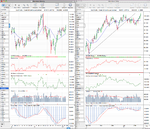
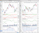
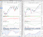
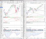
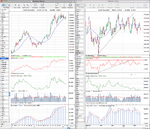
Attached is the updated major charts for analysis. The US 30 year Treasuries is the key one for me to watch as the price is sitting exactly on the 30 week weighted moving average after a fairly lengthy consolidation period since the September 11 high. I'm rating it Stage 2B- now as it's right on the cusp of becoming Stage 3A if it breaks down and closes below the $140 level or it could pivot on the moving average and breakout into a continuation move. However, it's given a few more negative signs on the weekly chart as the Mansfield relative strength has crossed into negative territory this week and the cumulative volume has moved below it's moving average for the first time since it crossed above it in March 2011 indicating that volume is beginning to slowly leave the 30 year Treasuries. Finally relative performance versus the S&P 500 has given a negative signal by moving below it's October low.

Crude Oil is another interesting chart and I'm rating it Stage 1B now following last weeks price action.
 

Attachments

  • CL_weekly_17_2_12.png
    CL_weekly_17_2_12.png
    128.5 KB · Views: 367
  • HG_weekly_17_2_12.png
    HG_weekly_17_2_12.png
    132.2 KB · Views: 313
  • GC_weekly_17_2_12.png
    GC_weekly_17_2_12.png
    125.4 KB · Views: 354
  • NDX_weekly_17_2_12.png
    NDX_weekly_17_2_12.png
    126 KB · Views: 346
  • SPX_weekly_17_2_12.png
    SPX_weekly_17_2_12.png
    126.1 KB · Views: 329
  • US_30yr_Treasuries_17_2_12.png
    US_30yr_Treasuries_17_2_12.png
    131.6 KB · Views: 351
  • TY_10yr_Treasuries_17_2_12.png
    TY_10yr_Treasuries_17_2_12.png
    131.4 KB · Views: 342
  • DX_Dollar_Index_17_2_12.png
    DX_Dollar_Index_17_2_12.png
    122.5 KB · Views: 336
...Crude Oil is another interesting chart and I'm rating it Stage 1B now following last weeks price action.
isa, Crude shows a problem with Weinstein system on very well publicised instruments, I think, that when the world is very bullish on something, the chart looks too perfect, and money looks easy, there is suspicion of being suckered in. http://tinyurl.com/77rfpbx
Assuming it (and USO) fully break next week, it does not have an "investor" feel to it, I think.

(P.S. USO is a weak CL tracker ETF, but is what many people will buy, rather than CL. http://tinyurl.com/7wq2po8 )
 
Last edited:
isa, Crude shows a problem with Weinstein system on very well publicised instruments, I think, that when the world is very bullish on something, the chart looks too perfect, and money looks easy, there is suspicion of being suckered in. CLJ12 | Commodity Futures Price Chart for Crude Oil WTI April 2012
Assuming it (and USO) fully break next week, it does not have an "investor" feel to it, I think.

(P.S. USO is a weak CL tracker ETF, but is what many people will buy, rather than CL. United States Oil Fund LP, USO Advanced Chart - (NAR) USO, United States Oil Fund LP Stock Price - BigCharts.com )

Hi lplate, I'm a little confused as to why you think the crude chart is too perfect? As the Mansfield Relative Strength is negative, and volume is below average. Next resistance is last years high around $115 and it's outperformed the S&P 500 since the October low by around 6%. So I personally think for it to become Stage 2 that it needs to break up towards the $115 level, where it will meet resistance, pullback, and then breakout again above that short term high. Only then on that breakout will it be Stage 2 for me. It broke above the current Stage 1 range last week, so hence my change to Stage 1B. But it could be in the Stage 1B for a while and might never reach Stage 2. All you can do is trade the moves if they occur imo, and I certainly wouldn't use the USO as it has huge contango issues and tracks the price of crude very badly.
 
On another note, the purpose of me posting the major charts for analysis each week is not about looking for individual picks. But instead is meant to be looked at as a whole to build a picture on what the direction of the market will be. For example, the Treasuries and the Dollar index largely have a negative correlation with the Stock Indexes, whereas Copper, Crude and to a lesser extent Gold have a positive correlation. So by looking at all the charts and determining their stages I try to build up a picture of what the market stage is that you can't tell from an individual chart like the S&P 500 alone. As at times the other charts will give you warning signs before the Stock indexes do and vice versa.
 
isa Points taken. With the rising 30 week WMA, I mistakenly thought you regarded the breakout line to be not at 115 but at 103-104 (40 on USO), and that these will be hit next week. The volume will be in the April contract and in USO.
 
isa Points taken. With the rising 30 week WMA, I mistakenly thought you regarded the breakout line to be not at 115 but at 103-104 (40 on USO), and that these will be hit next week. The volume will be in the April contract and in USO.

No worries lplate. The CL chart I show is the CL continuous futures contract, which is a combination of all the front month contracts joined together from the CME, which I manually copy and paste from their website each weekend. On options expiration each month the volume moves from the current months contract to the next months contract. So the continuous contract joins all the futures charts together giving a continuous picture of the volume that you don't get by just looking at the current contract.

The breakout point for Stage 2 won't necessarily be $115, as the price may form another short term high before reaching that level and pullback and then breakout again. So whatever that level is would determine the Stage 2 breakout level for me personally. However, I can see why you might think that a breakout above the current level is the Stage 2 breakout point and to be honest it could be, as it's made a couple of attempts to break up further since it broke above the 30 week WMA, which can be seen more clearly on the daily chart. But I'm a bit more conservative with my stage ratings when there's significant resistance to work through and it's a popular instrument like crude as there's a higher probability of false breakouts, so I like to be a bit more cautious personally.
 

Attachments

  • CL_weekly_17_2_12.png
    CL_weekly_17_2_12.png
    128.5 KB · Views: 231
Last edited:
No worries lplate. The CL chart I show is the CL continuous futures contract, which is a combination of all the front month contracts joined together from the CME, which I manually copy and paste from their website each weekend. On options expiration each month the volume moves from the current months contract to the next months contract. So the continuous contract joins all the futures charts together giving a continuous picture of the volume that you don't get by just looking at the current contract.

The breakout point for Stage 2 won't necessarily be $115, as the price may form another short term high before reaching that level and pullback and then breakout again. So whatever that level is would determine the Stage 2 breakout level for me personally. However, I can see why you might think that a breakout above the current level is the Stage 2 breakout point and to be honest it could be, as it's made a couple of attempts to break up further since it broke above the 30 week WMA, which can be seen more clearly on the daily chart. But I'm a bit more conservative with my stage ratings when there's significant resistance to work through and it's a popular instrument like crude as there's a higher probability of false breakouts, so I like to be a bit more cautious personally.

Here is mi CL chart, i´m trying to look a bit like yours... so i can continue learning.

CL-comparadoSP500_foro.gif


The Perfomance % i didn´t know how to make it similar to yours, but the rest i think is quite similar.

The Blue Histogram is you Force Index.

The Green Lines is the Relative Perfomance with the Sp500.

The red Line in the chart is the WMA of 30 weekly, and the Yellow one is the 150 which i use a support and resistence in Daily charts.

Thanks.
 
The Perfomance % i didn´t know how to make it similar to yours, but the rest i think is quite similar.
The Blue Histogram is you Force Index.
The Green Lines is the Relative Perfomance with the Sp500.
The red Line in the chart is the WMA of 30 weekly, and the Yellow one is the 150 which i use a support and resistence in Daily charts.
Thanks.

The Performance % I use is just the closing price shown as a percentage. As I find it gives a cleaner place on the chart to put the trend lines, calculate the measured move targets and keep the main weinstein chart nice and clean.

The force index I use to help interpret the volume information is my own customisation of it using the cumulative value instead of the normal calculation. I use a ten week cumulative summation and apply a 9 week simple moving average to it.
 
slightly off topic, but does anyone know how we can short sell as he mentions in his book in the uk. although i have no intention of doing it at the moment, as i believe we are at the wrong stage, i would like to know how to do it once the market takes a turn for the worse.
 
slightly off topic, but does anyone know how we can short sell as he mentions in his book in the uk. although i have no intention of doing it at the moment, as i believe we are at the wrong stage, i would like to know how to do it once the market takes a turn for the worse.

Interactibe Brokers is specialist and is from UK, they are a losts ofothers brokers to get short in CFD...
 
thats wha i thought. does anybody here have any experience in cfd's?

Ypu have to be a good trader ang big monet to try to win a lot of money, but you also have to be prepare to lose it. When they started i tried but it wasnt for me.... You have be in front of the screen and place well the stops.
 
Top