Best Thread Market Breadth

Hi isatrader,
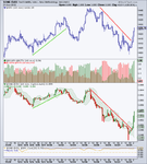
I particularly like the one hour chart. To my eye, it's easier to see the flow of volume moving between advancing and declining issues. It's smoother too than other timeframes. 30 mins is just about usable, but any timeframe shorter than that isn't so instructive as it's hard to see the wood for the trees. Ditto with a longer timeframes to some extent. Anyone who gets excited by divergences will need to chance their underwear when they look at this chart - they're all over the place!
:LOL:
Tim.
 
Hi IsaTrader,
Just come across your posts and hope to look at your threads in more depth when I get time. Loved the 60min chart. I was interesting to see the massive sell offs as events (or should that be MMs) force the market prices down as far as they possibly can. Then the almost immediate snapback as buyers rush back in at the major bottoms. One thing that can’t easily be disguise is volume.

There’s supposed to Trillions, and Trillion of $s waiting to enter the market once the fiscal cliff is sorted. Will be interesting see how the chart looks when they either walk back from edge or fall right on over it!

Great work, please keep on posting its appreciated.

Rgds
 
The Advance Decline Volume ratio is showing a big volume spike at the open. Biggest negative Advance Decline volume spike since March. It's pulling back now, so will be interesting to see how this progresses during the day.

[Update 16.05 GMT] The Advance Decline Volume ratio halved from the open figures, but it's still the biggest negative volume since the current short term uptrend began in November, so could be the first signs of a short term top starting the form.

[Update 21.07 GMT] The negative AD volume declined a bit during the day, but there was no real pickup in the up volume, which stayed very weak.
 

Attachments

  • sc-52.png
    sc-52.png
    26.5 KB · Views: 176
  • sc-54.png
    sc-54.png
    26.9 KB · Views: 178
Last edited:
Attached is the updated major NYSE Bullish Percent and Moving Average Breadth charts plus the data table. The long term NYSE Bullish Percent made a reversal back to a column of Xs this week on the 20th December, and so moves back to Bull Confirmed status. Whereas, the Moving Average breadth charts gained a few more in the Xs column, but pulled back on Friday, and so there was no status changes in those, with the medium to long term charts remaining on Bear Correction and the short term on Bull Confirmed. However, something to be aware of is that all three of the charts are now in the higher risk zone at the upper portion of their ranges.

attachment.php
 

Attachments

  • sc-58-200.png
    sc-58-200.png
    37.2 KB · Views: 168
  • NYA50R_21-12-12.png
    NYA50R_21-12-12.png
    16.6 KB · Views: 140
  • NYA150R_21-12-12.png
    NYA150R_21-12-12.png
    18.5 KB · Views: 159
  • NYA200R_21-12-12.png
    NYA200R_21-12-12.png
    19.1 KB · Views: 175
  • $BPNYA_21-12-12.png
    $BPNYA_21-12-12.png
    18.1 KB · Views: 182
  • sc-57-150.png
    sc-57-150.png
    39.9 KB · Views: 181
  • sc-59-50.png
    sc-59-50.png
    35.5 KB · Views: 184
  • market-breadth-table_21-12-12.png
    market-breadth-table_21-12-12.png
    11.6 KB · Views: 715
Attached is the secondary breadth charts. Advance Decline, Advance Decline Volume, Momentum Index, 10-Day MA Advance Decline Oscillator, New High New Lows, S&P 500 / 10 & 30 Year Treasuries Ratios, and the Put Call Ratio. Also attached is the volatility breadth charts.
 

Attachments

  • NHNL_Weekly_21-12-21.png
    NHNL_Weekly_21-12-21.png
    27 KB · Views: 159
  • NHNL_Daily_21-12-21.png
    NHNL_Daily_21-12-21.png
    32.8 KB · Views: 168
  • AD_Vol_Daily_21-12-12.png
    AD_Vol_Daily_21-12-12.png
    51.8 KB · Views: 196
  • AD_Weekly_21-12-12.png
    AD_Weekly_21-12-12.png
    27.5 KB · Views: 139
  • AD_Daily_21-12-12.png
    AD_Daily_21-12-12.png
    48.4 KB · Views: 202
  • SPX_30T_21-12-12.png
    SPX_30T_21-12-12.png
    37.4 KB · Views: 176
  • SPX_10T_21-12-12.png
    SPX_10T_21-12-12.png
    36.2 KB · Views: 157
  • sc-57.png
    sc-57.png
    44.3 KB · Views: 172
  • sc-61.png
    sc-61.png
    28.7 KB · Views: 181
  • sc-60.png
    sc-60.png
    34.1 KB · Views: 160
  • sc-59.png
    sc-59.png
    34.7 KB · Views: 213
  • sc-58.png
    sc-58.png
    29.7 KB · Views: 160
Last edited:
US Industry Sectors Breadth

There was numerous changes in the sector moving average breadth charts this week with five of the nine sectors breaking swing highs to give new buy signals. So now all nine sectors are on a buy signal and none are yet in the overbought zone.

Below is the data table for the Percent of Stocks Above 150 Day Moving Average in each sector which I've ordered by relative strength, with the highest to the lowest percentage in each sector. Also attached is the visual diagram of the 9 sectors and the overall NYSE Percentage of Stocks above their 150 day Moving Averages, plus the 1% P&F chart and line chart of the nine sectors.

attachment.php
 

Attachments

  • sector_breadth_21-12-12.png
    sector_breadth_21-12-12.png
    124.6 KB · Views: 209
  • sector_breadth_1pc_PnF_21-12-12.png
    sector_breadth_1pc_PnF_21-12-12.png
    54.6 KB · Views: 168
  • sector-breadth-visual_21-12-12.png
    sector-breadth-visual_21-12-12.png
    15.2 KB · Views: 220
  • sector-breadth-table_21-12-12.png
    sector-breadth-table_21-12-12.png
    15.1 KB · Views: 709
Short term Breadth Status Change

I appreciate it's a light volume trading week, but there have been some changes on the short term moving average breadth charts that I follow. I only normally post the short term NYSE percentage of stocks above their 50 day moving averages ($NYA50R). But I thought it would be useful to see a fuller range of short term charts tonight, so I've posted charts and the table for S&P 500 ($SPXA50R), Nasdaq 100 ($NDXA50R)and the Dow Jones Industrial Average ($DOWA50R).

attachment.php


The most volatile of the charts is the DOW percentage of stocks above their 50 day moving averages, as it only has 30 stocks. This reversed to a column of Os the earliest last Wednesday 19th and today gave a double bottom sell signal and so moved to Bear Confirmed status. The S&P 500 and Nasdaq 100 moving average breadth charts are both in a column of Os also, and today moved below their 70% levels and so change from Bull Correction to Bear Alert status. Finally, the NYSE percentage of stocks above their 50 day moving averages that I always show - which includes over 3000 stocks in the entire New York Stock Exchange, reversed to a column of Os today through it's 70% level and so also moves to Bear Alert status imo. So the short term moving average breadth charts are suggesting caution if you are long.
 

Attachments

  • NYA_50.png
    NYA_50.png
    35.3 KB · Views: 159
  • DOW50R_26-12-12.png
    DOW50R_26-12-12.png
    17 KB · Views: 244
  • NDX50R_26-12-12.png
    NDX50R_26-12-12.png
    17.3 KB · Views: 177
  • SPX50R_26-12-12.png
    SPX50R_26-12-12.png
    17.2 KB · Views: 195
  • NYA50R_26-12-12.png
    NYA50R_26-12-12.png
    16.7 KB · Views: 171
  • SPX_50.png
    SPX_50.png
    37.8 KB · Views: 187
  • NDX_50.png
    NDX_50.png
    38.1 KB · Views: 180
  • DOW_50.png
    DOW_50.png
    36.6 KB · Views: 194
  • ST_MA-breadth-table_26-12-12.png
    ST_MA-breadth-table_26-12-12.png
    12.5 KB · Views: 608
Medium term Breadth Status Change

There was a reversal to Os today on the medium term P&F moving average breadth chart of the NYSE percentage of stocks above their 150 day moving averages ($NYA150R). This moves the medium term status back to Bear Confirmed at 67.63% on the broad NYSE chart.

attachment.php
 

Attachments

  • NYA150R_27-12-12.png
    NYA150R_27-12-12.png
    18.3 KB · Views: 848
Attached is the updated major NYSE Bullish Percent and Moving Average Breadth charts plus the data table.

attachment.php


attachment.php


As I noted through the week, there was some changes in the Moving Average Breadth charts this week with the short and medium term NYSE charts reversing to Os on Bear Alert status. The more specific short term charts also confirmed the negative move with the S&P 500 ($SPXA50R), Nasdaq 100 ($NDXA50R), and Dow Jones Industrials ($DOWA50R) all now on Bear Confirmed, as they continued to break down one by one during the week. The NYSE percentage of stocks above their 50 day moving averages ($NYA50R) has the most stocks and so is a little slower, but closed the week right at the double bottom breakdown level, and so has a good chance of following next week unless there's a big reversal on Monday.

The long term NYSE percentage of stocks above their 200 day moving averages ($NYA200R) also reversed to a column of Os on Friday and so joins the Bear Alert status of the other two NYSE charts.

The much slower NYSE Bullish Percent chart held on the Xs, but is still below the lower high it made in September.
 

Attachments

  • $BPNYA_28-12-12.png
    $BPNYA_28-12-12.png
    18.2 KB · Views: 162
  • NYA200R_28-12-12.png
    NYA200R_28-12-12.png
    19 KB · Views: 156
  • NYA150R_28-12-12.png
    NYA150R_28-12-12.png
    17.6 KB · Views: 163
  • NYA50R_28-12-12.png
    NYA50R_28-12-12.png
    16.7 KB · Views: 184
  • NYA200R_line_28-12-12.png
    NYA200R_line_28-12-12.png
    36.9 KB · Views: 151
  • NYA50R_line_28-12-12.png
    NYA50R_line_28-12-12.png
    35.4 KB · Views: 159
  • NYA150R_line_28-12-12.png
    NYA150R_line_28-12-12.png
    40 KB · Views: 163
  • market-breadth-table_28-12-12.png
    market-breadth-table_28-12-12.png
    11.1 KB · Views: 808
  • ST_MA-breadth-table_28-12-12.png
    ST_MA-breadth-table_28-12-12.png
    12.6 KB · Views: 809
  • SPXA50R_line_28-12-12.png
    SPXA50R_line_28-12-12.png
    37.9 KB · Views: 185
  • NDXA50R_line_28-12-12.png
    NDXA50R_line_28-12-12.png
    38.2 KB · Views: 180
  • DOWA50R_line_28-12-12.png
    DOWA50R_line_28-12-12.png
    36.8 KB · Views: 202
Attached is the other breadth charts I monitor. Advance Decline, Advance Decline Cumulative Volume, Advance Decline Volume Ratio, Momentum Index, 10-Day MA Advance Decline Oscillator, New High New Lows, S&P 500 / 10 & 30 Year Treasuries Ratios, Put Call Ratio, S&P 500 divided by Equity Options Ratio, and also the volatility breadth charts.

The "weight of evidence" looks to be learning towards the bearish side imo. The Put Call Ratio is back up to October/November levels. New Highs New Lows is neutral below 100, but still above it's zero line. The Momentum Index (200 day MA of AD Line) is close to it's November low and continues to make a big divergence with the price action. The 60 minute AD Volume Ratio shows that the declining volume in the NYSE is building with very little buying volume and the Volatility breadth ratios have turned up and are moving towards negative territory.
 

Attachments

  • NYHL_Daily_28-12-12.png
    NYHL_Daily_28-12-12.png
    32.4 KB · Views: 220
  • NYAD_Vol_28-12-12.png
    NYAD_Vol_28-12-12.png
    28.6 KB · Views: 165
  • NYUD_Daily_28-12-12.png
    NYUD_Daily_28-12-12.png
    50 KB · Views: 198
  • NYAD_Weekly_28-12-12.png
    NYAD_Weekly_28-12-12.png
    27.8 KB · Views: 136
  • NYAD_Daily_28-12-12.png
    NYAD_Daily_28-12-12.png
    48.1 KB · Views: 186
  • NYA_BPNYA_28-12-12.png
    NYA_BPNYA_28-12-12.png
    29.5 KB · Views: 160
  • CPC_Daily_28-12-12.png
    CPC_Daily_28-12-12.png
    44.4 KB · Views: 150
  • SPX_10YT_28-12-12.png
    SPX_10YT_28-12-12.png
    36.1 KB · Views: 154
  • SPX_30YT_28-12-12.png
    SPX_30YT_28-12-12.png
    37.3 KB · Views: 158
  • NYHL_Weekly_28-12-12.png
    NYHL_Weekly_28-12-12.png
    31.3 KB · Views: 160
  • SPX_CPCE_28-12-12.png
    SPX_CPCE_28-12-12.png
    52.1 KB · Views: 165
  • NYA_NYA50R_28-12-12.png
    NYA_NYA50R_28-12-12.png
    28.4 KB · Views: 150
  • NYA_NYA150R_28-12-12.png
    NYA_NYA150R_28-12-12.png
    33.6 KB · Views: 156
  • NYA_NYA200R_28-12-12.png
    NYA_NYA200R_28-12-12.png
    37.2 KB · Views: 172
Last edited:
Happy New Year folks!

My Christmas pressie to myself was a subscription to StockCharts - which means I've been spending a fair few hours playing with that whilst ploughing my way through a few glasses of plonk. The perfect Christmas!
:cheesy:

So, I thought I'd share a chart I've come up with . . .

$VIX_$SPX_$NYUPV$NYDNV.png

1st pane
$SPX (NB: the chart is 60 mins)

2nd pane (Histogram)
This is a variation on isatrader's excellent NYSE Volume Advancing / Declining Ratio chart. The minor difference is that instead of relating up and down volume to one another, each relates to total volume.

3rd pane
$VIX. Please note that I've inverted it so that its complements $SPX. In reality, it normally does the exact opposite. Viewed like this, IMO, it's easier to relate to price and spot divergences etc. What I especially like about it is that it tends to be smoother than price. Compare the two short trends. In the uptrend, $VIX didn't go anywhere near the lower BB until 12th Dec - hinting at the imminent end to the move. A lower high the next day (while price made a higher high) predicated the move down.

Of the down move, the big bear candle of the $VIX on the 19th Dec' indicated that the move up was running out of steam. The pullback in price the next day would have got many price only traders thinking that everything looks set to move higher. But $VIX told a different story. From the 19th through to the 31st $VIX only breached the upper BB once and spent most of its time beneath the 10 period moving average. Using the $VIX in conjunction with the volume histogram could be a useful tool to confirm short term trend direction.

4th pane
This shows the correlation between $VIX and $SPX. It's like an oscillator, such that +1 equals moving in perfect lockstep in the same direction, whereas, -1 equals moving in perfect lockstep in the opposite direction. Zero means no particular correlation either way. Note how the correlation dropped off noticeably in the last week as $VIX fell while $SPX attempted to rally. Please remember, $VIX is inverted on this chart so that, in reality, the correlation is negative and not positive.
Tim.
 
New Highs New Lows

The New Highs New Lows chart has caught my eye today as the New Highs (dark grey) is having an outsized move and is the second highest it's been over the last twelve months so far today. The highest was on 14th September 2012 which was the previous top for the S&P 500.

The New Lows (red) is also interesting as it has picked up to it's highest level since mid November.

attachment.php
 

Attachments

  • sc-7.png
    sc-7.png
    32.9 KB · Views: 806
Last edited:
The very short term "Percentage of Stocks Above 20-Day Moving Average" chart ($MMTW) gaped up to the match it's highs of the year today, and so is very overbought here, with over 85% of stocks in the NYSE trading above their 20 day moving averages. The 50 day MA chart looks to be in a similar position, but I'll update it later when stockcharts updates it's end of day data for the breadth charts.

attachment.php
 

Attachments

  • 796e0e8416a41589ee26f1159c8ab130.png
    796e0e8416a41589ee26f1159c8ab130.png
    13 KB · Views: 819
Short term Breadth Status Change

The short term Percentage of Stocks above their 50 day moving average charts all unsurprisingly moved back to Bull Confirmed status on today's huge move. However, all are now hugely overbought at the top extremes of their short term ranges and so will likely need to either consolidate very soon, or could put in a top. I'm personally hoping for the later as this weeks move has switched my S&P 500 short from being 2.5% in profit last Friday to around -2.5% down now.

Attached are the short term charts and the data table. I've not updated the medium and longer term charts tonight as I think it's a better idea to wait until the end of the week for those.

attachment.php
 

Attachments

  • sc-10.png
    sc-10.png
    35.3 KB · Views: 139
  • DOW50R_2-1-13.png
    DOW50R_2-1-13.png
    17 KB · Views: 154
  • NDX50R_2-1-13.png
    NDX50R_2-1-13.png
    17.6 KB · Views: 138
  • SPX50R_2-1-13.png
    SPX50R_2-1-13.png
    17.4 KB · Views: 131
  • NYA50R_2-1-13.png
    NYA50R_2-1-13.png
    16.9 KB · Views: 186
  • sc-11.png
    sc-11.png
    37.8 KB · Views: 141
  • sc-9.png
    sc-9.png
    38.1 KB · Views: 127
  • sc-8.png
    sc-8.png
    36.8 KB · Views: 143
  • ST_MA-breadth-table_2-1-13.png
    ST_MA-breadth-table_2-1-13.png
    11.7 KB · Views: 755
Last edited:
Attached is the updated major NYSE Bullish Percent and Moving Average Breadth charts plus the data table. It's bullish across the board this week, although almost all the charts are near the tops of their ranges, especially the short term moving average charts and so risk is heightened.

attachment.php


attachment.php
 

Attachments

  • NYA50R_4-1-13.png
    NYA50R_4-1-13.png
    16.9 KB · Views: 167
  • NYA150R_4-1-13.png
    NYA150R_4-1-13.png
    17.9 KB · Views: 159
  • NYA200R_4-1-13.png
    NYA200R_4-1-13.png
    19.2 KB · Views: 195
  • $BPNYA_4-1-13.png
    $BPNYA_4-1-13.png
    18.2 KB · Views: 209
  • market-breadth-table_4-1-13.png
    market-breadth-table_4-1-13.png
    10.2 KB · Views: 692
  • ST_MA-breadth-table_4-1-13.png
    ST_MA-breadth-table_4-1-13.png
    11.7 KB · Views: 684
  • NYA50R_line_4-1-13.png
    NYA50R_line_4-1-13.png
    35.3 KB · Views: 146
  • NYA150R_line_4-1-13.png
    NYA150R_line_4-1-13.png
    40.5 KB · Views: 176
  • NYA200R_line_4-1-13.png
    NYA200R_line_4-1-13.png
    37.2 KB · Views: 156
Last edited:
Attached is the other breadth charts I like to look at. Advance Decline, Advance Decline Cumulative Volume, Advance Decline Volume Ratio, Momentum Index, 10-Day MA Advance Decline Oscillator, New High New Lows, S&P 500 / 10 & 30 Year Treasuries Ratios, Put Call Ratio, S&P 500 divided by Equity Options Ratio, the volatility breadth charts and I've added the Advance Decline cumulative line divided by the NYSE total volume as it is interesting and looks useful to compare with the straight AD cumulative line.
 

Attachments

  • NYHL_D_4-1-13.png
    NYHL_D_4-1-13.png
    33.5 KB · Views: 207
  • NYUD_NYTV_4-1-13.png
    NYUD_NYTV_4-1-13.png
    54.6 KB · Views: 275
  • NYAD_NYTV_4-1-13.png
    NYAD_NYTV_4-1-13.png
    27.8 KB · Views: 262
  • NYAD_D_4-1-13.png
    NYAD_D_4-1-13.png
    51.1 KB · Views: 242
  • NYHL_Cum_4-1-13.png
    NYHL_Cum_4-1-13.png
    39.6 KB · Views: 243
  • SPX_10YT_4-1-13.png
    SPX_10YT_4-1-13.png
    36.1 KB · Views: 174
  • NYUPV_NYDNV_4-1-13.png
    NYUPV_NYDNV_4-1-13.png
    24.1 KB · Views: 249
  • SPX_30YT_4-1-13.png
    SPX_30YT_4-1-13.png
    37.3 KB · Views: 212
  • NYA_BPNYA_4-1-13.png
    NYA_BPNYA_4-1-13.png
    29.2 KB · Views: 232
  • NYA_NYA50R_4-1-13.png
    NYA_NYA50R_4-1-13.png
    28.4 KB · Views: 257
  • NYA_NYA150R_4-1-13.png
    NYA_NYA150R_4-1-13.png
    33.2 KB · Views: 219
  • NYA_NYA200R_4-1-13.png
    NYA_NYA200R_4-1-13.png
    38.1 KB · Views: 211
  • CPC_4-1-13.png
    CPC_4-1-13.png
    45.7 KB · Views: 199
  • SPX_CPCE_4-1-13.png
    SPX_CPCE_4-1-13.png
    51.8 KB · Views: 290
Effective Volume

I'm also going to start to keep a more regular eye on the total effective volume flow of the major index ETFs on here each week for the S&P 500 (SPY), Nasdaq 100 (QQQ) and the Russell 2000 (IWM). It's fairly simple to read, as it's bullish when above the 20 day MA line and it's the MA line is rising, and it's bearish when it's below the 20 day MA line and the MA line is declining. Divergences with the price action can also be useful I've noticed.

attachment.php


attachment.php


attachment.php
 

Attachments

  • QQQ_EF_4-1-13.png
    QQQ_EF_4-1-13.png
    12.9 KB · Views: 881
  • IWM_EF_4-1-13.png
    IWM_EF_4-1-13.png
    11.7 KB · Views: 869
  • SPY_EF_4-1-13.png
    SPY_EF_4-1-13.png
    12.5 KB · Views: 925
Last edited:
US Industry Sectors Breadth

It's been a few weeks since I updated the sector breadth charts. A few went back to sell signals last week, but all have reversed again strongly to put every sector back on a buy signal. Financials is still the strongest sector with 79.65% of financial stocks in the NYSE above their 150 day MA.

Below is the data table for the Percent of Stocks Above 150 Day Moving Average in each sector which I've ordered by relative strength, with the highest to the lowest percentage in each sector. Also attached is the visual diagram of the 9 sectors and the overall NYSE Percentage of Stocks above their 150 day Moving Averages, plus the 1% P&F chart and line chart of the nine sectors.

attachment.php
 

Attachments

  • sector_breadth_4-1-13.png
    sector_breadth_4-1-13.png
    125.8 KB · Views: 269
  • sector_breadth_1pc_PnF_4-1-13.png
    sector_breadth_1pc_PnF_4-1-13.png
    53.9 KB · Views: 245
  • sector-breadth-visual_4-1-13.png
    sector-breadth-visual_4-1-13.png
    15.3 KB · Views: 264
  • sector-breadth-table_4-1-13.png
    sector-breadth-table_4-1-13.png
    14.4 KB · Views: 839
Momentum Index (MI)

The AD Momentum Index (200 day MA of the NYSE Advances minus Declines) is still showing a notable divergence with the price action. As is the 10 day Advances minus Declines oscillator, which has failed to get above it's December swing high so far.

attachment.php


Also attached below is the Advance Decline Volume Momentum Index (200 day MA of the NYSE Advances minus Declines Volume) and the 10 Day Advances minus Declines Volume oscillator. These show a very similar picture, but the AD Volume is notably weaker than the straight Advance decline data as you can see. So personally I'm looking for a close above/below the recent swing highs and lows on the momentum indexes to give some idea on the next direction of the US market, but imo it's looking weak currently with a sizable divergence in both metrics.

attachment.php
 

Attachments

  • sc-29.png
    sc-29.png
    44.3 KB · Views: 815
  • sc-30.png
    sc-30.png
    43.2 KB · Views: 834
Last edited:
Top