isatrader
Senior member
- Messages
- 2,964
- Likes
- 135
I'm starting this thread on Market Breadth charts as I think they give a clearer picture to what is really going on the market.
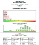
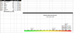
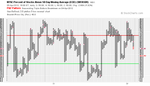
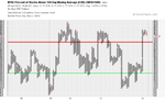
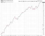
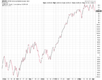
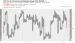
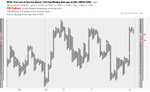
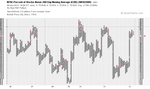
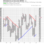
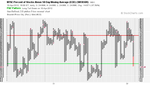
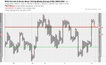
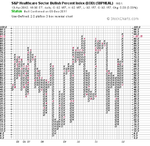
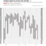
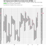
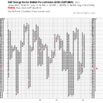
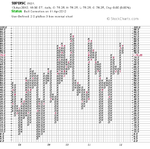
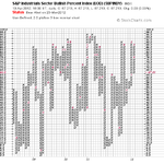
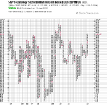
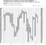
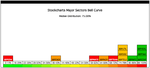
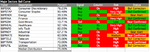
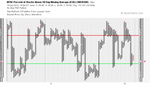
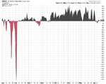
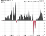
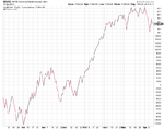
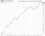
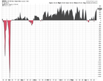
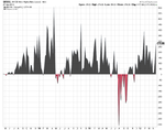
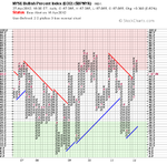
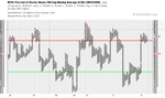
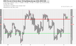
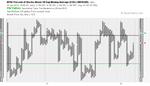
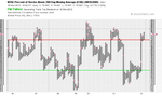
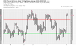
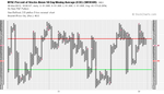
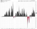
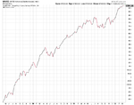
Feel free to posts your breadth charts in here, but I focus on the NYSE Bullish Percent Index ($BPNYA), NYSE Percent of Stocks Above 200 Day Moving Average ($NYA200R), NYSE Percent of Stocks Above 150 Day Moving Average ($NYA150R), NYSE Percent of Stocks Above 50 Day Moving Average ($NYA50R), NYSE A-D Line ($NYAD), and NYSE Highs-Lows ($NYHL) mainly. But I also look at the sector bullish percents regularly.
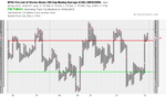
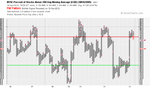
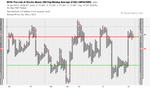
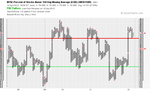
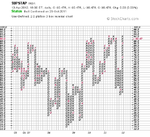
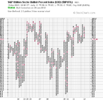
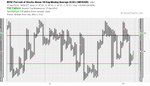
Attached is the current charts. The NYSE Percent of Stocks Above their 50 Day Moving Average ($NYA50R) has continued to fall away during March and is now on a sell signal after making a double bottom breakdown. It has also made a number of lower highs and moved below the key 70% level suggesting a short term correction is occurring in the broader market, as around 28% less stocks are now above their 50 day moving average than they were in February. This has taken the short term risk down though, as the $NYA50R was near record high levels of close to 90% in early February, but is now a much more reasonable 61.3%
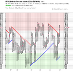
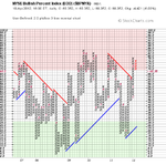
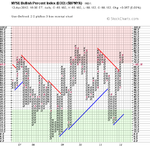
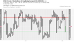
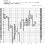
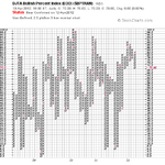
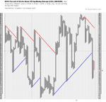
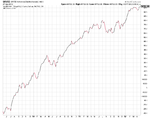
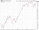
The longer term indicators such as the NYSE Bullish Percent Index ($BPNYA), NYSE Percent of Stocks Above 200 Day Moving Average ($NYA200R), and NYSE Percent of Stocks Above 150 Day Moving Average ($NYA150R) all remain above the 70% level and are still on buy signals, although the risk level is increased. Research by Dorsey Wright suggests that the NYSE Bullish Percent Index stays above the 70% level for an average of 96 days. It's more than 50 days since it broke above the 70% level now, so the research suggests on average we should have another month before it turns down again. But as it's an average it could also turn down much soon or much later, as there's no guarantees with anything, but the short term $NYA50R will lead, so I will look for the early warning signs there and the other shorter term indicators.
Feel free to posts your breadth charts in here, but I focus on the NYSE Bullish Percent Index ($BPNYA), NYSE Percent of Stocks Above 200 Day Moving Average ($NYA200R), NYSE Percent of Stocks Above 150 Day Moving Average ($NYA150R), NYSE Percent of Stocks Above 50 Day Moving Average ($NYA50R), NYSE A-D Line ($NYAD), and NYSE Highs-Lows ($NYHL) mainly. But I also look at the sector bullish percents regularly.
Attached is the current charts. The NYSE Percent of Stocks Above their 50 Day Moving Average ($NYA50R) has continued to fall away during March and is now on a sell signal after making a double bottom breakdown. It has also made a number of lower highs and moved below the key 70% level suggesting a short term correction is occurring in the broader market, as around 28% less stocks are now above their 50 day moving average than they were in February. This has taken the short term risk down though, as the $NYA50R was near record high levels of close to 90% in early February, but is now a much more reasonable 61.3%
The longer term indicators such as the NYSE Bullish Percent Index ($BPNYA), NYSE Percent of Stocks Above 200 Day Moving Average ($NYA200R), and NYSE Percent of Stocks Above 150 Day Moving Average ($NYA150R) all remain above the 70% level and are still on buy signals, although the risk level is increased. Research by Dorsey Wright suggests that the NYSE Bullish Percent Index stays above the 70% level for an average of 96 days. It's more than 50 days since it broke above the 70% level now, so the research suggests on average we should have another month before it turns down again. But as it's an average it could also turn down much soon or much later, as there's no guarantees with anything, but the short term $NYA50R will lead, so I will look for the early warning signs there and the other shorter term indicators.
Attachments

Last edited: