It is no secret that various people or bodies within the financial services industry will say or write whatever will sell the products, rather than what is actually true and correct. For this reason, buyers may be more inclined to rely on what they think is hard evidence – in the form of statistics and charts. Regrettably, one can lie with these too.
In 1954, Darell Huff wrote a classic book titled "How To Lie With Statistics," and a German professor by the name of Walter Krämer has had enormous success with a similar book with the same title, except in German "So Lügt Man Mit Statistik" (revised edition, Piper Verlag, 2011). The charts below are also from the book.
In this article, we will see that it is possible to present financial material in such a way as to exaggerate, minimize, distort or generally deceive the reader or viewer. You can say what you want with statistics, just like you can in words.
The Trick Bag
Sadly, it is a pretty full bag. The simplest of all tricks is simply what Krämer calls "the illusion of precision." By using decimals, for instance, a figure sounds more convincing. Instead of writing that you beat the index by 2%, if you put it as 2.35% it has a ring of authenticity. Whether this is correct or sustainable is another story.
And then, there are various other percentage ploys. "We have expanded our team of financial analysts by 50% over the last year," is an impressive claim. But, if it means that instead of only one full-time person, you also have someone coming in during the mornings, the reality is less exciting.
Similarly, you may read that a particular foreign country is a good investment because, among other leading indicators, its unemployment rate has dropped from 10 to 8%. But what if that 2% had simply been removed from the stats and just isn't counted anymore? As for growth and inflation rates, it is just amazing what can be done by focusing on rates of change rather than the actual level of inflation, and so on.
Talking of sustainability, one way of spinning a chart is to choose the starting or end point so as to emphasize only part of the process. Thus, if you want to stress an upward trend, start the graph in a deep trough. If you want to make the graph look generally positive, just leave the downturn out altogether. This is clearly shown in the graphs below.
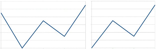
Fig 1
Where does the curve begin? The impression created is very different if you leave out the first plunging segment.
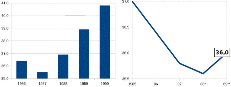
Fig 2
This chart shows how using bars and adding in one more year (on the left) with an expected value, makes it all look considerably rosier than on the right
Equally misleading are tricks with axes and scales. For example, if you present the sales figures of a stagnating company with the turnover running from nothing to $100, it is obvious that there is no growth or dynamic. On the other hand, if you chop off most of the y-axis, you can exaggerate tiny fluctuations so that things look like they are on the up-and-up. Indeed, this can be combined with the previous trick to double the effect.
This is beautifully illustrated below:
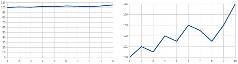
Fig 3
Likewise, you can make a sideways stock market look like a roller coaster, simply by changing the scales (see figure below). By expanding or contracting the axes like a concertina, you can fool a lot of people a lot of the time. Amazingly, both charts below show the same market!
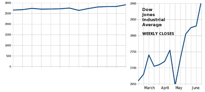
Fig 4
Such tricks can quite literally (but graphically only!) turn a failure into a success, near bankruptcy into a hot stock and horrendous volatility into gently wavering stability. The problem is that reality will eventually prevail, but by then, the seller hopes to have taken the money and run.
Pictograms can also be constructed to mislead. Even if one magnitude is only 10% larger than another, it can be shown in a picture as double the size. Thus, bulls that only marginally outweigh the bears at a certain point in time can look very dominant. Or, wads of dollar notes can be made bigger or smaller relative to the rest of the graphic to create the desired (misleading) impression.
And then, there are all manners of sampling techniques that can push the numbers up or down, as you please. If an investment firm conducts a customer survey, who is to know if they choose only those portfolios that have done well and cite their owners' enthusiastic comments, and simply ignore those who are seething with rage at having been sold some dud? This issue, among other factors, should be considered when choosing a broker.
It is an endless procession. Medical companies can paint a bright picture by looking at relative changes rather than absolute ones. Construction companies can report on what has been built rather than what is occupied. Arms manufacturers can play around with their numbers and pictures so that the true market share going to alarming undemocratic nations looks reassuringly low.
What To Do About It – Who Can You Trust?
The ugly reality is that anyone in the know can present statistics so as to create the desired impression, rather than the truth. As usual, you need to know whether the source is credible and honest or not. Recommendations, double checking, second opinions and if necessary, hiring an expert, can all be helpful. One is never totally safe from this kind of falsification, but viable controls are possible. And the more you learn and are aware of the dangers, the safer you are.
The Bottom Line
All that glitters statistically is not necessarily gold. Even without actually falsifying the numbers, statistics can be manipulated and abused so as to misrepresent the facts. The use of scales and axes, and even shading and colors, can all present a rosy impression or the converse, irrespective of the reality. Where there is a lack of financial ethics, there is a statistical way. Though statistics can be beneficial in making financial decisions, they can just as well be detrimental if not understood correctly. Don't let it pull the statistical wool over your eyes.
Dr Brian Bloch can be contacted at Brian Bloch.com
In 1954, Darell Huff wrote a classic book titled "How To Lie With Statistics," and a German professor by the name of Walter Krämer has had enormous success with a similar book with the same title, except in German "So Lügt Man Mit Statistik" (revised edition, Piper Verlag, 2011). The charts below are also from the book.
In this article, we will see that it is possible to present financial material in such a way as to exaggerate, minimize, distort or generally deceive the reader or viewer. You can say what you want with statistics, just like you can in words.
The Trick Bag
Sadly, it is a pretty full bag. The simplest of all tricks is simply what Krämer calls "the illusion of precision." By using decimals, for instance, a figure sounds more convincing. Instead of writing that you beat the index by 2%, if you put it as 2.35% it has a ring of authenticity. Whether this is correct or sustainable is another story.
And then, there are various other percentage ploys. "We have expanded our team of financial analysts by 50% over the last year," is an impressive claim. But, if it means that instead of only one full-time person, you also have someone coming in during the mornings, the reality is less exciting.
Similarly, you may read that a particular foreign country is a good investment because, among other leading indicators, its unemployment rate has dropped from 10 to 8%. But what if that 2% had simply been removed from the stats and just isn't counted anymore? As for growth and inflation rates, it is just amazing what can be done by focusing on rates of change rather than the actual level of inflation, and so on.
Talking of sustainability, one way of spinning a chart is to choose the starting or end point so as to emphasize only part of the process. Thus, if you want to stress an upward trend, start the graph in a deep trough. If you want to make the graph look generally positive, just leave the downturn out altogether. This is clearly shown in the graphs below.
Fig 1
Where does the curve begin? The impression created is very different if you leave out the first plunging segment.
Fig 2
This chart shows how using bars and adding in one more year (on the left) with an expected value, makes it all look considerably rosier than on the right
Equally misleading are tricks with axes and scales. For example, if you present the sales figures of a stagnating company with the turnover running from nothing to $100, it is obvious that there is no growth or dynamic. On the other hand, if you chop off most of the y-axis, you can exaggerate tiny fluctuations so that things look like they are on the up-and-up. Indeed, this can be combined with the previous trick to double the effect.
This is beautifully illustrated below:
Fig 3
Likewise, you can make a sideways stock market look like a roller coaster, simply by changing the scales (see figure below). By expanding or contracting the axes like a concertina, you can fool a lot of people a lot of the time. Amazingly, both charts below show the same market!
Fig 4
Such tricks can quite literally (but graphically only!) turn a failure into a success, near bankruptcy into a hot stock and horrendous volatility into gently wavering stability. The problem is that reality will eventually prevail, but by then, the seller hopes to have taken the money and run.
Pictograms can also be constructed to mislead. Even if one magnitude is only 10% larger than another, it can be shown in a picture as double the size. Thus, bulls that only marginally outweigh the bears at a certain point in time can look very dominant. Or, wads of dollar notes can be made bigger or smaller relative to the rest of the graphic to create the desired (misleading) impression.
And then, there are all manners of sampling techniques that can push the numbers up or down, as you please. If an investment firm conducts a customer survey, who is to know if they choose only those portfolios that have done well and cite their owners' enthusiastic comments, and simply ignore those who are seething with rage at having been sold some dud? This issue, among other factors, should be considered when choosing a broker.
It is an endless procession. Medical companies can paint a bright picture by looking at relative changes rather than absolute ones. Construction companies can report on what has been built rather than what is occupied. Arms manufacturers can play around with their numbers and pictures so that the true market share going to alarming undemocratic nations looks reassuringly low.
What To Do About It – Who Can You Trust?
The ugly reality is that anyone in the know can present statistics so as to create the desired impression, rather than the truth. As usual, you need to know whether the source is credible and honest or not. Recommendations, double checking, second opinions and if necessary, hiring an expert, can all be helpful. One is never totally safe from this kind of falsification, but viable controls are possible. And the more you learn and are aware of the dangers, the safer you are.
The Bottom Line
All that glitters statistically is not necessarily gold. Even without actually falsifying the numbers, statistics can be manipulated and abused so as to misrepresent the facts. The use of scales and axes, and even shading and colors, can all present a rosy impression or the converse, irrespective of the reality. Where there is a lack of financial ethics, there is a statistical way. Though statistics can be beneficial in making financial decisions, they can just as well be detrimental if not understood correctly. Don't let it pull the statistical wool over your eyes.
Dr Brian Bloch can be contacted at Brian Bloch.com
Last edited by a moderator: