Volume patterns are much harder to interpret than price patterns. The difficulty stems from the clandestine strategies of big market players. These folks tend to move slowly and cover their tracks within the broad noise of daily movement.
While price bars tell many tales in a vacuum, volume has little or no meaning without underlying price movement. But don't abandon your volume study just yet. It still adds power to prediction when you apply it judiciously.
The importance of volume depends on its location within the overall pattern. For example, heavy volume through a broken trend line suggests the start of a new trend, while the same activity after a long rally or decline predicts a reversal. This counterintuitive logic confuses traders and inhibits their ability to decipher volume at key turning points.
Here are five volume patterns that show considerable predictive power when interpreted correctly. Watch for these setups whenever you're flipping through your charts. Then realize how volume can yield vital information long before price action tells the tale.
Awakenings
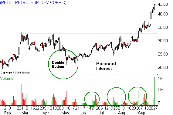
Stocks often go dead for long periods after vertical rallies. The trick is to be prepared when they start to wake up. Petroleum Development (PETD) rallied over 500% in a bull market run that gave way to a long sideways market last March. Then volume begins to spike at two- to four-week intervals after the stock prints a May double bottom.
Volume-building into a congestion pattern after a discernible low often signals renewed buying interest that precedes a breakout.
Notice how Petroleum Development's buying cycle finally lifts price into a test of the 52-week high in the low $30s. The stock pauses above resistance for two weeks after the breakout and explodes into a fresh uptrend.
Shock Spirals -- Down
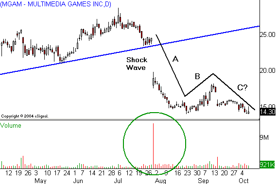
Tony Plummer examines the shock spiral in his classic book The Psychology of Technical Analysis. In this text he shows how unexpected events can trigger rapid price movement that takes on a spiral quality. Multimedia Games (MGAM) downward spike last summer certainly qualifies as a shock spiral event.
The trick with this phenomenon is to look for an A-B-C pattern in which A and C move in the same direction as the shock, while B moves against it. Additionally, the A and C waves often stretch to the same length, creating a "measured move" scenario. This translates into a substantial decline toward single digits for the casino provider.
Shock Spirals -- Up
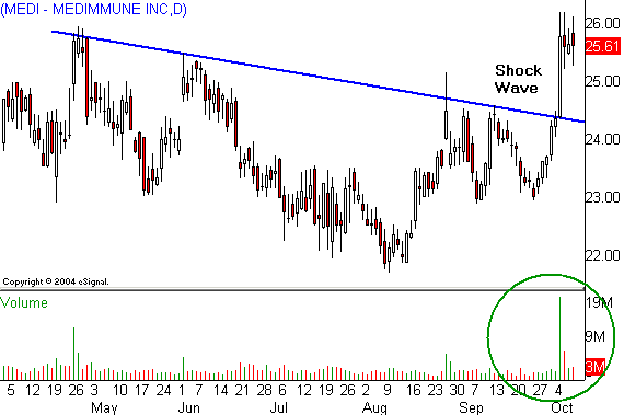
Shock spirals can occur in either direction. MedImmune (MEDI) triggered a huge volume spike when Chiron (CHIR) had to pull its competing flu drug off the market. Notice how the spike pushes the stock above strong resistance. This could set up an A-B-C rally, with the C wave breaking above the May high and sending price toward $30.
Is there any real difference between this pattern and a typical breakout pattern? Absolutely. The huge increase in participation across the former resistance level suggests price won't trade under the spike bar low for months or years to come. Routine breakouts carry a much higher failure rate.
Climax Events
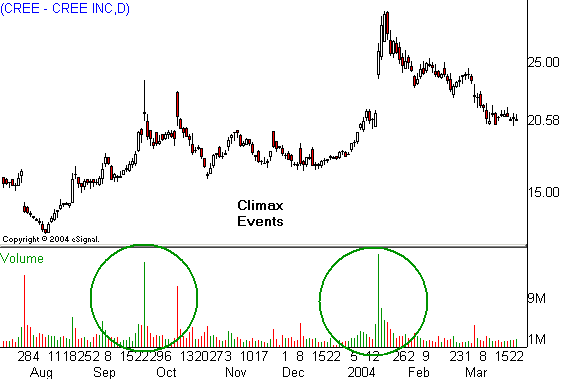
Climax events are counterintuitive because they signal the end of a trend just when the crowd piles into a stock. Notice how Cree (CREE) moves higher in two slow but steady rallies. The pace then quickens while volume starts to increase. Finally, price goes vertical for a few sessions, with volume peaking at a new high.
But both rallies run out of steam immediately because the stock has run out of buyers. This lets gravity kick in and trigger substantial declines. Watch out for the classic signs of a trend blowoff when you're trading vertical rallies or selloffs. Climax markets can turn you from a shareholder into a bagholder very quickly.
On Balance Volume
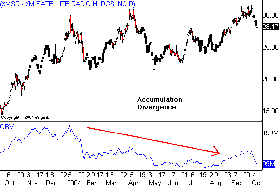
XM Satellite Radio (XMSR) shows all the signs of a breakout above $32, except for one thing: The on balance volume, or OBV, pattern is very weak. This bearish divergence sends a strong signal to stand aside and let others take the risk of a false breakout. It also suggests that a good short sale could present itself, if and when the pattern rolls over and starts to break down.
OBV is a great analytical tool, but use it sparingly. It's most effective when price is approaching important tests of old highs or lows. But it's best to ignore the indicator while markets are grinding through the debris of old congestion patterns. Accumulation-distribution data are much harder to decipher when markets are going nowhere.
While price bars tell many tales in a vacuum, volume has little or no meaning without underlying price movement. But don't abandon your volume study just yet. It still adds power to prediction when you apply it judiciously.
The importance of volume depends on its location within the overall pattern. For example, heavy volume through a broken trend line suggests the start of a new trend, while the same activity after a long rally or decline predicts a reversal. This counterintuitive logic confuses traders and inhibits their ability to decipher volume at key turning points.
Here are five volume patterns that show considerable predictive power when interpreted correctly. Watch for these setups whenever you're flipping through your charts. Then realize how volume can yield vital information long before price action tells the tale.
Awakenings

Stocks often go dead for long periods after vertical rallies. The trick is to be prepared when they start to wake up. Petroleum Development (PETD) rallied over 500% in a bull market run that gave way to a long sideways market last March. Then volume begins to spike at two- to four-week intervals after the stock prints a May double bottom.
Volume-building into a congestion pattern after a discernible low often signals renewed buying interest that precedes a breakout.
Notice how Petroleum Development's buying cycle finally lifts price into a test of the 52-week high in the low $30s. The stock pauses above resistance for two weeks after the breakout and explodes into a fresh uptrend.
Shock Spirals -- Down

Tony Plummer examines the shock spiral in his classic book The Psychology of Technical Analysis. In this text he shows how unexpected events can trigger rapid price movement that takes on a spiral quality. Multimedia Games (MGAM) downward spike last summer certainly qualifies as a shock spiral event.
The trick with this phenomenon is to look for an A-B-C pattern in which A and C move in the same direction as the shock, while B moves against it. Additionally, the A and C waves often stretch to the same length, creating a "measured move" scenario. This translates into a substantial decline toward single digits for the casino provider.
Shock Spirals -- Up

Shock spirals can occur in either direction. MedImmune (MEDI) triggered a huge volume spike when Chiron (CHIR) had to pull its competing flu drug off the market. Notice how the spike pushes the stock above strong resistance. This could set up an A-B-C rally, with the C wave breaking above the May high and sending price toward $30.
Is there any real difference between this pattern and a typical breakout pattern? Absolutely. The huge increase in participation across the former resistance level suggests price won't trade under the spike bar low for months or years to come. Routine breakouts carry a much higher failure rate.
Climax Events

Climax events are counterintuitive because they signal the end of a trend just when the crowd piles into a stock. Notice how Cree (CREE) moves higher in two slow but steady rallies. The pace then quickens while volume starts to increase. Finally, price goes vertical for a few sessions, with volume peaking at a new high.
But both rallies run out of steam immediately because the stock has run out of buyers. This lets gravity kick in and trigger substantial declines. Watch out for the classic signs of a trend blowoff when you're trading vertical rallies or selloffs. Climax markets can turn you from a shareholder into a bagholder very quickly.
On Balance Volume

XM Satellite Radio (XMSR) shows all the signs of a breakout above $32, except for one thing: The on balance volume, or OBV, pattern is very weak. This bearish divergence sends a strong signal to stand aside and let others take the risk of a false breakout. It also suggests that a good short sale could present itself, if and when the pattern rolls over and starts to break down.
OBV is a great analytical tool, but use it sparingly. It's most effective when price is approaching important tests of old highs or lows. But it's best to ignore the indicator while markets are grinding through the debris of old congestion patterns. Accumulation-distribution data are much harder to decipher when markets are going nowhere.
Last edited by a moderator:

